This tutorial will explain how to code a basic hamburger icon, in order to display the main navigation with CSS Grid.
The navigation will be hidden by default at all screen sizes and it will appear when clicking the hamburger icon.
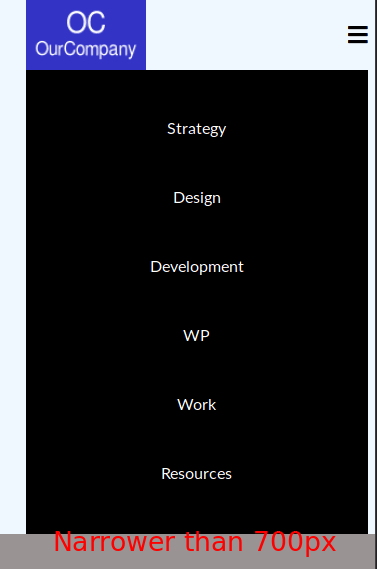
The desktop version of the code displays a horizontal menu, whereas the mobile version (< 700px) displays a vertical menu.


Let’s start!
Step #1. - The HTML
- Please, visit this Codepen page and copy the HTML code
- Open your preferred code editor
- Create an HTML file
- Copy and paste the following code:
There is a header container with three children:
- logo
- main-nav
- hamburger
The links to Font Awesome and Google Fonts are already included in the head tag of the file. You will define two grid containers, one for the header element and one for the unordered list containing the navigation links.
Step #2. - The Basic CSS Styles
- Create a file called style.css
- Copy and paste the following code:
/* BASIC STYLES */ * { padding: 0; margin: 0; } li { list-style-type: none; } a { text-decoration: none; color: #000; } body { font-family: 'Lato', sans-serif; background-color: #999393; } h1, h2, h3, h4, h5, h6 { font-family: 'Merriweather', serif; }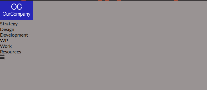
Step # 3. - The CSS Grid Styles
The first element you need to target is the header container. It has 5 columns and 2 rows. The items inside it are all aligned vertically. The first row has a fixed height of 70px.
- Edit the CSS code:
.header { display: grid; grid-template-columns: 7vw 1fr 10fr 1fr 2vw; grid-template-rows: 70px auto; align-items: center; background-color: #f0f8ff; }
Notice that the first and last columns serve as spacing (margin) to the left and right of the layout. It is not centered on the x-axis because the spacing on the right is much smaller than the spacing on the left. If you want a centered layout, just make sure the size of these side columns is the same.
Position the grid items according to the proposed layout. Align the hamburger icon to the right of its containing grid cell.
If you are asking yourself about the second (unused) row in this grid, don’t worry, we’ll come back to that when coding the mobile version of the menu.
- Edit the CSS code:
.logo { grid-column: 2; } .main-nav { grid-column: 3; } .hamburger { grid-column: 4; justify-self: end; }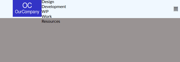
The items inside the header container are already placed, now target the navigation menu. Create a grid with 6 columns for each one of the navigation links and center them vertically.
- Edit the CSS code:
.main-nav ul { display: grid; grid-template-columns: repeat(6, 1fr); justify-items: center; }
Make some adjustments to the size of the hamburger icon and to the logo image.
- Edit the CSS code:
.fa-bars { font-size: 1.4em; } .logo img { display: block; height: 70px; }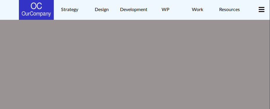
In order to be able to make this menu usable in mobile devices, you need to add media queries to your CSS code.
Step # 4. - The Media Queries
- Edit the CSS code:
@media screen and (max-width: 700px) { .main-nav { grid-row: 2; grid-column: 2 / 5; background-color: #000; } .main-nav ul a { color: #fff; } }For devices with a screen narrower than 700px, the main navigation will be placed on the second row of the header element.
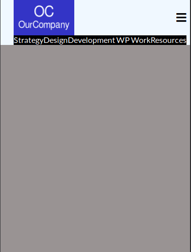
The menu items have to be displayed in a vertical order.
- Edit the CSS file and add this code inside the media query:
.main-nav ul { grid-template-columns: 1fr; height: calc(80vh - 70px); align-content: space-evenly; }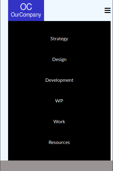
This is almost all the CSS that you need for this example. You need now to hide the main-nav container, in order to display it when clicking/tapping the hamburger icon.
- Edit the CSS code (outside the media query):
.main-nav { display: none; }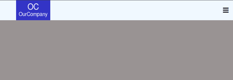
Step # 5. - The JavaScript
- Create a file called script.js, it is already linked in the head tag of the markup
- Paste this code:
/* Toggle between showing and hiding the navigation menu links when the user clicks on the hamburger menu icon */ function myFunction() { var x = document.getElementById("main-nav"); if (x.style.display === "grid") { x.style.display = "none"; } else { x.style.display = "grid"; } }When clicking the icon (hint: take a look at the function call in the markup), the script gets the element main-nav by its id and checks its display. If the display is grid, the display will be set to none otherwise, it will be set to grid.
Save all files and refresh your browser. Click the hamburger icon. If the menu appears, you have done everything right.
Congratulations!
This is the last part of this tutorial series about CSS Grid. It was certainly fun for me!
I hope these tutorials have helped you learn about this fantastic CSS module.
Please, leave us your comments below.
Thanks for reading!
The previous 22 posts in this series:
- CSS Grid #1: Everything Joomla users need to get started with CSS Grid
- CSS Grid #2: How to Use the Firefox Grid Inspector with CSS Grid
- CSS Grid #3: Understanding Explicit and Implicit Grids in CSS Grid
- CSS Grid #4: How to Use the Autoflow Property in CSS Grid
- CSS Grid #5: Determining the Size of the Tracks in CSS Grid
- CSS Grid #6: The Auto Keyword and Repeat Notation in CSS Grid
- CSS Grid #7: How to Size Grid Items with the Span Keyword in CSS Grid
- CSS Grid #8: How to Use Line Placing in CSS Grid
- CSS Grid #9: How to Layer Items Inside a CSS Grid
- CSS Grid #10: How to Name Grid Lines
- CSS Grid #11: How to Place Items with Grid Template Areas
- CSS Grid #12: The minmax() Function
- CSS Grid #13: The auto-fill and auto-fit Keywords in CSS Grid
- CSS Grid #14: Centering and Aligning Items in CSS Grid
- CSS Grid #15. The justify-content and align-content Properties
- CSS Grid #16. The grid-auto-flow: dense Property
- CSS Grid #17. Nesting Grids
- CSS Grid #18: How to Build a Dropdown Menu
- CSS Grid #19: Difference Between Grid Containers and Block Containers
- CSS Grid #20: Build a Teaser Gallery with Cards
- CSS Grid #21: How to Insert an Empty Row in CSS Grid
- CSS Grid #22: Theming a Footer with CSS Grid and Media Queries
Get our CSS Grid Explained Book
All Joomlashack Pro members get access to our "CSS Grid Explained" book. All you need to do is sign up for a Joomlashack extension, template or training membership.
In this short book, you are going to master the key ideas behind CSS Grid. This book is in the best traditions of OSTraining. There are no long-dense paragraphs of theory. You pick up the book and you start writing code immediately.
In the first chapter, we start with the basic terminology. You'll learn the difference between Grid Areas and Grid Cells, between Grid Tracks and Grid Gaps.
Then, using a hands-on approach, you'll start building CSS Grids. There are 9 different exercises in this book. You'll build everything from the most basic CSS Grid to a full site layout.


