
In one of the first tutorials, you learned that items inside a grid are placed according to a row based flow by default. Items wrap over to the next row and are placed into grid areas if there’s enough space available.
If not, the item will jump over to the next slot, where it can fit. This could lead to a grid layout with empty spaces because the placement algorithm is placing the grid items according to a sequence. The grid-auto-flow: dense property will allow you to fill those empty spaces with grid items of the right size, independently of the source order of the document.
Let’s demonstrate this property with an example!
Step #1. Create the HTML
- Open the text editor of your liking.
- Create an HTML file.
- If you have the Emmet extension installed in your editor, you can type this code:
.container>.item.item${$}*25
- Hit the “Tab” key.
- If you don’t have the Emmet extension installed, just copy and paste this code:
<div class="container">
<div class="item item1">1</div>
<div class="item item2">2</div>
<div class="item item3">3</div>
<div class="item item4">4</div>
<div class="item item5">5</div>
<div class="item item6">6</div>
<div class="item item7">7</div>
<div class="item item8">8</div>
<div class="item item9">9</div>
<div class="item item10">10</div>
<div class="item item11">11</div>
<div class="item item12">12</div>
<div class="item item13">13</div>
<div class="item item14">14</div>
<div class="item item15">15</div>
<div class="item item16">16</div>
<div class="item item17">17</div>
<div class="item item18">18</div>
<div class="item item19">19</div>
<div class="item item20">20</div>
<div class="item item21">21</div>
<div class="item item22">22</div>
<div class="item item23">23</div>
<div class="item item24">24</div>
<div class="item item25">25</div>
</div>
Step #2. Create the CSS
Create the global styles for the markup you just created:
- Create a CSS file and link it to your HTML file.
- Add the following styles:
/* GLOBAL STYLES */

* {
       box-sizing: border-box;
   }

   body {
   background-color: #AAA;
   margin: 50px;
   }

   /* Each item in the grid contains numbers */
   .item {
   /* Center the contents of the grid items, making each grid item a Flex Container */
   display: flex;

   /* Horizontal and Vertical centering */
   justify-content: center;
   align-items: center;
   border: 5px solid #87b5ff;
   border-radius: 3px;
   font-size: 2em;
   font-family: sans-serif;
   font-weight: bold;
   background-color: #1c57b5;
}
Step #3. Create the CSS Grid
For the purpose of this tutorial, we’re going to create a grid with 5 columns and 5 rows. The height of each one of the elements will be auto (default).
You’ll be changing the size of a couple of them, in order to generate blank spaces within the grid. The gap between columns and rows will be 2em, that’s about 32px on a desktop screen.
- Add this code to your CSS file:
.container {
       display: grid;
       grid-template-columns: repeat(5, 1fr);
       grid-template-rows: repeat(5, 1fr);
       grid-gap: 2em;
   }
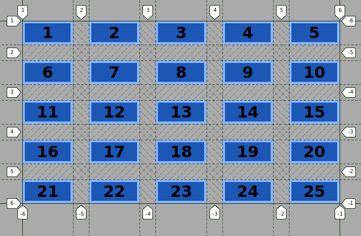
This is the normal flow of the grid. The browser takes each item and places it from left to right and from top to bottom like in western languages, according to CSS Grid’s placement algorithm.
Step #4. Changing the Size of some Grid Items
We need to change the size of some of the items, in order to make some blank spaces appear on the grid.
The CSS :nth-child pseudo-class will allow us to target specific items, more precisely each third, fifth, and seventh item in the source order.
- Edit the CSS code:
.item:nth-child(3n) {
       grid-column: span 4;
       background-color: #12cc12;
   }

   .item:nth-child(5n) {
       grid-column: span 3;
       background-color: #f5ecec;
   }

   .item:nth-child(7n) {
       grid-column: span 2;
       background-color: #f35810;
   }
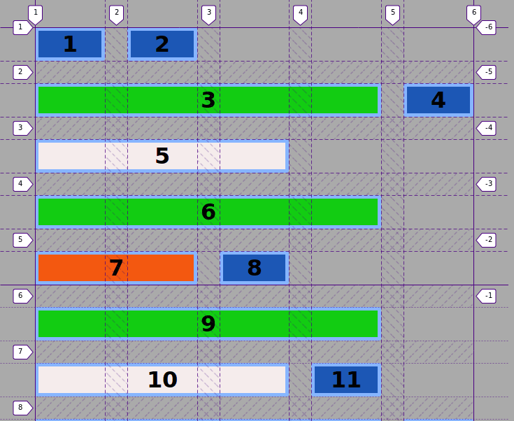
Notice that the styling of items, which are targeted by two different CSS pseudo-classes (i.e. items 15, and 21), will be ruled by the last available selector in the source order of the CSS code. Moreover, the grid items have been placed on the implicit grid from Item 9 onwards.
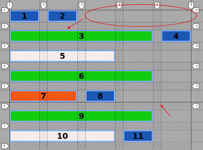
As you can see, item 3 for example, does not fit into the available space on the first row, so it wraps over to the next row, leaving 3 empty grid cells on that row, item 4 comes after item 3 according to the source order of the markup.
Step #5. The grid-auto-flow: dense property
It’s time to use the grid-auto-flow: dense property, which will place items on the grid, according to their size, making use of that available empty space.
- Edit the CSS code
.container {
       display: grid;
       grid-template-columns: repeat(5, 5fr);
       grid-template-rows: repeat(5, 5fr);
       grid-gap: 2em;
       grid-auto-flow: dense;
   }
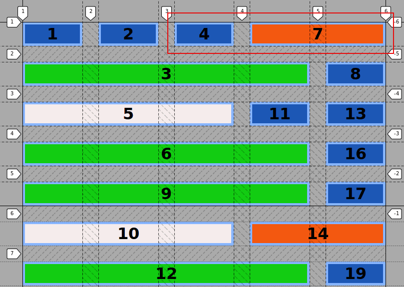
Now you can see that item 4 has taken the available space on the first row between lines 3 and 4, item 7 has been placed with the same logic and so on. This is very useful if the source order of the markup is not relevant to the presentation layer, for example with an image gallery.
As already stated, the default flow of the grid is the row. So, if you edit the CSS code and add the keyword row, to the grid-auto-flow property, you won’t see any difference.
- Edit the following CSS code:
.container {
       display: grid;
       grid-template-columns: repeat(5, 5fr);
       grid-template-rows: repeat(5, 5fr);
       grid-gap: 2em;
       grid-auto-flow: row dense;
   }
- Edit the CSS code once again to test the column
auto-flowproperty:
.container {
       display: grid;
       grid-template-columns: repeat(5, 5fr);
       grid-template-rows: repeat(5, 5fr);
       grid-gap: 2em;
       grid-auto-flow: column dense;
   }
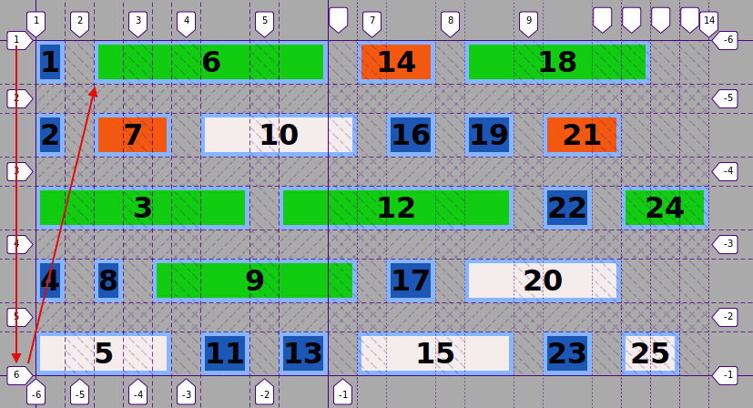
Now items flow first from top to bottom and then from left to right in a column-based flow. The width of items that haven’t been spanned has become auto, and the explicit grid ends with item 13.
The grid-auto-flow property takes control over the functioning of the placement algorithm for the items onto the grid. The dense keyword places items on blank spaces of the grid, according to their size.
It is very useful if you don’t have to preserve the source order of the markup within the visual presentation of your site.
Thanks for reading!
The previous 15 posts in this series:
- CSS Grid #1: Everything Joomla users need to get started with CSS Grid
- CSS Grid #2: How to Use the Firefox Grid Inspector with CSS Grid
- CSS Grid #3: Understanding Explicit and Implicit Grids in CSS Grid
- CSS Grid #4: How to Use the Autoflow Property in CSS Grid
- CSS Grid #5: Determining the Size of the Tracks in CSS Grid
- CSS Grid #6: The Auto Keyword and Repeat Notation in CSS Grid
- CSS Grid #7: How to Size Grid Items with the Span Keyword in CSS Grid
- CSS Grid #8: How to Use Line Placing in CSS Grid
- CSS Grid #9: How to Layer Items Inside a CSS Grid
- CSS Grid #10: How to Name Grid Lines
- CSS Grid #11: How to Place Items with Grid Template Areas
- CSS Grid #12: The minmax() Function
- CSS Grid #13: The auto-fill and auto-fit Keywords in CSS Grid
- CSS Grid #14: Centering and Aligning Items in CSS Grid
- CSS Grid #15. The justify-content and align-content Properties
Get our CSS Grid Explained Book
All Joomlashack Pro members get access to our "CSS Grid Explained" book. All you need to do is sign up for a Joomlashack extension, template or training membership.
In this short book, you are going to master the key ideas behind CSS Grid. This book is in the best traditions of OSTraining. There are no long-dense paragraphs of theory. You pick up the book and you start writing code immediately.
In the first chapter, we start with the basic terminology. You'll learn the difference between Grid Areas and Grid Cells, between Grid Tracks and Grid Gaps.
Then, using a hands-on approach, you'll start building CSS Grids. There are 9 different exercises in this book. You'll build everything from the most basic CSS Grid to a full site layout.
About the author