
Welcome to the 9th tutorial in our series on the CSS Grid.
We are presenting this series to help Joomla developers learn about CSS Grid. The introduction of CSS Grid will be one of the major changes in upcoming Joomla 4.
In the first tutorials in this series, you learned that the browser has an auto-placement algorithm. That way, items are placed inside empty grid cells automatically. Items won’t overlap each other when using the auto-placement.
You also learned how to place grid items anywhere on the grid with the help of the grid’s numbered lines in the last tutorial.
In this case, it’s possible to overlap items because you’re defining the start and end positions of every item within the grid with this two-dimensional approach (start and end lines across columns and rows, ie. width+height).
The CSS z-index property will allow you to change the position of the items in a third dimension (ie. depth). That way you can control the behavior of items that overlap.
Let’s look at an example to clarify this concept.
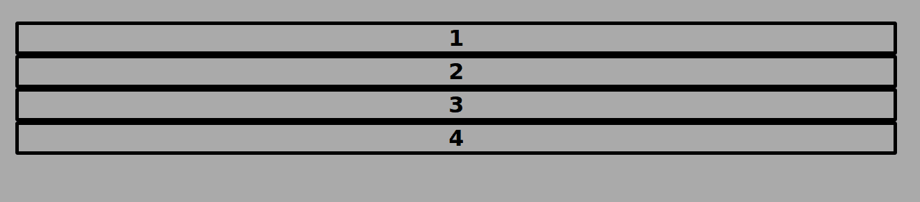
Step #1. Create the HTML
- Open your preferred code editor.
- Create an HTML file.
- Type this command if the Emmet extension is available in your code editor:
.container>.item.item${$}*4
- Hit the Tab key.
- If you don’t have the Emmet extension, copy and paste this code:
<div class="container">
<div class="item item1">1</div>
       <div class="item item2">2</div>
       <div class="item item3">3</div>
       <div class="item item4">4</div>
</div>
Step #2. Create the CSS
- Create a CSS file and link it to your HTML file.
- Add the following global styles:
/* GLOBAL STYLES */
   * {
       box-sizing: border-box;
       }
   body {
   background-color: #AAA;
   margin: 50px;
   }

    /* Each item in the grid contains numbers */
   .item {

     /* Center the contents of the grid items. Making each
     grid item a Flex Container */
    display: flex;

    /* Horizontal and Vertical centering */
      justify-content: center;
      align-items: center;
      border: 5px solid black;
      border-radius: 3px;
      font-size: 2em;
      font-family: sans-serif;
      font-weight: bold;
      }
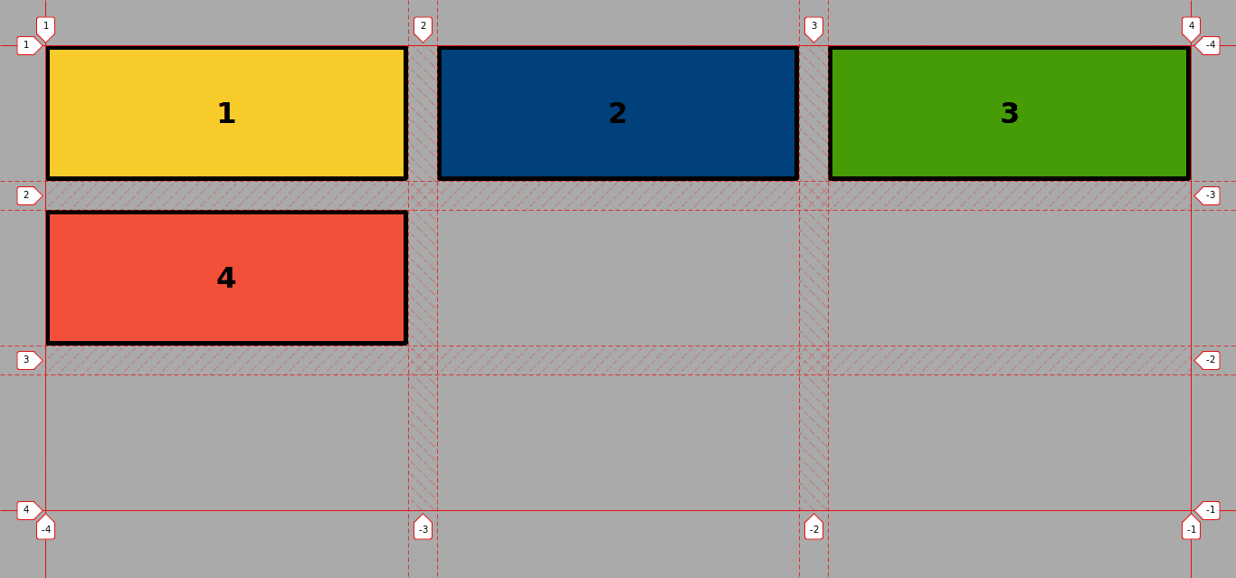
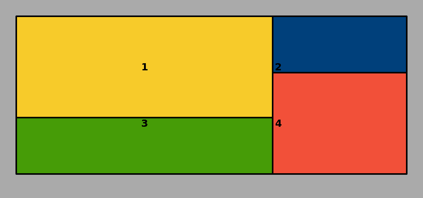
Step #3. Create the CSS Grid
The grid will have 3 columns and 3 rows.
The gap between columns and rows will be 2rem (approximately 32px).
Each one of the items will have a different color to better identify it:
/* CSS Grid Styles */
.container {
display: grid;
grid-template-columns: repeat(3, 1fr);
grid-template-rows: repeat(3, 150px);
grid-gap: 2rem;
}

.item1 {
background-color: #f7cb2a;
}

.item2 {
background-color: #00407b;
}

.item3 {
background-color: #469c07;
}

.item4 {
background-color: #f25039;
}
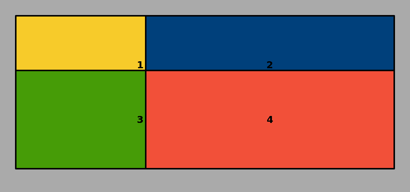
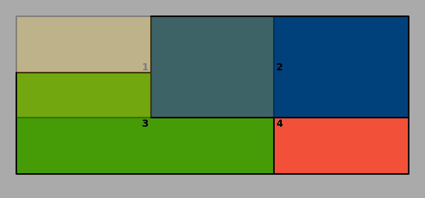
Step # 4. - Overlapping Items
- Use line placement to change the position and dimensions of the grid items. Each item will span over two rows and two columns, starting from each of the four corners of the grid:
.item1 {
background-color: #f7cb2a;
grid-column: 1 / 3;
grid-row: 1 / 3;
}

.item2 {
background-color: #00407b;
grid-column: 2 / 4;
grid-row: 1 / 3;
}
.item3 {
background-color: #469c07;
grid-column: 1 / 3;
grid-row: 2 / 4;
}

.item4 {
background-color: #f25039;
grid-column: 2 / 4;
grid-row: 2 / 4; }
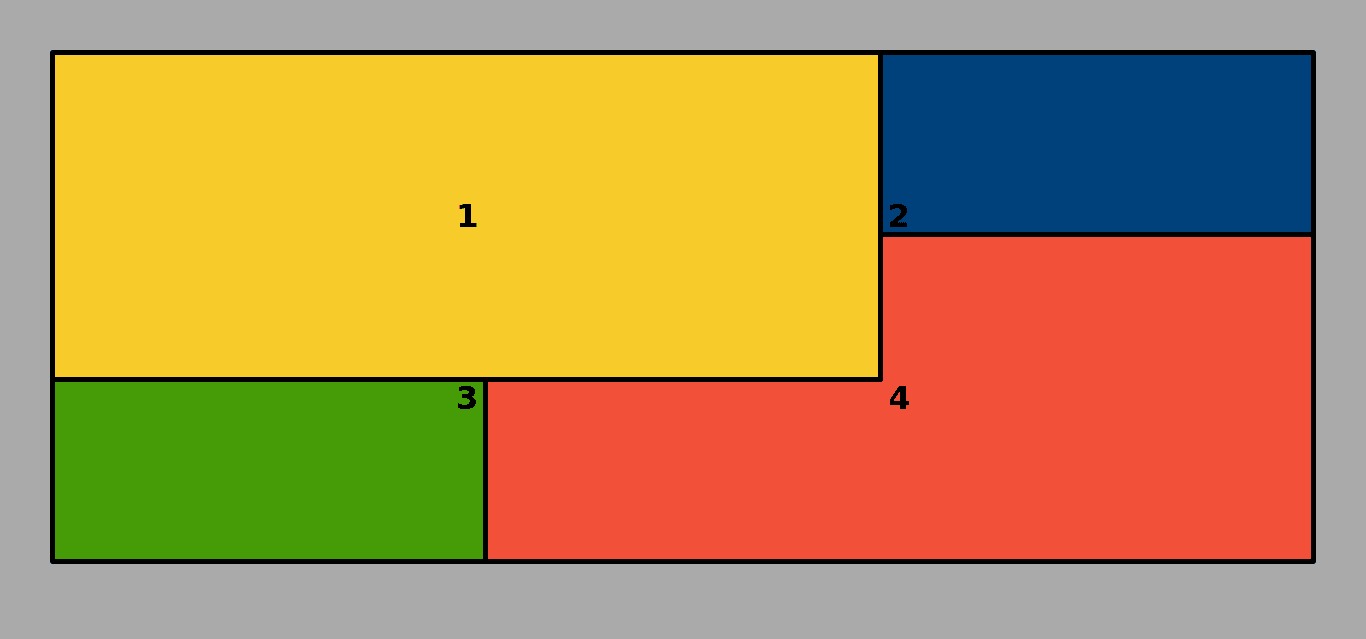
The Grid looks now like this:
As you already have noticed, the item that comes last in the source order of the markup overlaps all other items. In this case, item 4 is the upper layer by default.
But what if you want item1 to be the uppermost layer? This is what the property z-index is for.
- Edit the CSS code:
.item1 {
background-color: #f7cb2a;
grid-column: 1 / 3;
grid-row: 1 / 3;
z-index: 10; }
In order to put item 3 over item 4 but still under item 1, you have to choose a lower value for the z-index property when targeting item 3.
.item3 {
background-color: #469c07;
grid-column: 1 / 3;
grid-row: 2 / 4;
z-index: 8; }
Now item3 overlaps item4 and item2.
Notice that item4 is still overlapping item2 because item2 doesn’t have a z-index. Item4 still comes after item2 in the source order of the HTML code.
- Edit the CSS code once again:
.item2 {
background-color: #00407b;
grid-column: 2 / 4;
grid-row: 1 / 3;
z-index: 9; }
Now item2 is on top of item3 and item4, but still under item1.

You can check this by adding transparency to item 1.
.item1 {
background-color: #f7cb2a;
grid-column: 1 / 3;
grid-row: 1 / 3;
z-index: 10;
opacity: 0.35; }
Notice: this will work even for items that have been declared with the position: static property
.item1 {
position: static;
background-color: #f7cb2a;
grid-column: 1 / 3;
grid-row: 1 / 3;
z-index: 10; }
Here are the previous 8 posts in this series:
- CSS Grid #1: Everything Joomla users need to get started with CSS Grid
- CSS Grid #2: How to Use the Firefox Grid Inspector with CSS Grid
- CSS Grid #3: Understanding Explicit and Implicit Grids in CSS Grid
- CSS Grid #4: How to Use the Autoflow Property in CSS Grid
- CSS Grid #5: Determining the Size of the Tracks in CSS Grid
- CSS Grid #6: The Auto Keyword and Repeat Notation in CSS Grid
- CSS Grid #7: How to Size Grid Items with the Span Keyword in CSS Grid
- CSS Grid #8: How to Use Line Placing in CSS Grid
Conclusion
With the z-index property, you’ll have total control over how you overlap items within a grid.
Get our CSS Grid Explained Book
All Joomlashack Pro members get access to our "CSS Grid Explained" book. All you need to do is sign up for a Joomlashack extension, template or training membership.
In this short book, you are going to master the key ideas behind CSS Grid. This book is in the best traditions of OSTraining. There are no long-dense paragraphs of theory. You pick up the book and you start writing code immediately.
In the first chapter, we start with the basic terminology. You'll learn the difference between Grid Areas and Grid Cells, between Grid Tracks and Grid Gaps.
Then, using a hands-on approach, you'll start building CSS Grids. There are 9 different exercises in this book. You'll build everything from the most basic CSS Grid to a full site layout.
About the author