
Welcome to the 7th tutorial in our series on the CSS Grid.
We created this series because Joomla developers need to know about CSS Grid. The introduction of CSS Grid will be one of the significant changes in Joomla 4.
Here are the previous posts in this series:
- Everything Joomla users need to get started with CSS Grid
- How to use the Grid Inspector tool in Firefox
- The difference between Implicit and Explicit grids
- How to use the Autoflow property
- Determining the size of the tracks
- The Auto keyword and repeat notation
Introducing the Span Keyword
As you saw earlier in this series, grid items flow one after another. Your grid items will autoamtically place themselves into the grid, taking a grid cell each.
In those earlier tutorials, we’ve been sizing the grid container and testing the different ways to generate tracks, but we haven’t dealt with the items themselves. In this tutorial, we'll focus on the grid items.
I'm going to show you how to determine the width of an item inside the grid container with the span keyword. We're going to span the items to a specific width or height across multiple tracks, according to the available tracks within the grid.
Step #1. Create the HTML
First let's create the base CSS for the 13 items we'll use in this tutorial.
- Open the text editor of your liking
- Create an HTML file
- Type this command if the Emmet extension is available in your code editor
.container>.item.item${$}*13- Hit the tab key
- If you don’t have the Emmet extension, copy and paste this code:
<div class="container">
      <div class="item item1">1</div>
      <div class="item item2">2</div>
      <div class="item item3">3</div>
      <div class="item item4">4</div>
      <div class="item item5">5</div>
      <div class="item item6">6</div>
      <div class="item item7">7</div>
      <div class="item item8">8</div>
      <div class="item item9">9</div>
      <div class="item item10">10</div>
      <div class="item item11">11</div>
      <div class="item item12">12</div>
      <div class="item item13">13</div>
</div>
Step #2. Create the CSS
Next, let's create the CSS that we'll apply to the items we just created.
- Create a CSS file and link it to your HTML file.
- Add the following global styles:
/* GLOBAL STYLES */
  * {
      box-sizing: border-box;
      }

  body {
  background-color: #AAA;
  margin: 50px;
  }

  /* Each item in the grid contains numbers */
  .item {
  /* Center the contents of the grid items. Making each grid item a Flex Container */
  display: flex;

  /* Horizontal and Vertical centering */
  justify-content: center;
  align-items: center;
  border: 5px solid #87b5ff;
  border-radius: 3px;
  font-size: 2em;
  font-family: sans-serif;
  font-weight: bold;
  background-color: #1c57b5
  }
Step #3. Create the CSS Grid
Now let's create the grid. Our starting point will be a grid with 4 columns and 4 (implicit) rows. The gap between columns and rows will be 2rem which
is approximately 32 px on a desktop screen:
/* CSS Grid Styles */

  .container {
      display: grid;
      grid-template-columns: repeat(4, 1fr);
      grid-gap: 2rem;
  }
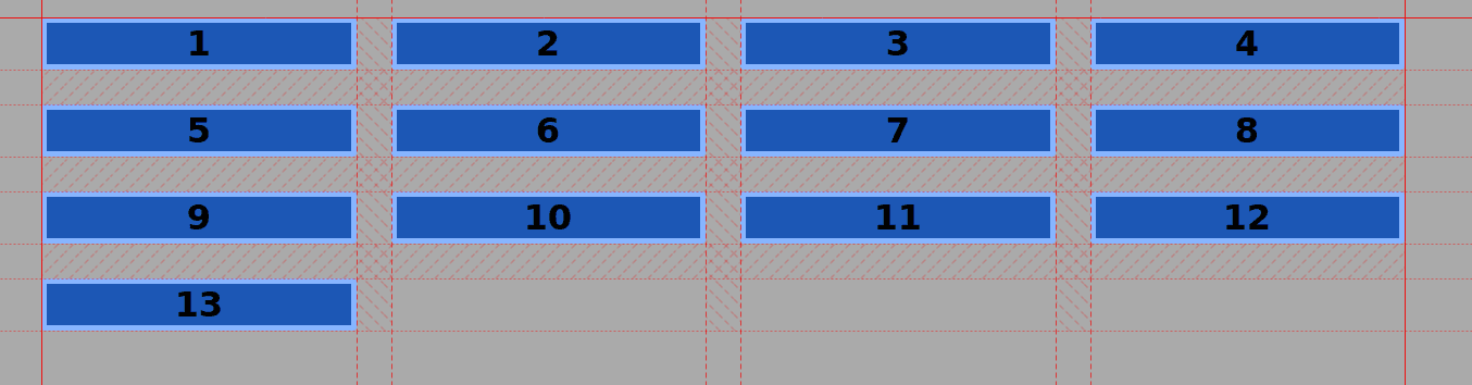
Once the grid is ready, you'll see that the item #13 automatically creates a 4th row:
Step #4. Resizing the Items
Now let's get to the heart of this tutorial. We're going to resize individual grid items. We're going to double the size of the third item in the grid:
- Add this CSS code targeting the .item3 class
.item3 {
      grid-column: span 2;
  }
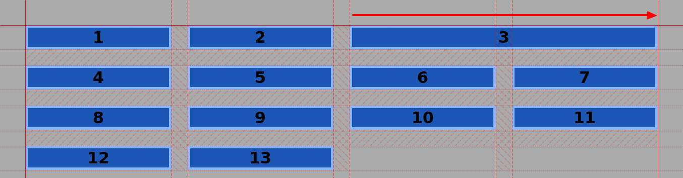
You'll see that item #3 now spans across two column tracks. All the items from item #4 onwards have skipped one spot to the next available cell. The browser takes care of this automatically.
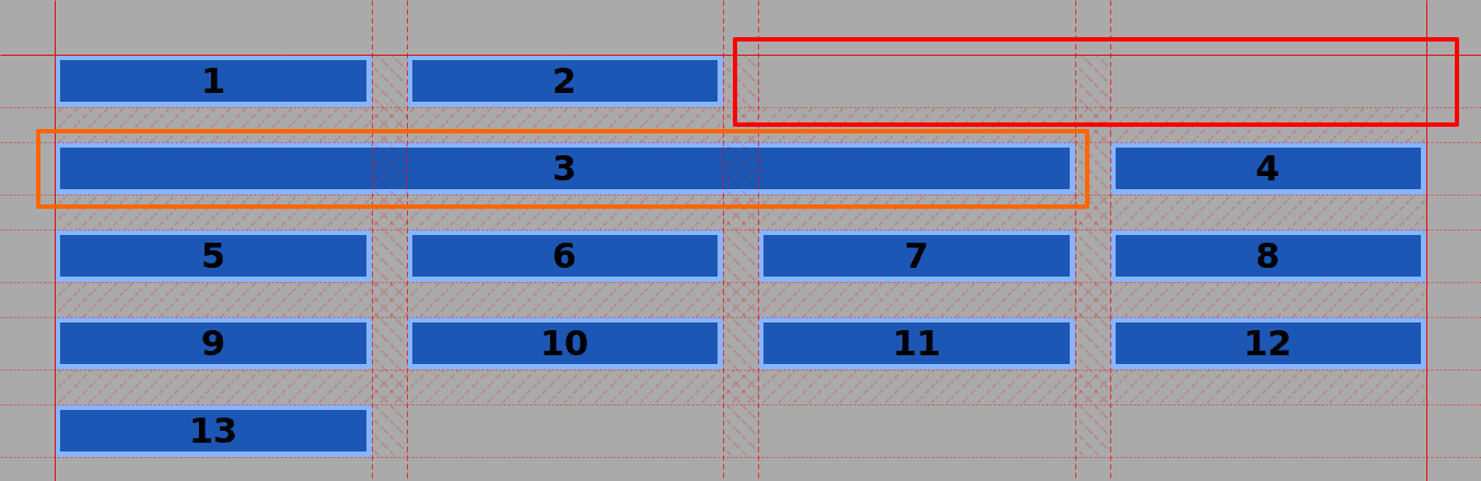
Let's see what happens if we make item #3 even wider:
- Edit the code and let's span item #3 one more column to 3.
.item3 {
      grid-column: span 3;
  }
Item #3 is now wider than the available space on the first row of the grid, so it wraps over to the next row.
Now let's great really funky with the item size. We're going to make item #3 stretch across multiple rows and columns,
- Edit the CSS code once again to span item #3 across rows:
.item3 {
      grid-column: span 3;
      grid-row: span 3;
  }
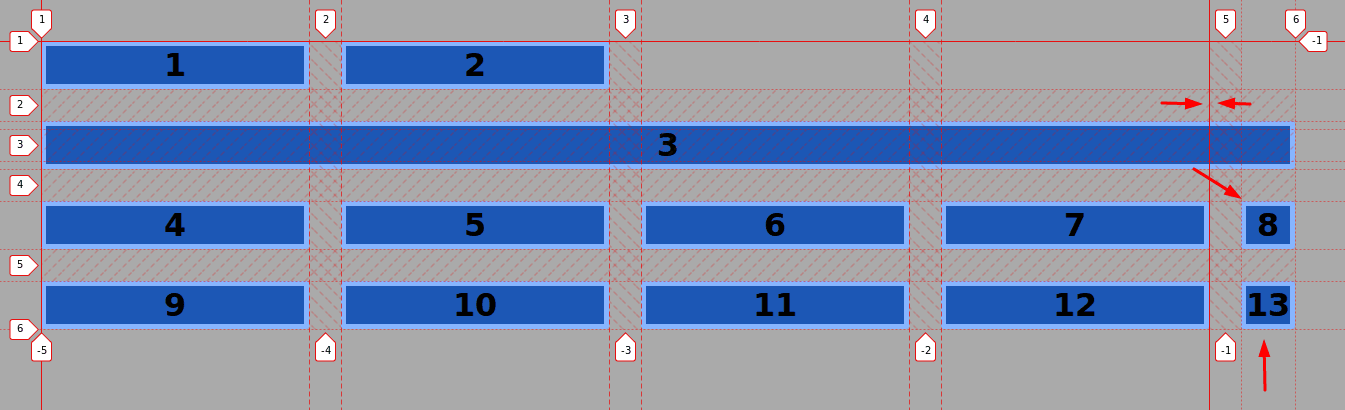
You can see that item #3 spans across 3 columns and 3 rows. Items #4, #5, and #6 took the available cells on the right side. Item #7 starts a new row.
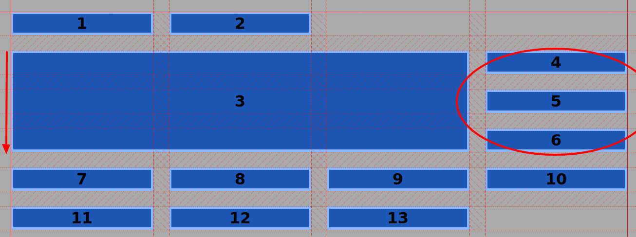
If you’re wondering about the blank space on the upper right, there are ways in CSS Grid to place items on any cell or area of the grid. I'll show you how to do that in a future tutorial.
A note of caution
There are limits to how creative you can be with CSS Grid. Let's do something that I would not recommend you attempt in a production environment.
- Edit the CSS code one more time:
.item3 {
      grid-column: span 5;
      grid-row: span 2;
  }
Item #3 now covers 5 columns so it overlaps the whole implicit grid and takes one more track from the explicit grid. The width of this track is determined by the widest content inside that column - in this particular case, item #13. The vertical span has also disappeared and so the Grid is broken. Remember back in Step #3, you specified that the grid only has 4 columns.
Summary
Thanks very much for following this series on the CSS Grid. Now it’s time for you to play with the grid and attempt to span some items.
Get our CSS Grid Explained Book
All Joomlashack Pro members get access to our "CSS Grid Explained" book. All you need to do is sign up for a Joomlashack extension, template or training membership.
In this short book, you are going to master the key ideas behind CSS Grid. This book is in the best traditions of OSTraining. There are no long-dense paragraphs of theory. You pick up the book and you start writing code immediately.
In the first chapter, we start with the basic terminology. You'll learn the difference between Grid Areas and Grid Cells, between Grid Tracks and Grid Gaps.
Then, using a hands-on approach, you'll start building CSS Grids. There are 9 different exercises in this book. You'll build everything from the most basic CSS Grid to a full site layout.
About the author