
Since we blogged that Joomla 4 will adopt CSS Grid, many Joomlashack readers expressed their interest in CSS Grid.
In our first few tutorials on this topic, we covered these topics:
- The basics of CSS Grid.
- How to use the Grid Inspector tool in Firefox.
- The difference between Implicit and Explicit grids.
In this post, we'll look at the Autoflow property of CSS Grid.
You already know that grid items are placed in the grid in an explicit way through the grid algorithm, in case that you haven't defined enough rows to place the items.
Let's take a look at an example.
The HTML code
- Open the text editor of your liking.
- Create an HTML file.
- If you have the Emmet extension installed in your editor, you can type this code:
.container>.item{$}*6- Hit the “Tab” key.
- If you don’t have the Emmet extension installed, just copy and paste this code:
<div class="container">
<div class="item">1</div>
<div class="item">2</div>
<div class="item">3</div>
<div class="item">4</div>
<div class="item">5</div>
<div class="item">6</div>
</div>
The CSS code
- Create a CSS file and link it to your HTML file
- Add the following global styles:
/* GLOBAL STYLES */
* {
box-sizing: border-box;
}
body {
background-color: #AAA;
margin: 50px;
}
/* Each item in the grid contains numbers */
.item {
/* Center the contents of the grid items. Making each grid item a Flex Container */
display: flex;
/* Horizontal and Vertical centering */
justify-content: center;
align-items: center;
border: 5px solid #87b5ff;
border-radius: 3px;
font-size: 2em;
font-family: sans-serif;
font-weight: bold;
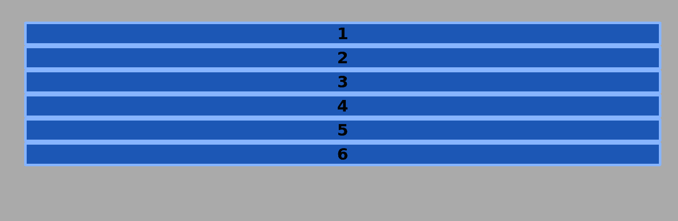
background-color: #1c57b5;
} Now, take a look at your browser. Open the HTML file. It should look like the image below:
The Grid Styles
To declare the .container element as a grid container, add the following code to your CSS file:
.container
{
display: grid;
width: 900px;
grid-gap: 15px;
grid-template-columns: 200px 200px 200px 200px;
grid-template-rows: 75px 75px;
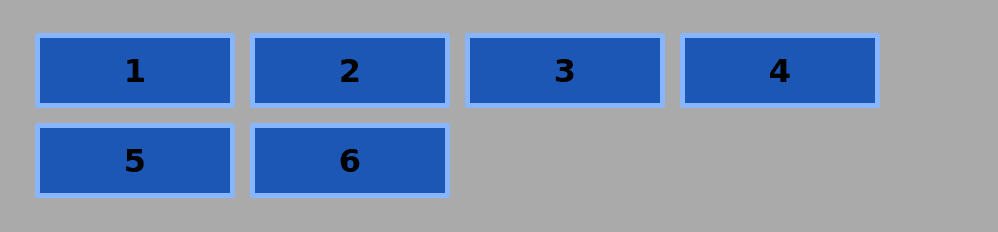
The Grid container will have a width of 900px. Each column will have a width of 200px. Each declared row will have a height of 75px.
There will be a gap between columns and rows of 15px. The grid looks now like this:
- Turn on the Grid Inspector and select the grid container
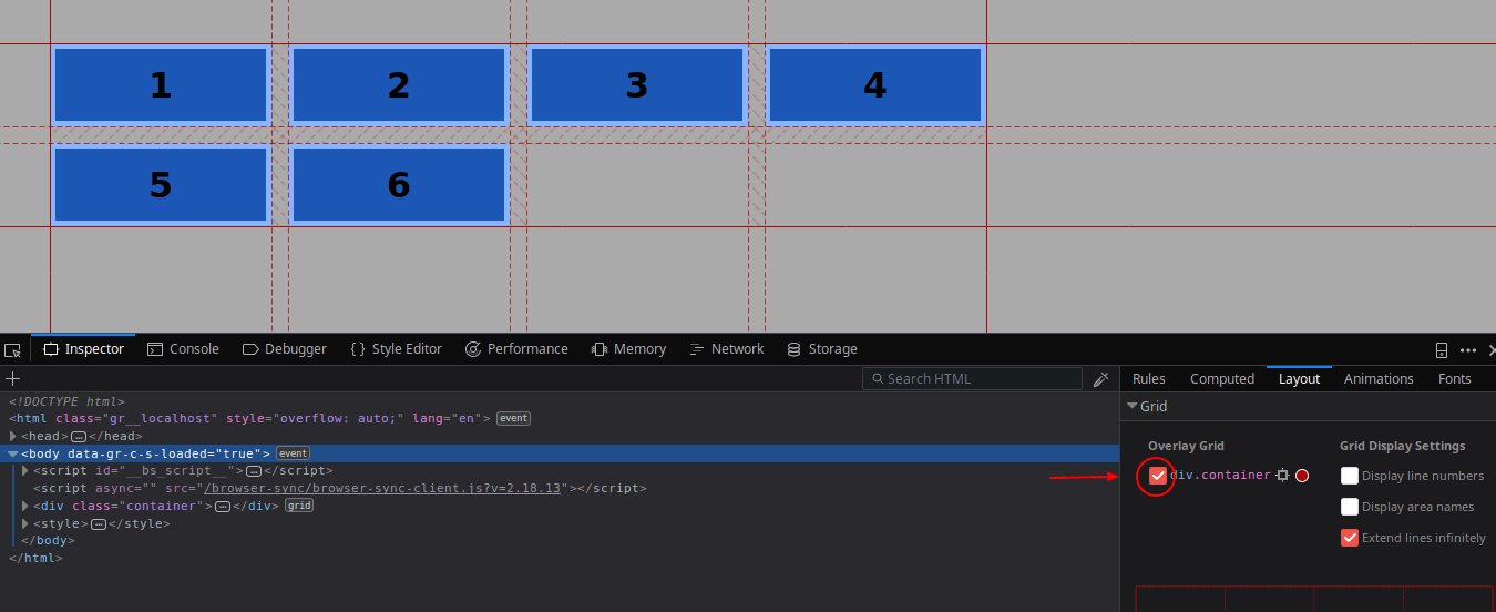
You can tell by the solid line surrounding all grid items, that all these items are placed inside the explicit grid.
- Add 3 more items to the HTML structure
<div class="container">
<div class="item">1</div>
<div class="item">2</div>
<div class="item">3</div>
<div class="item">4</div>
<div class="item">5</div>
<div class="item">6</div>
<div class="item">7</div>
<div class="item">8</div>
<div class="item">9</div>
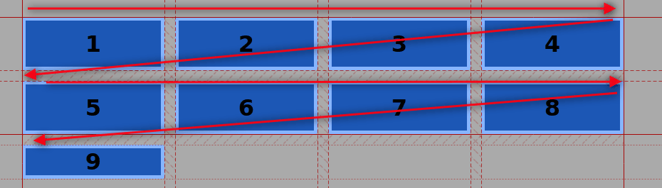
</div>Items 1-8 are placed inside the explicit grid, the one that has been declared.
Item 9 has been placed into the implicit grid. You can tell by the dotted line that shows the grid inspector.
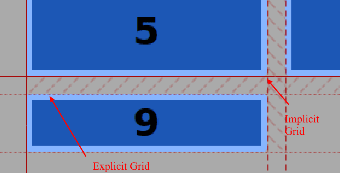
That means, the browser placed this item in the grid with the help of a placement algorithm.
The flow of this grid is row-based because elements flow (wrap over) to the next row when there’s no more space available.
This is the default in the CSS Grid specification. Items flow from left to right and wrap over to the next row as in western languages.
The grid-auto-flow property
The grid-auto-flow property will allow you to place the grid items in a column-based flow.
- Add this line to your CSS file, save and take a look at the browser:
.container
{
display: grid;
width: 900px;
grid-gap: 15px;
grid-template-columns: 200px 200px 200px 200px;
grid-template-rows: 75px 75px;
grid-auto-flow: column;
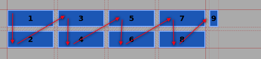
}The flow of the grid is now column-based. Item 9 is still in the explicit grid, but it wrapped over to the next column instead of wrapping to the next row.
We haven’t declared a width for this column. That means it will have a width of auto.
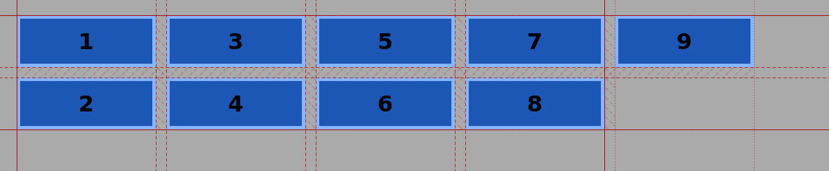
- Assign this item the same width as the other items with the grid-auto-columns property
.container
display: grid;
width: 900px;
grid-gap: 15px;
grid-template-columns: 200px 200px 200px 200px;
grid-template-rows: 75px 75px;
grid-auto-flow: column;
grid-auto-columns: 200px;
}
Each new column will have a width of 200px from now on.
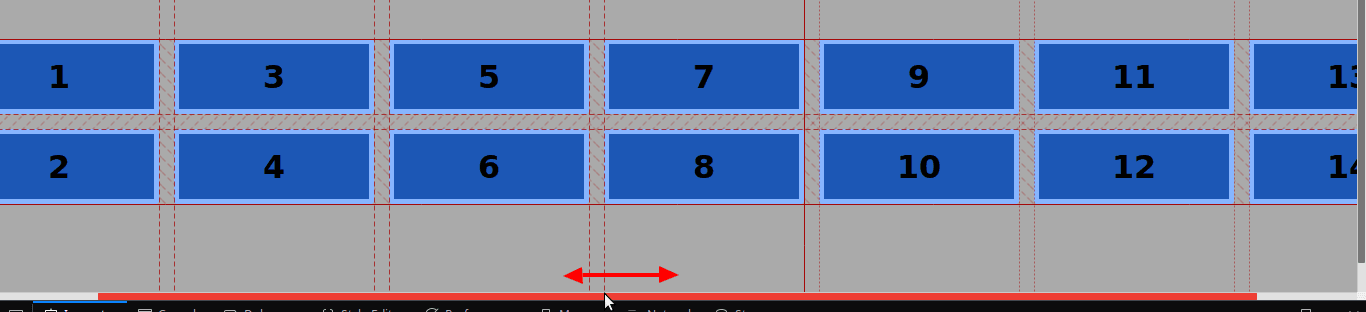
Horizontal scrolling
As you already noticed, we are using fixed units (px) in this grid.
That means that if you keep adding grid items to the container, you’ll get a horizontal scrolling effect in your screen.
Pay close attention to the sizing of the grid items if you don’t want this to happen.
Of course, you can imagine a practical use for this effect, for example, a really long horizontal timeline.
<div class="container">
       <div class="item">1</div>
       <div class="item">2</div>
       <div class="item">3</div>
       <div class="item">4</div>
       <div class="item">5</div>
       <div class="item">6</div>
       <div class="item">7</div>
       <div class="item">8</div>
       <div class="item">9</div>
       <div class="item">10</div>
       <div class="item">11</div>
       <div class="item">12</div>
       <div class="item">13</div>
       <div class="item">14</div>
   </div>
There are other ways to declare column width with relative values (the fr unit), but that’s stuff for another tutorial.
You just learned how to place items in a grid based on a column distribution with the help of the CSS grid-auto-flow property.
Test this Grid feature, play with the markup and the styles and leave us your comments below.
Get our CSS Grid Explained Book
All Joomlashack Pro members get access to our "CSS Grid Explained" book. All you need to do is sign up for a Joomlashack extension, template or training membership.
In this short book, you are going to master the key ideas behind CSS Grid. This book is in the best traditions of OSTraining. There are no long-dense paragraphs of theory. You pick up the book and you start writing code immediately.
In the first chapter, we start with the basic terminology. You'll learn the difference between Grid Areas and Grid Cells, between Grid Tracks and Grid Gaps.
Then, using a hands-on approach, you'll start building CSS Grids. There are 9 different exercises in this book. You'll build everything from the most basic CSS Grid to a full site layout.
About the author