
Welcome to the 8th tutorial in our series on the CSS Grid.
We are publishing this series because Joomla developers need to know about CSS Grid. The introduction of CSS Grid will be one of the significant changes in Joomla 4.
In the last tutorial, you learned about the span keyword in CSS Grid and how to use this feature to increment or decrement the size of a grid item.
But, what if you want to have more visual control about what’s happening on the grid?
The CSS Grid Specification defines a grid as follows:
The grid is an intersecting set of horizontal and vertical grid lines that divides the grid container’s space into grid areas, into which grid items (representing the content of the grid container) can be placed.
We already saw this in the tutorial explaining basic concepts.
It is possible to place grid items with the help of the numbered lines that compose the grid. This tutorial will explain this feature.
Step #1. Create the HTML
- Open your preferred code editor.
- Create a HTML file.
- Type the following command if the Emmet extension is available in your code editor:
.container>.item.item${$}*4
- Press the Tab key.
- If you don’t have the Emmet extension, copy and paste this code:
<div class="container">
<div class="item item1">1</div>
<div class="item item2">2</div>
<div class="item item3">3</div>
<div class="item item4">4</div>
</div>
Step #2. Create the CSS
- Create a CSS file and link it to your HTML file.
- Add the following global styles:
/* GLOBAL STYLES */
* {
box-sizing: border-box;
}
body {
background-color: #AAA;
margin: 50px;
}
/* Each item in the grid contains numbers */
.item {
/* Center the contents of the grid items. Making each grid item a Flex Container */
display: flex;

/* Horizontal and Vertical centering */
justify-content: center;
align-items: center;
border: 5px solid #87b5ff;
border-radius: 3px;
font-size: 2em;
font-family: sans-serif;
font-weight: bold;
background-color: #1c57b5
}
Step #3. Create the CSS Grid
Our grid will be vary basic in first instance. It will only have four defined columns, the gap between columns and rows will be 2rem (approximately 32px):
/* CSS Grid Styles */
.container {
display: grid;
grid-template-columns: repeat(4, 1fr);
grid-gap: 2rem;
}
- Turn on the Grid Inspector and choose to display line numbers and to extend lines infinitely.
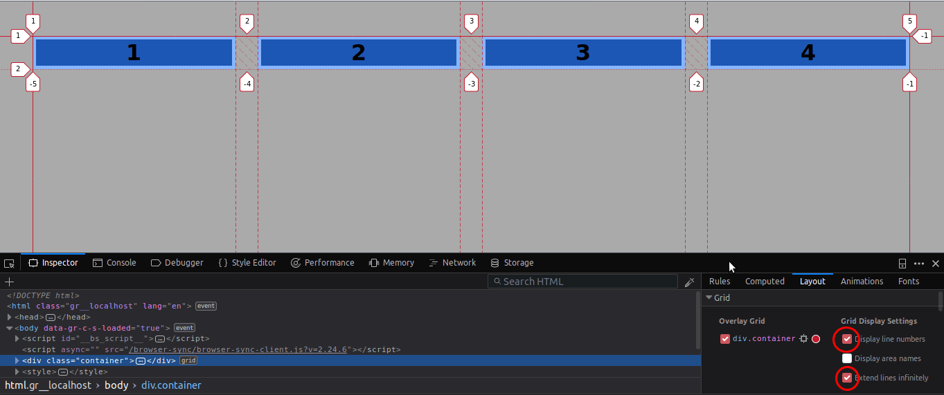
Step # 4. Line Based Placement - Over Columns
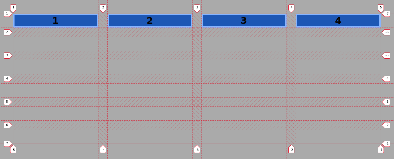
As you can see, the items in the grid are separated by lines.
Item 1 starts at line 1 and ends at line 2, while item 2 starts at line 2 and ends at line 3. Don’t consider the gap in your thinking, remember that gap is pure styling.
To understand this a little bit better, let’s take a look at an example with the span keyword that you already know:
.item3 {
grid-column: span 2;
}
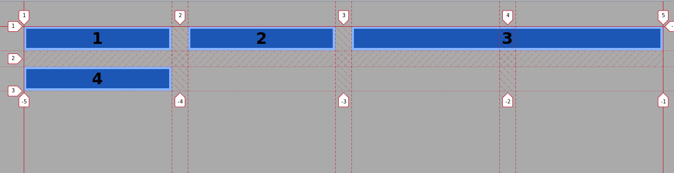
Grid item 3 spans two columns from line # 3 to line # 5. The grid-column property is a shorthand for grid-column-start and grid-column-end. The extended code that produces the same results, in this case, would be:
.item3 {
grid-column-start: span 2;
grid-column-end: auto;
}
The code is telling the browser to place item 3 starting from where it’s located and to span it over 2 vertical tracks.
The line numbers are used to mark the starting and ending position of items within the grid. This visual aid helps you save time and organize your code better, especially with complex layouts.
- Let’s replicate the layout with this new knowledge:
.item3 {
grid-column-start: 3;
grid-column-end: 5;
}
Item 3 starts at line 3 and ends at line 5 spanning over two vertical tracks. The shorthand property is:
.item3 {
grid-column: 3 / 5;
}
- Edit the CSS code once again:
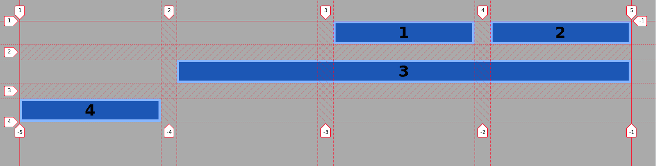
.item1 {
grid-column: 3 / 4;
}
.item3 {
grid-column: 2 / 5;
}
By now you already have grasped how this works. But, what about those negative numbers pointing to the grid lines?
Those negative numbers help you see the grid “backwards”, meaning the last line in the grid is -1 the penultimate line is -2 and so on.
- Edit the CSS code:
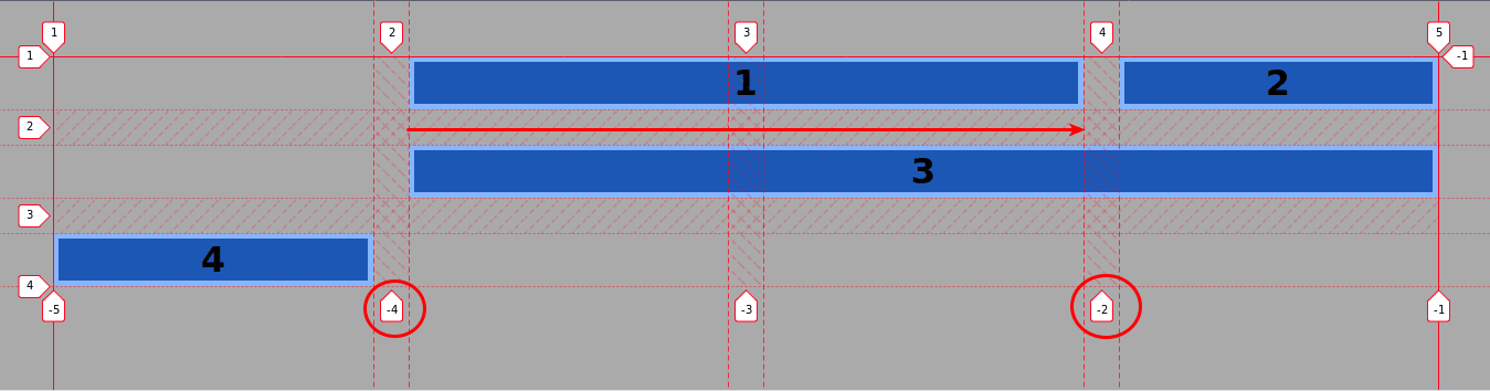
.item1 {
grid-column: -4 / -2;
}
Item 1 starts at line -4 and spans two columns to the right ending at line -2. Notice that you can invert these values without seeing any difference. It’s notated like that because you’re used to read from left to right.
Step # 5. Line Based Placement - Over Rows
- Remove the .item1 and .item3 selectors and edit the CSS code once again:
.container {
display: grid;
grid-template-columns: repeat(4, 1fr);
grid-template-rows: repeat(6, 1fr);
grid-gap: 2rem;
}
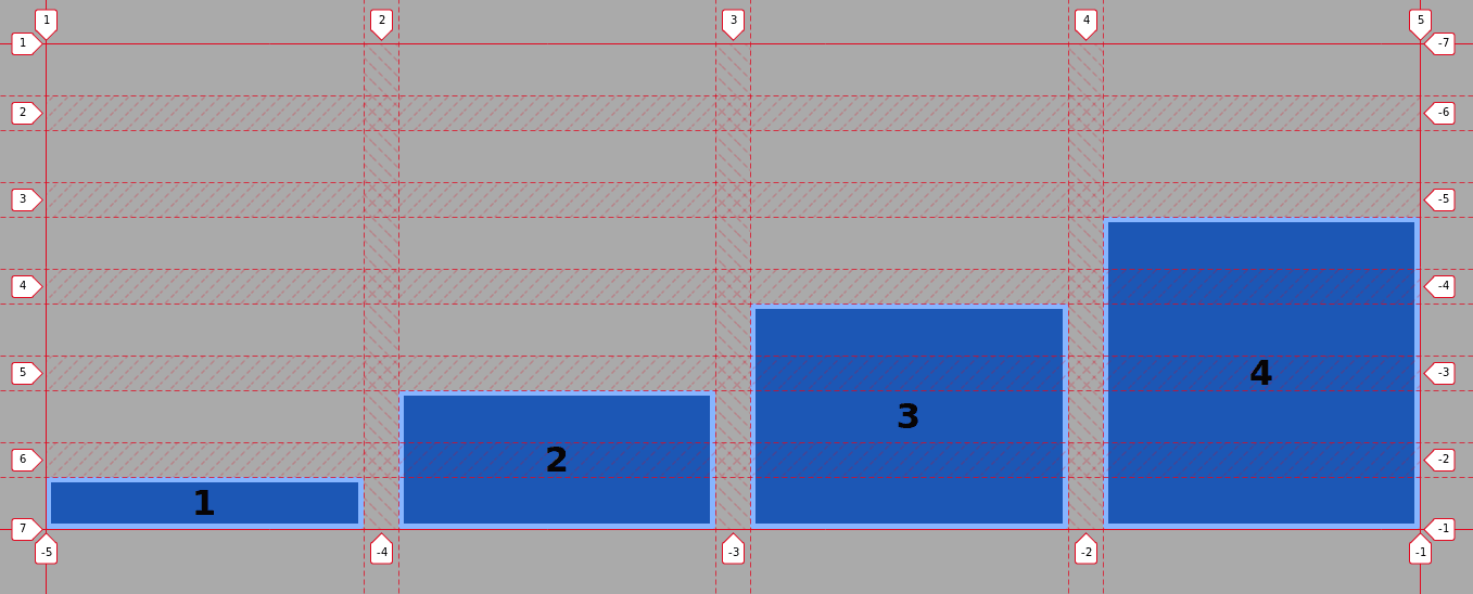
The grid has 4 columns (vertical lines 1 - 5) and 6 rows (horizontal lines 1 - 7). Let’s edit the CSS code:
.item1 {
grid-column: 1 / 2;
grid-row: 7 / 6;
}
.item2 {
grid-column: 2 / 3;
grid-row: 7 / 5
}
.item3 {
grid-column: 3 / 4;
grid-row: 7 / 4;
}
.item4 {
grid-column: 4 / 5;
grid-row: -1 / -5;
}
 Time for you to play, try to explore all possibilities available with the line based placement.
For example, you can span item 3 over two columns to the right and see what happens. Then do the same but spanning it 2 columns to the left.
After that, place the .item3 selector before .item2 in the CSS code, does that change the layout? What happens if you change the order of the items in the markup?
Conclusion
The lines surrounding and encompassing a grid are a valuable tool to place and size items within it.
Here are the previous posts in this series:
- Everything Joomla users need to get started with CSS Grid
- How to use the Grid Inspector tool in Firefox
- The difference between Implicit and Explicit grids
- How to use the Autoflow property
- Determining the size of the tracks
- The Auto keyword and repeat notation
- How to Size Grid Items with the Span Keyword in CSS Grid
Get our CSS Grid Explained Book
All Joomlashack Pro members get access to our "CSS Grid Explained" book. All you need to do is sign up for a Joomlashack extension, template or training membership.
In this short book, you are going to master the key ideas behind CSS Grid. This book is in the best traditions of OSTraining. There are no long-dense paragraphs of theory. You pick up the book and you start writing code immediately.
In the first chapter, we start with the basic terminology. You'll learn the difference between Grid Areas and Grid Cells, between Grid Tracks and Grid Gaps.
Then, using a hands-on approach, you'll start building CSS Grids. There are 9 different exercises in this book. You'll build everything from the most basic CSS Grid to a full site layout.
About the author