
Welcome to the 12th tutorial in our series on the CSS Grid.
We are presenting this series to help Joomla developers learn about CSS Grid. The introduction of CSS Grid will be one of the major changes in upcoming Joomla 4.
Accordng to the CSS Grid Specification, minmax()
Defines a size range greater than or equal to min and less than or equal to max.
In other words, the minmax() function provides a method to specify the minimum and maximum sizes of a grid track. Thus, the minimax() takes two values as parameters.
This tutorial will explain the use of this CSS function.
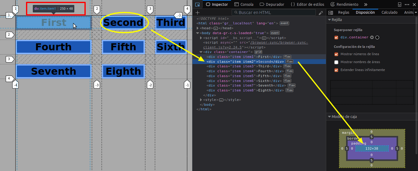
Step #1. Create the HTML
- Open your preferred code editor.
- Create an HTML file.
- Copy and paste the following code:
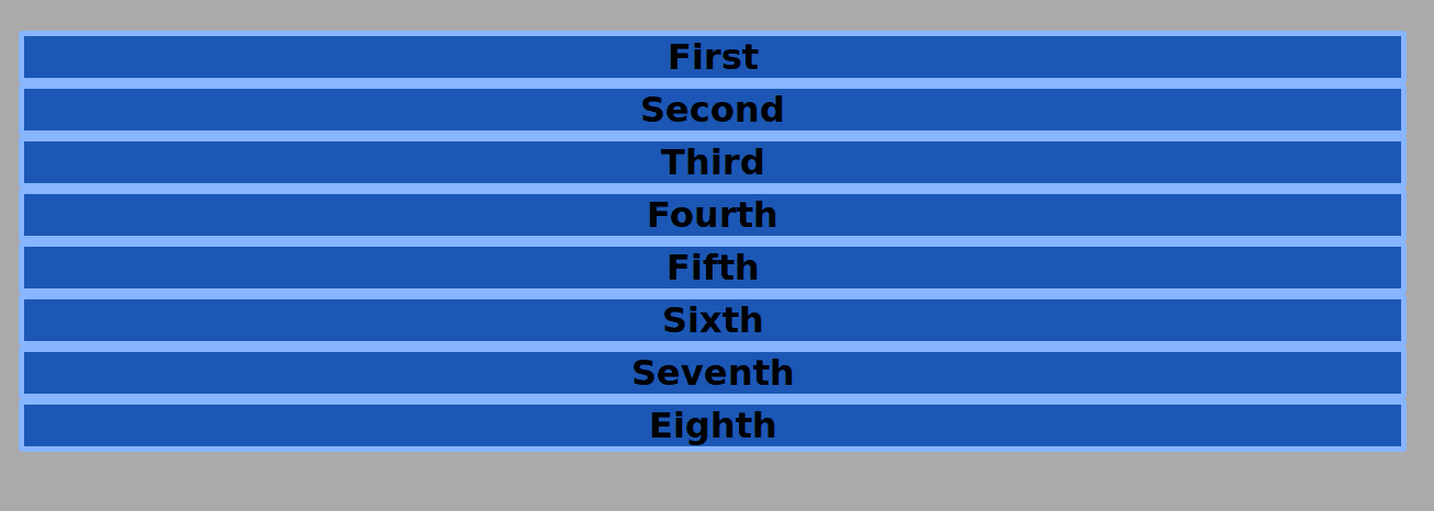
<div class="container">
   <div class="item item1">First</div>
   <div class="item item2">Second</div>
  <div class="item item3">Third</div>
   <div class="item item4">Fourth</div>
   <div class="item item5">Fifth</div>
   <div class="item item6">Sixth</div>
   <div class="item item7">Seventh</div>
   <div class="item item8">Eighth</div>
</div>
Step #2. Create the CSS
- Create a CSS file and link it to your HTML file.
- Add the following global styles:
/* GLOBAL STYLES */
* {
   box-sizing: border-box;
   }
  body {
  background-color: #AAA;margin: 50px;
  }
/* Each item in the grid contains numbers */
.item {
/* Center the contents of the grid items. Making each grid item a Flex Container */
   display: flex;
/* Horizontal and Vertical centering */
   justify-content: center;
  align-items: center;
  border: 5px solid #87b5ff;
  border-radius: 3px;
  font-size: 2em;
  font-family: sans-serif;
  font-weight: bold;
  background-color: #1c57b5;
   }
Step #3. Create the Grid
Initially, the grid will have 3 columns with the same width and a gap between columns and rows of 20 px.
/* CSS Grid Styles */
.container {
   display: grid;
   grid-template-columns: 1fr 1fr 1fr;
   grid-gap: 2rem;
}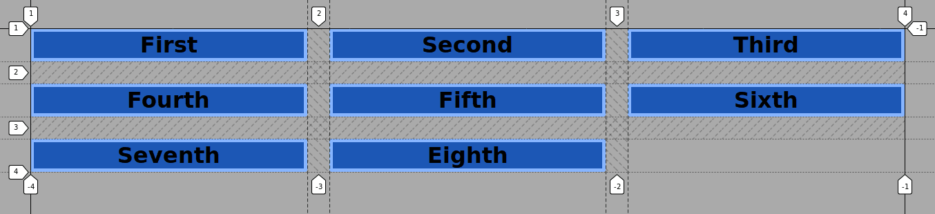
The grid is not responsive, but it is flexible.
- Resize the window of your browser. You will see that each column will shrink until it fits the widest content on that particular column.
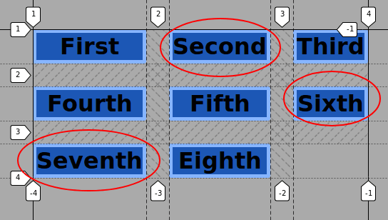
Step #4. Introducing minmax()
With the minmax() function, it’s possible to set a range with the minimum and maximum size of a track (in this case column).
- Edit the CSS code to set the width of the first column to a minimum of 250px and a maximum of 480px:
.container {
   display: grid;
   grid-template-columns: minmax(250px, 480px) 1fr 1fr;
   grid-gap: 2rem;
}
The first column is now 480px wide (in a desktop screen). The second and third columns, however, take 1fr. That is one fraction of the available remaining space each (in my screen 361px).
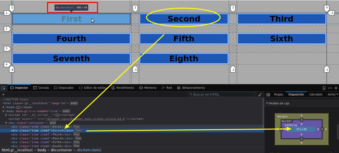
- Resize the browser window once again until the second and third columns have the value of
auto, i.e. they are as wide as the widest content within them.
The first column has now a minimum width of 250px, as specified in the minmax() function.
That is the basic functioning of minmax(). There are two basic rules, which have to be considered.
- If the value of the
maxis less than the value of themin, themaxwill be ignored and the wholeminmax()expression will be treated as themin. - It is not possible to set a flex value (fr units) as a minimum.
You can use the repeat notation to create patterns.
- Edit the CSS code:
.container {
   display: grid;
   grid-template-columns: repeat(2, minmax(80px, 160px) 1fr 2fr);
   grid-gap: 2rem;
}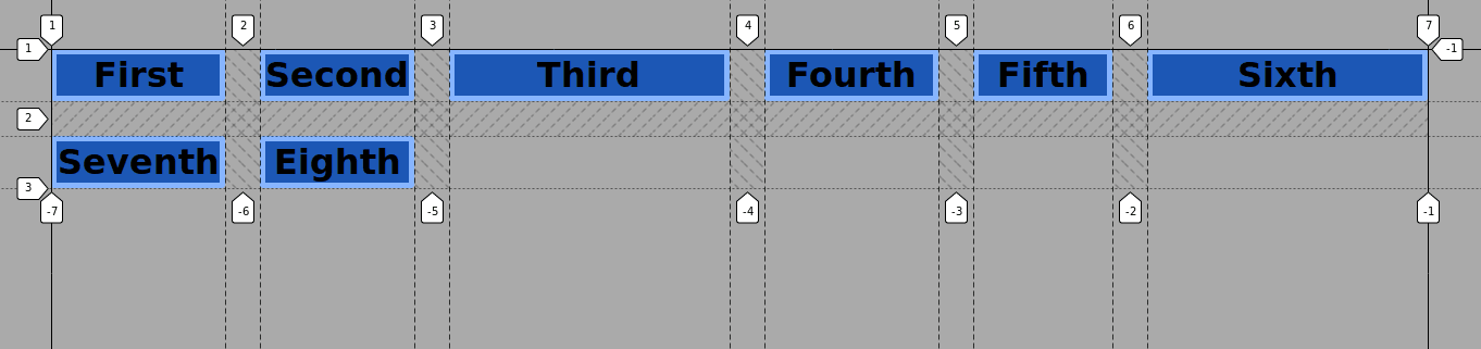
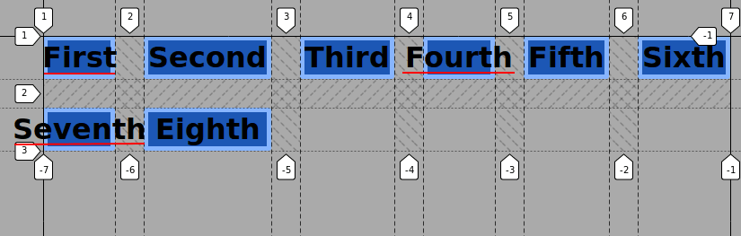
The first, fourth, and seventh items are placed inside columns with fixed values, between 80px and 160px.
- Resize the browser window. The content inside these columns will overflow its container, due to these fixed values.
Step #5. Using minmax() with rows
Often, you will need to have rows in a grid with a predefined height, that is a minimum height independently from the content inside them.
By default, the height of each row is set to auto. These rows are as high as the content inside them.
The minmax() function allows you to set a minimum row height, when used inside the grid-template-rows property.
- Edit the CSS code:
/* CSS Grid Styles */
.container {
   display: grid;
   grid-template-columns: 1fr 1fr 1fr;
   grid-template-rows: repeat(3, minmax(75px, auto));
   grid-gap: 2rem;
}
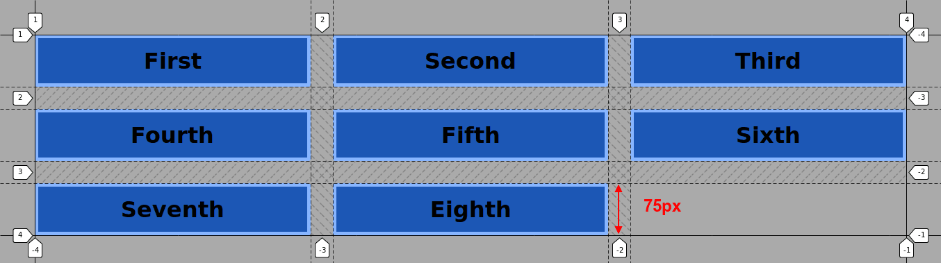
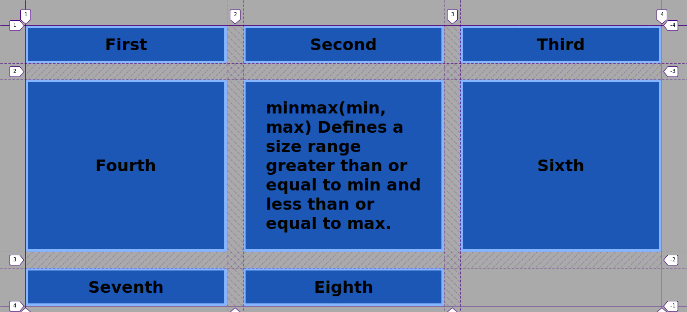
Now the grid has 3 rows. The rows have a minimum height of 75px. The maximum height of these rows will be determined by the content inside each of the items.
- Edit the HTML code to illustrate this:
<div class="container">
       <div class="item item1">First</div>
       <div class="item item2">Second</div>
       <div class="item item3">Third</div>
       <div class="item item4">Fourth</div>
       <div class="item item5">
           <blockquote>
          minmax(min, max)
<p>Defines a size range greater than or equal to min and less than or equal to max.</p>
</blockquote>
       </div>
       <div class="item item6">Sixth</div>
       <div class="item item7">Seventh</div>
       <div class="item item8">Eighth</div>
    </div>
The second row is now as high as the content in it. The other two rows have a height of 75px.
Conclusion
The minmax() function allows you to specify a value range between minimum/maximum values, in order to set the width and/or height of CSS Grid columns and/or rows.
Thanks for reading!
The previous 11 posts in this series:
- CSS Grid #1: Everything Joomla users need to get started with CSS Grid
- CSS Grid #2: How to Use the Firefox Grid Inspector with CSS Grid
- CSS Grid #3: Understanding Explicit and Implicit Grids in CSS Grid
- CSS Grid #4: How to Use the Autoflow Property in CSS Grid
- CSS Grid #5: Determining the Size of the Tracks in CSS Grid
- CSS Grid #6: The Auto Keyword and Repeat Notation in CSS Grid
- CSS Grid #7: How to Size Grid Items with the Span Keyword in CSS Grid
- CSS Grid #8: How to Use Line Placing in CSS Grid
- CSS Grid #9: How to Layer Items Inside a CSS Grid
- CSS Grid #10: How to Name Grid Lines
- CSS Grid #11: How to Place Items with Grid Template Areas
Get our CSS Grid Explained Book
All Joomlashack Pro members get access to our "CSS Grid Explained" book. All you need to do is sign up for a Joomlashack extension, template or training membership.
In this short book, you are going to master the key ideas behind CSS Grid. This book is in the best traditions of OSTraining. There are no long-dense paragraphs of theory. You pick up the book and you start writing code immediately.
In the first chapter, we start with the basic terminology. You'll learn the difference between Grid Areas and Grid Cells, between Grid Tracks and Grid Gaps.
Then, using a hands-on approach, you'll start building CSS Grids. There are 9 different exercises in this book. You'll build everything from the most basic CSS Grid to a full site layout.
About the author