
Welcome to the 10th tutorial in our series on the CSS Grid.
We are presenting this series to help Joomla developers learn about CSS Grid. The introduction of CSS Grid will be one of the major changes in upcoming Joomla 4.
In the previous tutorial, you learned how to place grid items according to the numbered lines that compose the grid.
As humans though, we find much easier to process names rather than numbers.
In this tutorial, you will learn how to name the lines that compose the CSS Grid.
Let's start!
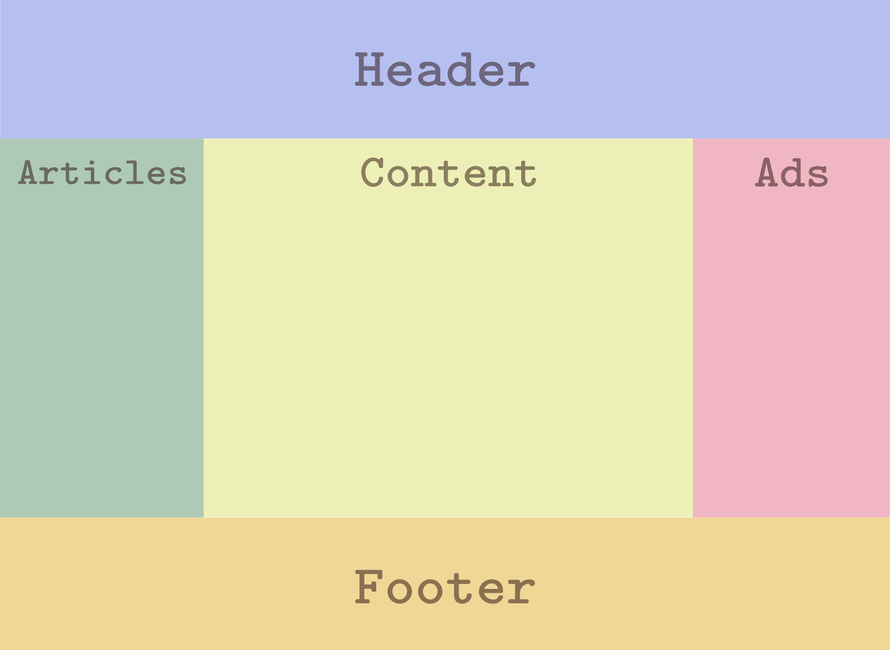
Step #1. The layout
We’re going to build a simple layout with a header, a footer, a content area in the center surrounded by two sidebars. The left sidebar will contain relevant information related to the content and the right sidebar is for placing ads.
Step #2. Create the HTML
- Open your preferred code editor.
- Create an HTML file and paste the following code:
<div class="container">
       <div class="item header">Header</div>
       <div class="item content">Content</div>
       <div class="item articles">Articles</div>
       <div class="item footer">Footer</div>
       <div class="item ads">Ads</div>
   </div>
Let’s take a look at the structure of the markup. As you can see, the order of the markup does not concur with the distribution of the layout.
That’s great because now you can place the relevant content on top and the less relevant content will go further down in the source order of the file.
The placement of all this divs (items) will be achieved merely through CSS (useful with screen readers for example).
Step #3. Create the CSS
- Create a CSS file and link it to your HTML file.
- Add the following global styles:
/* GLOBAL STYLES */

   * {
       box-sizing: border-box;
       }

   body {
   background-color: #AAA;
   margin: 0px 50px 50px;
}

/* Each item in the grid contains numbers */
   .item {
   /* Center the contents of the grid items. Making each grid item a Flex Container */
   display: flex;

   /* Horizontal and Vertical centering */
   justify-content: center;
   align-items: center;
   border: 5px solid #87b5ff;
   border-radius: 3px;
   font-size: 2em;
   font-family: sans-serif;
   font-weight: bold;
   background-color: #1c57b5
   }
Step #4. Create the CSS Grid
We need a grid with 3 columns for the sidebars and content area and 3 rows for the header, main and footer containers. There will be a separation between columns of 1rem, that’s about 16px in a desktop screen.
/*CSS Grid styles */
.container {
       display: grid;
       grid-template-columns: 3fr 5fr 3fr;
       grid-template-rows: auto auto auto;
       grid-column-gap: 1rem;
   }
- Turn on the grid inspector and choose to display line numbers and to extend lines infinitely.
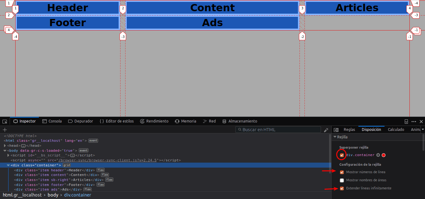
You might be wondering why the grid is split in 11 vertical tracks instead of 12 (for example). The only reason for that is because you can. This is part of the flexibility provided by CSS Grid and its layout possibilities.
Step #5. Declaring Line Names
In order to use line names, you have to declare them first. The notation for declaring a line is this:
[first-line]
The names of the lines are declared inside the grid-template-columns and grid-template-rows properties. A line can have two or more different names with this notation:
[first-line start-line]
This line can be referenced by either of its names.
You cannot declare a line with two particular values: ‘auto’ and ‘span’ so be aware that you don’t use these keywords when assigning names to the lines of your grid.
A vertical and a horizontal line can share the same name within a grid.
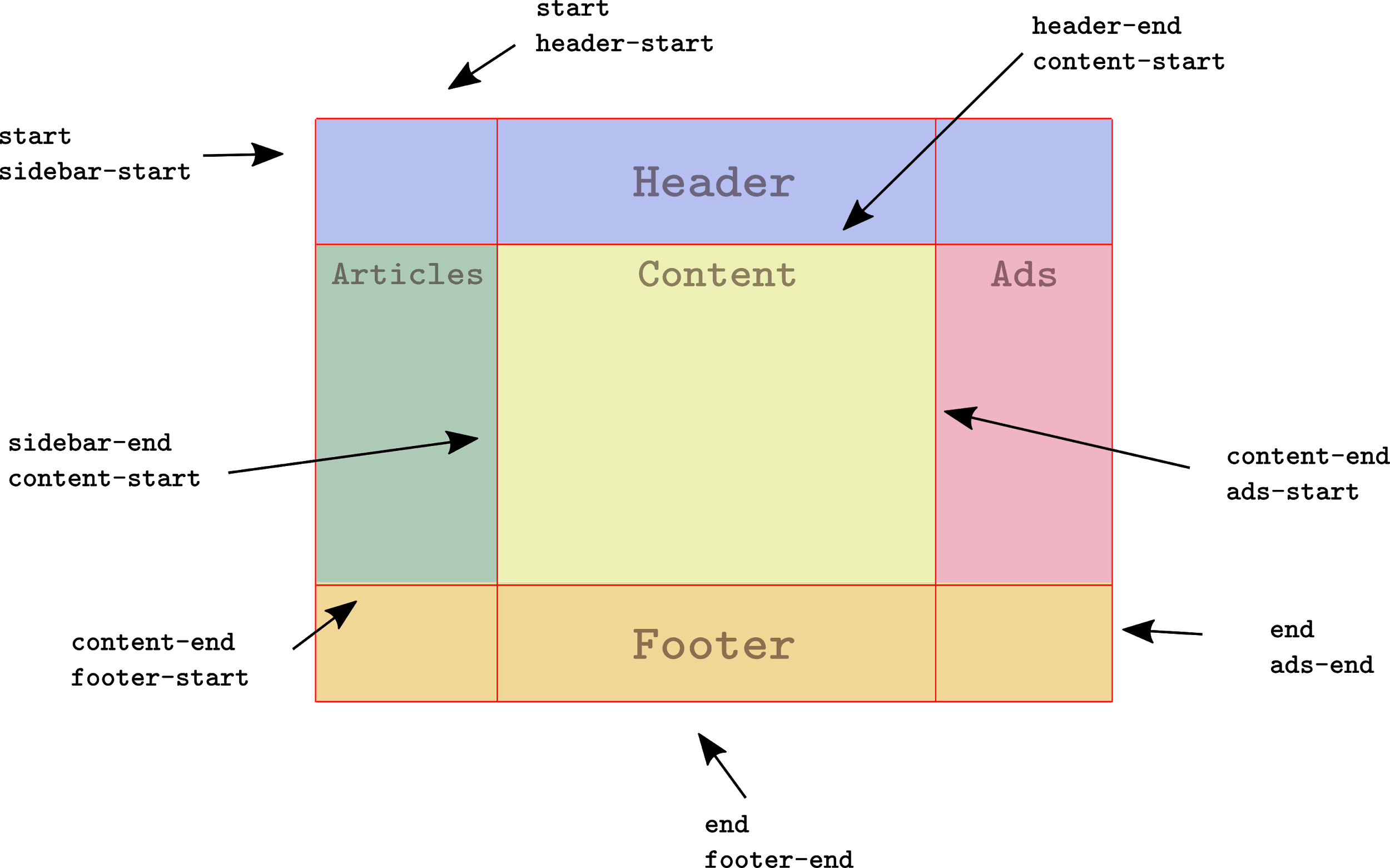
Let’s take a look at the layout mockup once again:
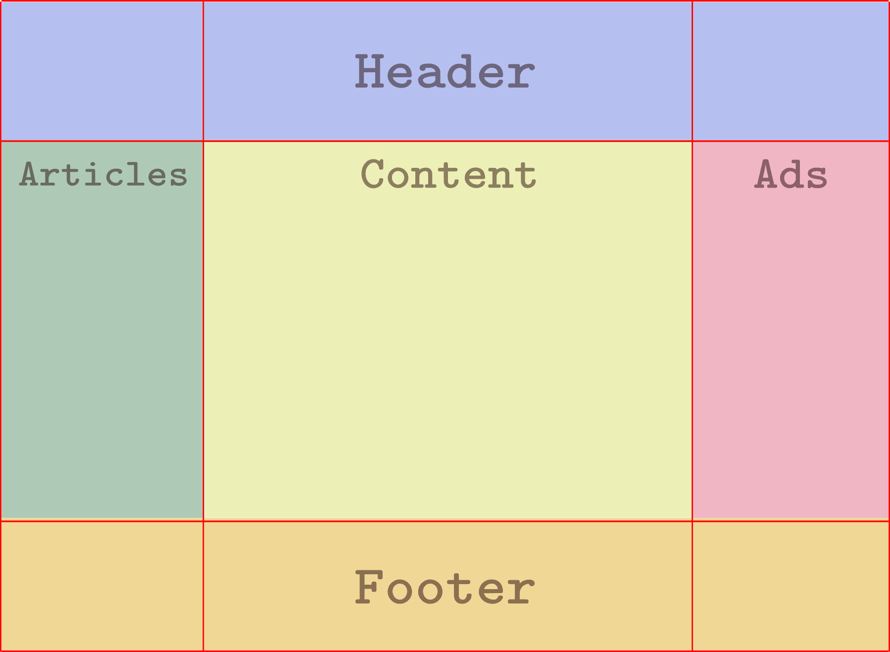
The grid is composed of 4 lines from top to bottom and 4 lines from left to right. We can now define names for these lines and then declare them in the CSS file.
You can name the lines whatever you want but make sure you choose relevant names, in order to work more easily.
Each line will have two different names according to its position inside the grid.
- Edit the CSS code in your code editor:
.container {
       display: grid;
       grid-template-columns: [start sidebar-start] 3fr [sidebar-end content-start] 5fr [content-end ads-start] 3fr [end ads-end];
      grid-template-rows: [start header-start] auto [header-end content-start] auto [content-end footer-start] auto [end footer-end];
       grid-column-gap: 1rem;
   }
Step #6. Placing Grid Items
Time to place the items according to the layout. Just like placing items with line numbers, you have to target the grid item and position it through the grid-column and grid-row properties.
Use the names of the lines instead of their numbers to position the items.
- Edit the CSS code:
/*CSS Grid styles */
   .container {
       display: grid;
       grid-template-columns: [start sidebar-start] 3fr [sidebar-end content-start] 5fr [content-end ads-start] 3fr [end ads-end];
      grid-template-rows: [start header-start] auto [header-end content-start] auto [content-end footer-start] auto [end footer-end];
      grid-column-gap: 1rem;
   }

  .header {
      grid-column: start / end;
      grid-row: start / header-end;
  }

  .articles {
      grid-column: start / sidebar-end;
      grid-row: header-end / footer-start;
  }

  .content {
      grid-column: content-start / content-end;
      grid-row: content-start / content-end;
  }

  .footer {
      grid-column: start / end;
      grid-row: footer-start / footer-end;
  }

  .ads {
      grid-column: ads-start / end;
      grid-row: header-end / footer-start;
  }
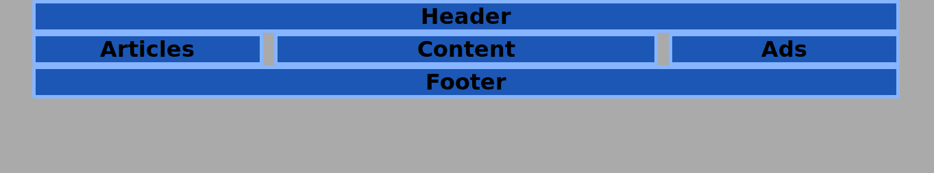
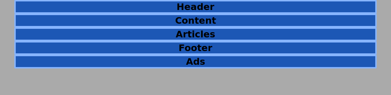
As you already know, the height of each one of the rows will be determined by its content, the representation of the mockup is accurate in its structure but not visually.
Let’s tweak the CSS code for demonstration purposes once again:
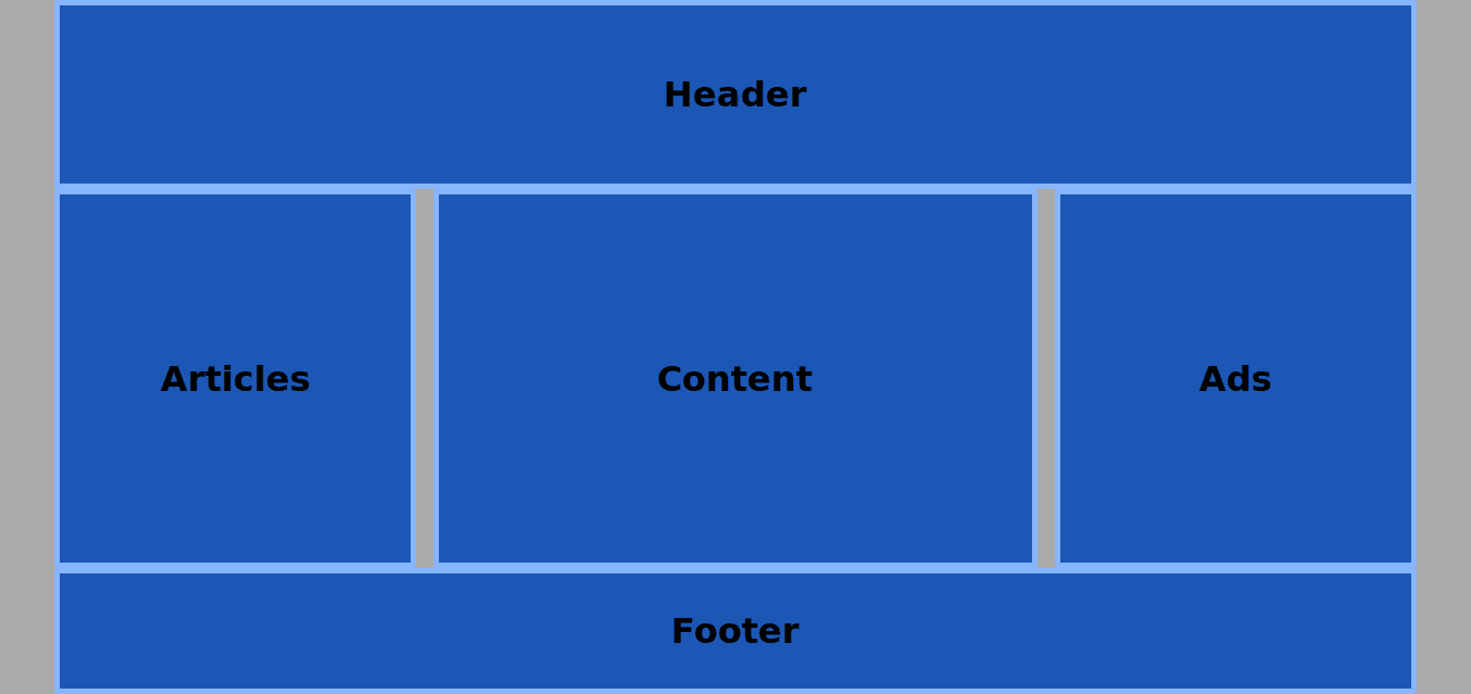
- Set a height value for the grid container of 100vh (the height of the screen) and divide the row (vertical) space with these values: 3fr 6fr and 2fr:
.container {
       display: grid;
       grid-template-columns: [start sidebar-start] 3fr [sidebar-end content-start] 5fr [content-end ads-start] 3fr [end ads-end];
      grid-template-rows: [start header-start] 3fr [header-end content-start] 6fr [content-end footer-start] 2fr [end footer-end];
       grid-column-gap: 1rem;
       height: 100vh;
   }
Conclusion
Line names are very useful when dealing with large and more complex grids because they make easier for humans to find a location on the grid, in order to position items in it.
The previous 9 posts in this series:
- CSS Grid #1: Everything Joomla users need to get started with CSS Grid
- CSS Grid #2: How to Use the Firefox Grid Inspector with CSS Grid
- CSS Grid #3: Understanding Explicit and Implicit Grids in CSS Grid
- CSS Grid #4: How to Use the Autoflow Property in CSS Grid
- CSS Grid #5: Determining the Size of the Tracks in CSS Grid
- CSS Grid #6: The Auto Keyword and Repeat Notation in CSS Grid
- CSS Grid #7: How to Size Grid Items with the Span Keyword in CSS Grid
- CSS Grid #8: How to Use Line Placing in CSS Grid
- CSS Grid #9: How to Layer Items Inside a CSS Grid
Get our CSS Grid Explained Book
All Joomlashack Pro members get access to our "CSS Grid Explained" book. All you need to do is sign up for a Joomlashack extension, template or training membership.
In this short book, you are going to master the key ideas behind CSS Grid. This book is in the best traditions of OSTraining. There are no long-dense paragraphs of theory. You pick up the book and you start writing code immediately.
In the first chapter, we start with the basic terminology. You'll learn the difference between Grid Areas and Grid Cells, between Grid Tracks and Grid Gaps.
Then, using a hands-on approach, you'll start building CSS Grids. There are 9 different exercises in this book. You'll build everything from the most basic CSS Grid to a full site layout.
About the author