
Welcome to the 13th tutorial in our series on the CSS Grid.
We are presenting this series to help Joomla developers learn about CSS Grid. The introduction of CSS Grid will be one of the major changes in upcoming Joomla 4.
As you already learned, it is possible to create repeating track patterns with help of the repeat notation.
However, using this method gives you a fixed number of tracks, independently of the content inside each one of them.
The auto-fill and auto-fit keywords will allow you to place as many tracks of the specified size as possible, depending on the size of the viewport. This tutorial will explain the usage of these keywords.
Let’s start!
Step #1. Create the HTML
- Open your preferred code editor
- Create an HTML file and paste the following code
<div class="container">
   <div class="item item1">First</div>
   <div class="item item2">Second</div>
   <div class="item item3">Third</div>
   <div class="item item4">Fourth</div>
   <div class="item item5">Fifth</div>
   <div class="item item6">Sixth</div>
   <div class="item item7">Seventh</div>
   <div class="item item8">Eighth</div>
</div>
Step #2. Create the CSS
- Create a CSS file and link it to your HTML file.
- Add the following global styles:
/* GLOBAL STYLES */
* {
   box-sizing: border-box;
   }
  body {
   background-color: #AAA;margin: 50px;
    }
/* Each item in the grid contains numbers */
.item {
/* Center the contents of the grid items. Making each grid item a Flex Container */
   display: flex;
     /* Horizontal and Vertical centering */
   justify-content: center;
   align-items: center;
   border: 5px solid #87b5ff;
   border-radius: 3px;
   font-size: 2em;
   font-family: sans-serif;
   font-weight: bold;
   background-color: #1c57b5;
   }
Step #3. Create the CSS Grid
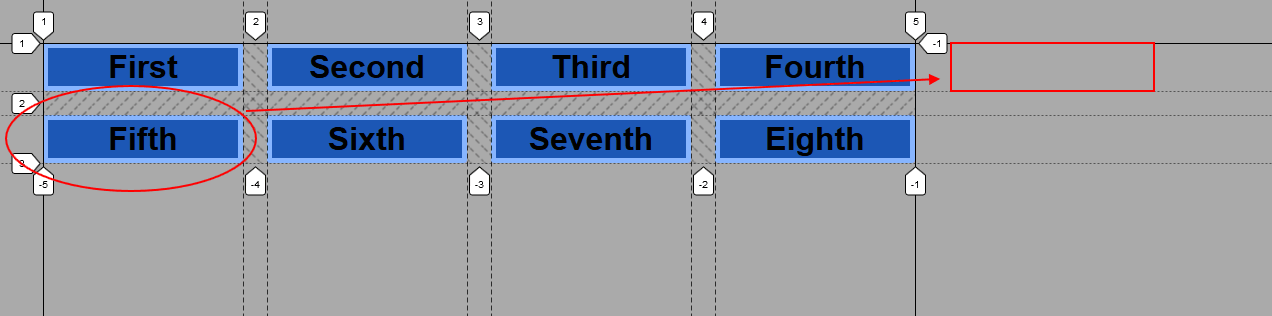
Create a grid with four columns. Each column will have a width of 200px and there will be a gap between columns and rows of 1.5rem (approx. 24px in a desktop screen).
/* CSS Grid styles */
.container {
   display: grid;
   grid-template-columns: repeat(4, 200px);
   grid-gap: 1.5rem;
}

As you can notice, to the right of the grid container, there’s room to place the fifth item on the first row, but you already declared four columns, so this extra space on desktop screens is somehow useless.
Step #4. Learn to use the auto-fill and auto-fit keywords
- Edit the CSS code:
.container {
   display: grid;
   grid-template-columns: repeat(auto-fill, 200px);
   grid-gap: 1.5rem;
}
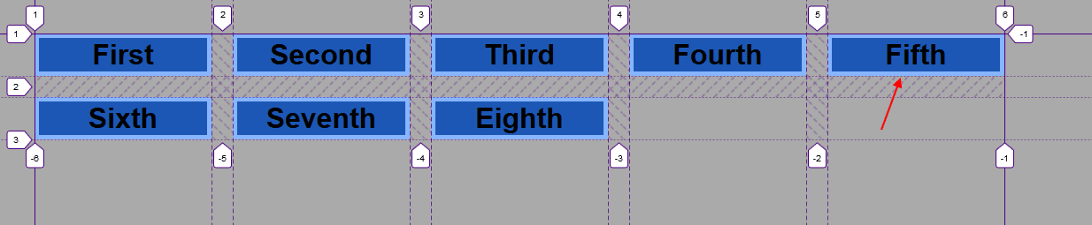
The grid container is wide enough to hold 5 items, each one with a width of 200px.
- Resize the browser window, in order to make it narrower, for example to 800px
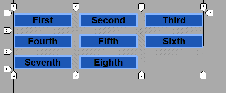
The fourth and fifth items wrapped over to the next row, because there is room for only 3 columns now. This is the math:
3 columns (200px each) = 600px
Gap between columns = 24px * 2= 48px
Total space in use = 648px
Viewport width = 800px
Available remaining space = 800px - 648px = 152px
The fourth item wraps to the next column because it’s not possible to create a 200px column to the right, there’s no space for it.
- Edit the CSS code once again:
.container {
   display: grid;
   grid-template-columns: repeat(auto-fit, 200px);
   grid-gap: 1.5rem;
}
You won’t see any change in the layout.
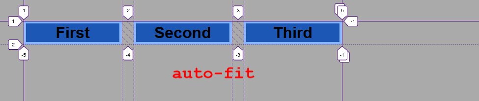
In order to illustrate the difference between auto-fill and auto-fit, edit the HTML code and remove items 4 to 7:
<div class="container">
       <div class="item item1">First</div>
       <div class="item item2">Second</div>
       <div class="item item3">Third</div>
   </div>
- Edit the following CSS code:
.container {
   display: grid;
   grid-template-columns: repeat(auto-fill, 200px);
   grid-gap: 1.5rem;
}
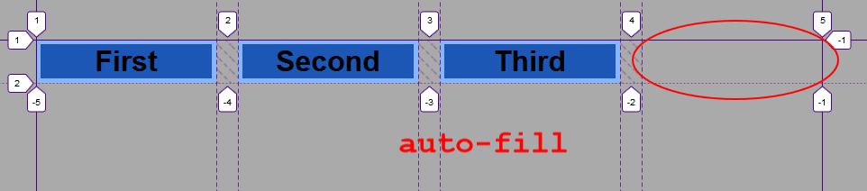
The auto-fill creates additional empty columns if there’s space available. The auto-fit ends the grid container with the last grid item, independently if there’s room for another column.
That means, you could span item 3 across two columns or even place one of the items on the last cell of that row, if you’re using auto-fill, for example.
You might be thinking that this is somehow practical, but it’s not really useful. Read on, in order to discover the real power of these keywords.
Step #5. Use auto-fill and auto-fit with minmax()
The minmax() function in CSS allows you to specify the minimum and maximum sizes of a grid track. Using minmax() with auto-fill or auto-fit gives you the ability to create a grid with responsive behavior.
- Edit the following CSS code:
.container {
   display: grid;
   grid-template-columns: repeat(auto-fill, minmax(200px, 1fr));
   grid-gap: 1.5rem;
}
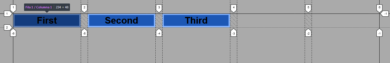
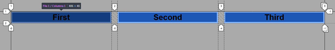
The auto-fill places two additional columns according to the available viewport space. However the size of these columns is not fixed.
It is a fraction of the available space, that is, it will adjust the size of the columns based on the values specified as parameters within the minmax() function.
- Resize your viewport until you see the third item wrap over to the next row
Let’s see what happens with the auto-fit keyword!
- Edit the following CSS code:
.container {
   display: grid;
   grid-template-columns: repeat(auto-fit, minmax(200px, 1fr));
   grid-gap: 1.5rem;
}
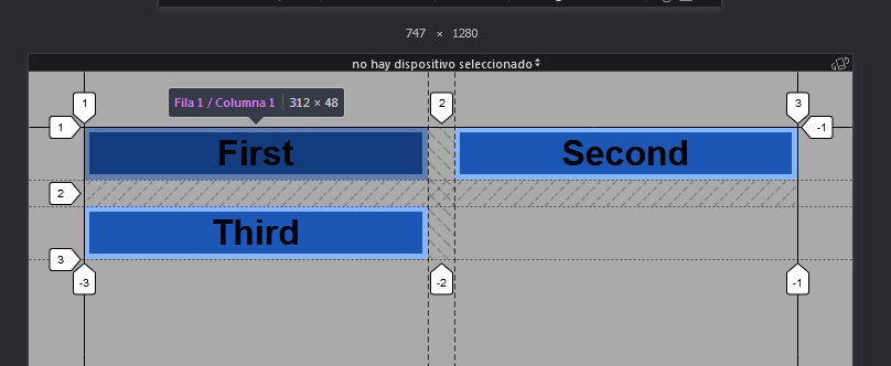
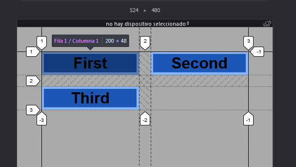
All columns are evenly distributed across the available viewport space. If you resize the viewport to 524px, you will see how the third column wraps over to the next row.
Here’s the math:
2 columns (200px each) = 400px - the minimum size according to minmax()
Gap between columns = 24px
Total space in use = 424px
Body margin (set in the global styles) = 50px to left and right = 100px
Total viewport width = 524px
Now you have a flexible grid with responsive behavior without the need of writing media queries or adding extra classes (for example Bootstrap classes) to the items in the markup.
You can see now how useful the auto-fill and auto-fit keywords in CSS Grid are. They really help you create flexible and responsive grids.
Thank you very much for reading!
The previous 12 posts in this series:
- CSS Grid #1: Everything Joomla users need to get started with CSS Grid
- CSS Grid #2: How to Use the Firefox Grid Inspector with CSS Grid
- CSS Grid #3: Understanding Explicit and Implicit Grids in CSS Grid
- CSS Grid #4: How to Use the Autoflow Property in CSS Grid
- CSS Grid #5: Determining the Size of the Tracks in CSS Grid
- CSS Grid #6: The Auto Keyword and Repeat Notation in CSS Grid
- CSS Grid #7: How to Size Grid Items with the Span Keyword in CSS Grid
- CSS Grid #8: How to Use Line Placing in CSS Grid
- CSS Grid #9: How to Layer Items Inside a CSS Grid
- CSS Grid #10: How to Name Grid Lines
- CSS Grid #11: How to Place Items with Grid Template Areas
- CSS Grid #12: The minmax() Function
Get our CSS Grid Explained Book
All Joomlashack Pro members get access to our "CSS Grid Explained" book. All you need to do is sign up for a Joomlashack extension, template or training membership.
In this short book, you are going to master the key ideas behind CSS Grid. This book is in the best traditions of OSTraining. There are no long-dense paragraphs of theory. You pick up the book and you start writing code immediately.
In the first chapter, we start with the basic terminology. You'll learn the difference between Grid Areas and Grid Cells, between Grid Tracks and Grid Gaps.
Then, using a hands-on approach, you'll start building CSS Grids. There are 9 different exercises in this book. You'll build everything from the most basic CSS Grid to a full site layout.
About the author