
With CSS Grid, it is possible to turn a grid item into a grid itself and that way, nest a grid inside another grid. With this approach, you can break the design into different parts and layout each one of them individually.
This will provide you with the required flexibility when converting your designs to HTML/CSS. This tutorial will explain how to build nested grids with CSS Grid.
Let’s start!
Step #1. - Create the HTML
- Open the code editor of your liking and create a HTML file
- Copy and paste the following HTML code:
<div class="container">
<div class="item item1">1</div>
<div class="item item2">2</div>
<div class="item item3">
<div class="subitem item4">4</div>
<div class="subitem item5">5</div>
</div>
<div class="item item6">6</div>
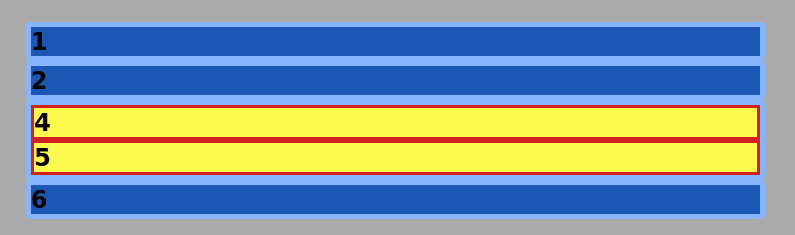
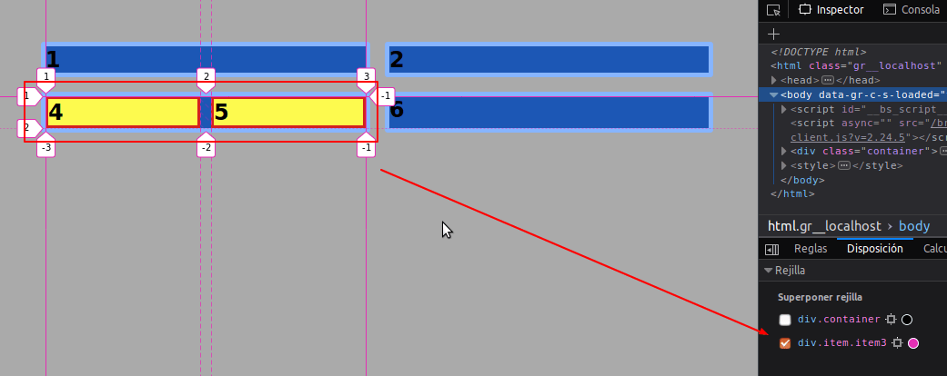
</div>It is a container with four child items, namely items 1, 2, 3, and 6.
Item 3 contains two additional “subitems”, those are item 4 and item 5.
Step #2. - Create the CSS
Apply some basic styling to the items and subitems, in order to be able to differentiate them.
- Create a CSS file and link it to your HTML file
- Add this code to the CSS file:
/* GLOBAL STYLES */

   * {
       box-sizing: border-box;
       }

   body {
   background-color: #AAA;
   margin: 50px;
   }

   /* Each item in the grid contains numbers */
   .item {
       border: 5px solid #87b5ff;
       border-radius: 3px;
       font-family: sans-serif;
       font-size: 1.5rem;
       font-weight: bold;
       background-color: #1c57b5;
   }

   .subitem {
       background-color: #fdfa4e;
       border: 3px solid #d32121;
   }
Step #3. - Create the CSS Grid
The grid will have two columns and a gap between items of 1rem, approximately 16px on a desktop screen.
- Edit the CSS code:
/*  CSS GRID STYLES */

   .container {
       display: grid;
       grid-template-columns: repeat(2, 1fr);
       grid-gap: 1rem;
   }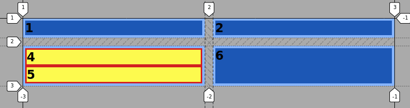
As you can see and as explained in the first tutorial of this series, grid items have to be direct children of the main grid container. Items 4 and 5 won’t inherit the grid item condition of their parent element, in this case, item 3.
However, we can display grid item 3 as a grid container itself, thus we convert items 4 and 5 into grid items, in order to lay them out inside their containing element.
Step #4 - Nesting a grid inside another grid
- Edit the CSS file once again and add this code:
.item3 {
       display: grid;
       grid-template-columns: repeat(2, 1fr);
       grid-gap: 0.5em;
   }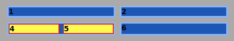
Now item 3 is a grid item and also a grid container. The items inside it have turned into grid items too.
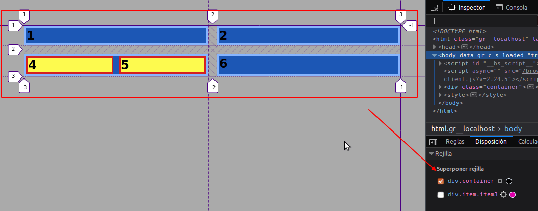
If you open the grid inspector of your browser, you will have the option to select either of the grids on the page.
With CSS Grid, it is possible to nest grids inside other grids by converting grid items into grid containers.
This gives developers more freedom when coding a design into HTML and CSS and increases the productivity during the layout process of design mockups.
Thanks for reading!
The previous 16 posts in this series:
- CSS Grid #1: Everything Joomla users need to get started with CSS Grid
- CSS Grid #2: How to Use the Firefox Grid Inspector with CSS Grid
- CSS Grid #3: Understanding Explicit and Implicit Grids in CSS Grid
- CSS Grid #4: How to Use the Autoflow Property in CSS Grid
- CSS Grid #5: Determining the Size of the Tracks in CSS Grid
- CSS Grid #6: The Auto Keyword and Repeat Notation in CSS Grid
- CSS Grid #7: How to Size Grid Items with the Span Keyword in CSS Grid
- CSS Grid #8: How to Use Line Placing in CSS Grid
- CSS Grid #9: How to Layer Items Inside a CSS Grid
- CSS Grid #10: How to Name Grid Lines
- CSS Grid #11: How to Place Items with Grid Template Areas
- CSS Grid #12: The minmax() Function
- CSS Grid #13: The auto-fill and auto-fit Keywords in CSS Grid
- CSS Grid #14: Centering and Aligning Items in CSS Grid
- CSS Grid #15. The justify-content and align-content Properties
- CSS Grid #16. The grid-auto-flow: dense Property
Get our CSS Grid Explained Book
All Joomlashack Pro members get access to our "CSS Grid Explained" book. All you need to do is sign up for a Joomlashack extension, template or training membership.
In this short book, you are going to master the key ideas behind CSS Grid. This book is in the best traditions of OSTraining. There are no long-dense paragraphs of theory. You pick up the book and you start writing code immediately.
In the first chapter, we start with the basic terminology. You'll learn the difference between Grid Areas and Grid Cells, between Grid Tracks and Grid Gaps.
Then, using a hands-on approach, you'll start building CSS Grids. There are 9 different exercises in this book. You'll build everything from the most basic CSS Grid to a full site layout.
About the author