
The card gallery is a popular design pattern on the web and you see them often in newspaper, magazine and online commerce sites, because of a number of reasons:
- Cards can be adjusted to all screen sizes (responsiveness).
- The information can be read and processed in an easy way.
- Cards help the user focus on the detail.
- Cards increase usability.
In this tutorial, you will learn how to use the CSS Grid to create a card based layout. Each card will have a teaser to a particular book. The layout will be by default responsive and without the use of media queries.
Let’s start!
Step #1. The Layout
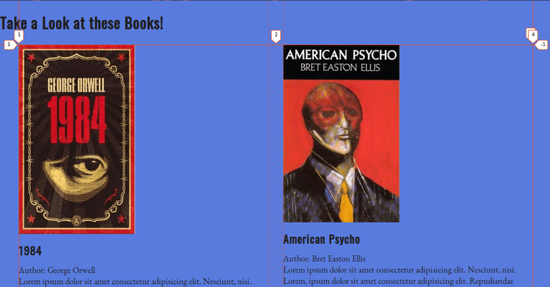
The layout has two sections:
- The upper part groups two highlighted books (in this example).
- The lower part displays other (regular) books.
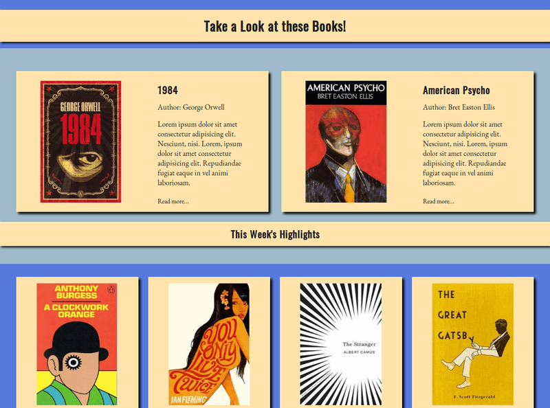
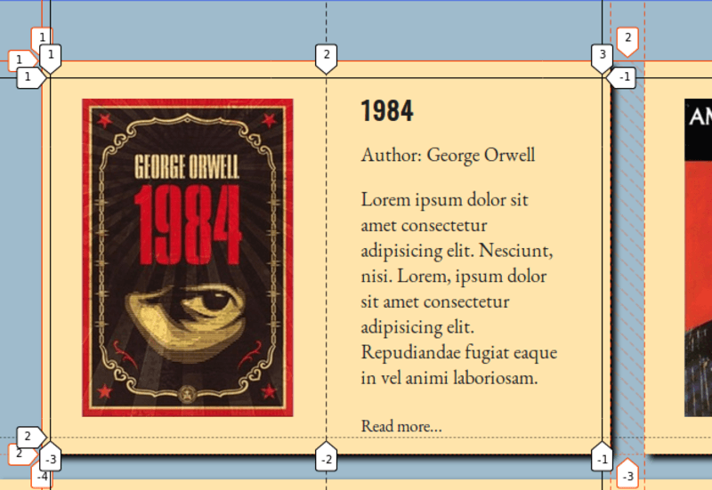
Each card in the “highlighted” area is a grid with two columns. The text will wrap over to the next row if there is not enough space available. Notice also, that both elements are nested grids of another grid.
The cards in the lower area are regular grid items.
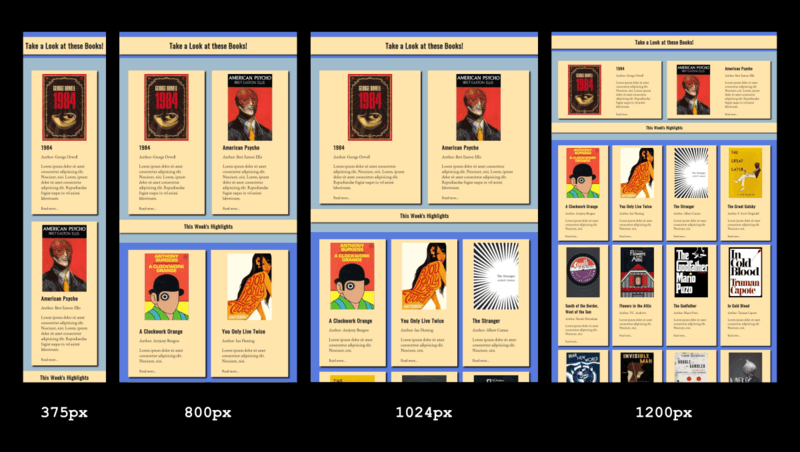
- Take a look at the design at different screen sizes. Right-click the image, hold the Ctrl key and click View image, to enlarge the image in a new browser tab.
Step #2. - The HTML
- Download this HTML source file.
- Open your preferred code editor and create an empty HTML file.
- Copy the HTML code from the downloaded file and paste it into your HTML file.
In the head tag of the HTML document you will find the links to Google fonts and to the CSS stylesheet. The markup has two main containing divs:
highlights-wrapperregular-books.
The first two books are contained in an additional wrapper book-highlights, which will be displayed as a grid container.
Each book has an image and a descriptive summary with:
- The title of the book.
- Its author.
- Its brief description.
- A “Read more” link.
Step #3. - The CSS
Now it’s time to add some basic styling to the markup.
- Create a CSS file with the name style.css and add the following basic styles:
/* GLOBAL STYLES */ * { box-sizing: border-box; margin: 0; padding: 0; } body { background-color: #597bde; margin: 1.5em 0 2.5em; color: #202020; font-family: 'EB Garamond', serif; } h1, h2, h3, h4, h5, h6 { font-family: 'Oswald', sans-serif; margin: 0.5em auto; } a { text-decoration: none; display: block; margin-top: 1.5em; color: #140f2d; } p { font-size: 1.15em; }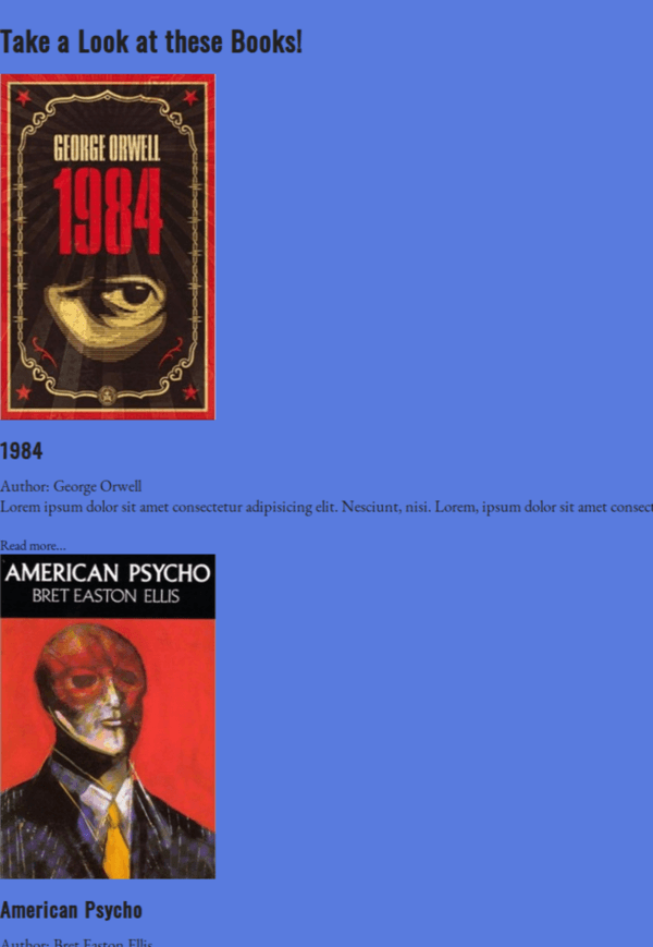
Step #4. - Create the CSS Grid Styles
With the basic styles in place, you are now ready to create grids and lay out the cards.
Let’s focus on the first grid (book-highlights), which contains the first two books.
- Edit the CSS code:
.book-highlights { display: grid; grid-template-columns: repeat(auto-fit, minmax(280px, 1fr)); grid-gap: 2em; margin: 1.5em 2.5em; }This code will create as many columns as possible with a minimum width of 280px and a maximum width of 1fr (it’s important to take the gap between columns into account). The two items in this container will be distributed each in a grid column, taking up the full viewport width, i.e. 1fr each.
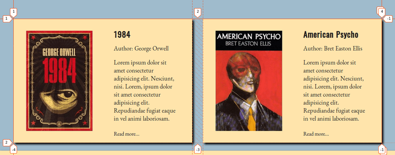
Each book in the “highlighted area” is a responsive (nested) grid with two columns.
- Edit the CSS code:
.book-highlights .book { display: grid; grid-template-columns: repeat(auto-fit, minmax(250px, 1fr)); align-items: center; justify-items: center; }This will create a 2-column based grid for the two available items (image and summary). The items contained within the book grid inside the “highlighted” container are aligned vertically and horizontally.
Once you are done with the layout in the upper container, you can proceed to apply the grid styles for the lower container (regular-books).
- Edit the CSS code once again and add these styles:
.regular-books { display: grid; grid-template-columns: repeat(auto-fit, minmax(280px, 1fr)); grid-gap: 1.5em; margin: 2em 2.5em 0; }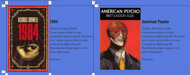
This is pretty much the same as the first wrapper. It creates more columns because there are more elements and the browser fits as many as possible according to the available space. Those are all the Grid styles required. You can tackle now the rest of the cosmetic styling.
Step #5. - Other Styles
The first heading and the heading for this week’s highlights have a background color. Both heading containers and the book cards have drop shadows, this adds depth to the design.
- Edit the CSS code:
h1, .week-highlights { background-color: #ffe4ab; text-align: center; padding: 0.5em 0; box-shadow: 3px 3px 5px #000; }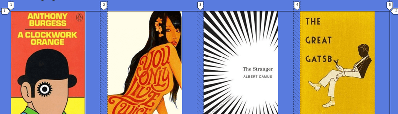
The wrapper containing the highlighted books has a background color.
- Edit the CSS code:
.highlights-wrapper { background-color: #9fbbcc; padding: 2em 0; }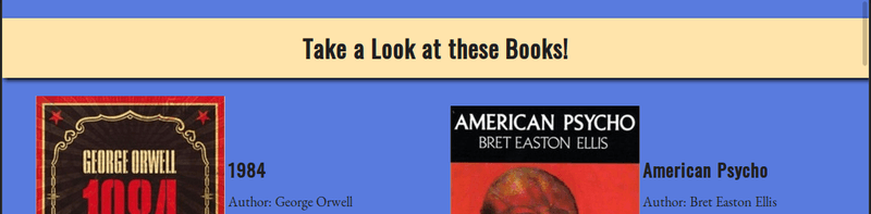
You need to enclose each book in a card by giving it a background color and some shadow. The images are too big, you need to adjust their size.
- Edit the CSS code:
.book { box-shadow: 5px 5px 5px #000; background-color: #ffe4ab; padding: 1em 0.5em; } .book img { width: 200px; height: 300px; }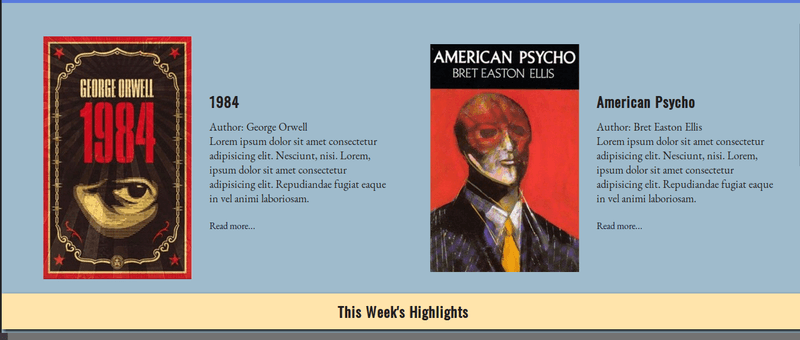
The summary text seems clogged, let’s clear that a little bit by making it narrower, centering it horizontally, and adding margin to the author name.
- Edit the CSS code:
.summary { width: 75%; margin: auto; } .summary > p:first-of-type { margin-bottom: 1em; }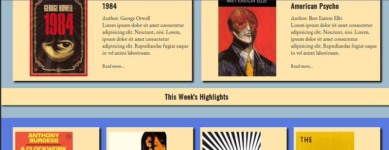
The last step is centering the book images horizontally in their containers. Notice that these are not grid items, their parent is a grid item but has not been declared as a grid container.
- Edit the CSS code one last time:
.regular-books .book img { display: block; margin: 0 auto 2em; }- Save all files and refresh your Browser!
Congratulations! You just built a card based layout with the help of CSS Grid. I hope you had fun doing this exercise. Leave us your comments below!
The previous 19 posts in this series:
- CSS Grid #1: Everything Joomla users need to get started with CSS Grid
- CSS Grid #2: How to Use the Firefox Grid Inspector with CSS Grid
- CSS Grid #3: Understanding Explicit and Implicit Grids in CSS Grid
- CSS Grid #4: How to Use the Autoflow Property in CSS Grid
- CSS Grid #5: Determining the Size of the Tracks in CSS Grid
- CSS Grid #6: The Auto Keyword and Repeat Notation in CSS Grid
- CSS Grid #7: How to Size Grid Items with the Span Keyword in CSS Grid
- CSS Grid #8: How to Use Line Placing in CSS Grid
- CSS Grid #9: How to Layer Items Inside a CSS Grid
- CSS Grid #10: How to Name Grid Lines
- CSS Grid #11: How to Place Items with Grid Template Areas
- CSS Grid #12: The minmax() Function
- CSS Grid #13: The auto-fill and auto-fit Keywords in CSS Grid
- CSS Grid #14: Centering and Aligning Items in CSS Grid
- CSS Grid #15. The justify-content and align-content Properties
- CSS Grid #16. The grid-auto-flow: dense Property
- CSS Grid #17. Nesting Grids
- CSS Grid #18: How to Build a Dropdown Menu
- CSS Grid #19: Difference Between Grid Containers and Block Containers
Get our CSS Grid Explained Book
All Joomlashack Pro members get access to our "CSS Grid Explained" book. All you need to do is sign up for a Joomlashack extension, template or training membership.
In this short book, you are going to master the key ideas behind CSS Grid. This book is in the best traditions of OSTraining. There are no long-dense paragraphs of theory. You pick up the book and you start writing code immediately.
In the first chapter, we start with the basic terminology. You'll learn the difference between Grid Areas and Grid Cells, between Grid Tracks and Grid Gaps.
Then, using a hands-on approach, you'll start building CSS Grids. There are 9 different exercises in this book. You'll build everything from the most basic CSS Grid to a full site layout.
About the author