
CSS Grid allows you to build complex user interfaces with ease. User experience with a browser-based interface very often starts from a navigation element.
This tutorial will apply some of the techniques you have already learned in this series to build a drop-down menu. You will build it for a fictional online sports store. Hopefully, it will help you to strengthen your knowledge.


Let’s start!
Step #1. - The Layout
For the purpose of this tutorial, we are going to build a fixed size layout for a desktop screen. The approach I’m using here is to fraction the design mockup, in order to identify which elements can be declared as grid containers. The layout process is much easier in that case.
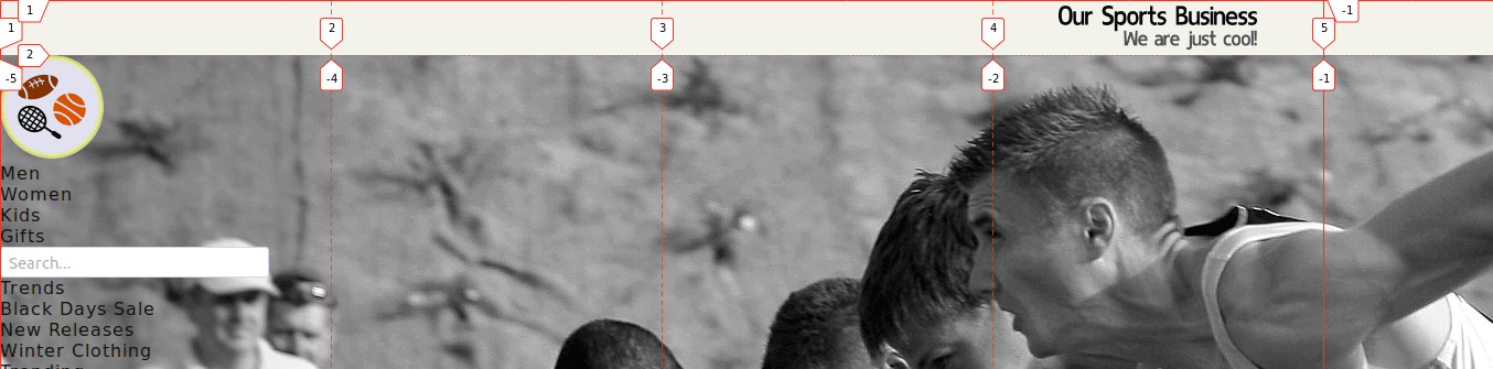
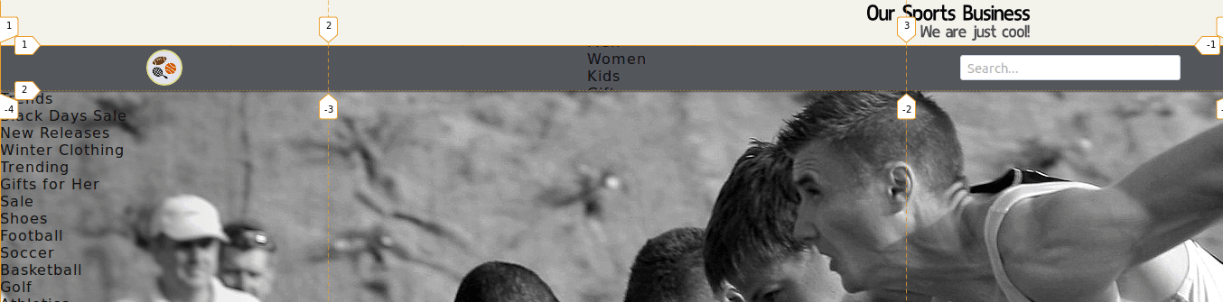
The container on top of the page will be named brand-wrapper, it will be a grid with only one element. This element will be placed on the last cell of the grid.

The top-bar-wrapper will contain three elements, namely a small logo image, the menu-bar, and a search box.

The menu-bar container will be a grid item of its parent (top-bar-wrapper), but it will be also a grid container itself (four columns). Each cell in this grid will contain a menu link.
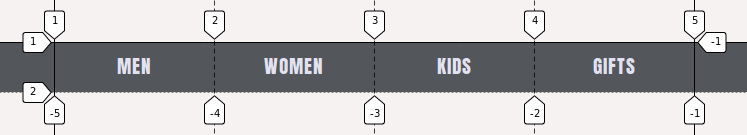
The main-menu-men container is a grid container and the items inside it will be declared as grid containers too (nested grids). Each menu link in the menu-bar will have a corresponding main-menu
Step #2. - Create the HTML
Once you have analyzed the design mockup, it’s time to write the markup.
- Create a HTML file
- Copy and paste this code:
<html lang="en">

   <head>
       <meta charset="UTF-8">
       <meta name="viewport" content="width=device-width, initial-scale=1.0">
       <meta http-equiv="X-UA-Compatible" content="ie=edge">
       <link href="https://fonts.googleapis.com/css?family=Anton|Nunito" rel="stylesheet">
       <link rel="stylesheet" href="/style.css">
       <title>Nested Grids</title>
   </head>

   <body>
       <div class="header">
           <div class="brand-wrapper">
               <img src="/img/brand-logo.png" alt="brand-logo">
           </div>
           <div class="top-bar-wrapper">
               <div class="logo">
                   <img src="/img/mini-logo.png">
               </div>
               <div class="menu-bar-wrapper">
                   <ul class="menu-bar">
                       <li class="men">
                           <a href="#">Men</a>
                       </li>
                       <li class="women">
                           <a href="#">Women</a>
                       </li>
                       <li class="kids">
                           <a href="#">Kids</a>
                       </li>
                       <li class="gifts">
                           <a href="#">Gifts</a>
                       </li>
                   </ul>
               </div>
               <div class="searchbox">
                   <input type="text" placeholder="Search...">
               </div>
           </div>

           <div class="main-menu-men">
               <div class="menu-container first trends">
                   <ul>
                       <li><a href="#">Trends</a></li>
                       <li><a href="#">Black Days Sale</a></li>
                       <li><a href="#">New Releases</a></li>
                       <li><a href="#">Winter Clothing</a></li>
                       <li><a href="#">Trending</a></li>
                       <li><a href="#">Gifts for Her</a></li>
                       <li><a href="#">Sale</a></li>
                   </ul>
               </div>
               <div class="menu-container second">
                   <ul>
                       <li><a href="#">Shoes</a></li>
                       <li><a href="#">Football</a></li>
                       <li><a href="#">Soccer</a></li>
                       <li><a href="#">Basketball</a></li>
                       <li><a href="#">Golf</a></li>
                       <li><a href="#">Athletics</a></li>
                       <li><a href="#">Tennis</a></li>
                   </ul>
               </div>
               <div class="menu-container third">
                   <ul>
                       <li><a href="#">Clothing</a></li>
                       <li><a href="#">T-Shirts</a></li>
                       <li><a href="#">Sweatshirts</a></li>
                       <li><a href="#">Shorts</a></li>
                       <li><a href="#">Jackets</a></li>
                       <li><a href="#">Socks</a></li>
                       <li><a href="#">Underwear</a></li>
                   </ul>
               </div>
               <div class="menu-container fourth">
                   <ul>
                       <li><a href="#">Shop collection</a></li>
                       <li><a href="#">Activewear</a></li>
                       <li><a href="#">Swimming</a></li>
                       <li><a href="#">Running</a></li>
                       <li><a href="#">Rugby</a></li>
                       <li><a href="#">Training</a></li>
                       <li><a href="#">Baseball</a></li>
                   </ul>
               </div>
               <div class="menu-container fifth">
                   <img src="/img/background_04.jpg" alt="Image background">
                   <a href="#">Win tickets for the next season</a>
               </div>
           </div>

   </div>
   <script src="//ajax.googleapis.com/ajax/libs/jquery/2.1.1/jquery.min.js"></script>
   <script src="/script.js"></script>

   </body>

</html>
As you can see in the markup, there is a containing div called header. The items brand-wrapper, top-bar-wrapper, and main-menu-men are direct children of the header. Notice also, that I’ve included links to the stylesheet (style.css) and to Google fonts.
The calls to the custom script (script.js) and to the jQuery library are just before the closing body tag.

Step # 3. - Create the CSS
- Create a CSS file called style.css, this file is already linked in the markup
- Add the following basic styles:
/* GLOBAL STYLES */
* {
   box-sizing: border-box;
   padding: 0;
   margin: 0;
   list-style-type: none;
   text-decoration: none;
   overflow-y: hidden;
}

body {
   font-family: sans-serif;
   background-color: #f7f2f2;
   background-image: url('img/background_02.jpg');
   background-repeat: no-repeat;
   background-attachment: fixed;
}

a {
   display: block;
   color: #111111;
   letter-spacing: 1px;
}
You added here the background image to the body element.
The overflow-y: hidden property tells the browser not to display a scrollbar in case that the height of the menu is greater than the available screen height (we are working with a fixed layout). Such a scrollbar would displace the layout around 5px to the left when hovering over the menu-bar links.

Step # 4. - The CSS Grid Containers
The first element you need to target is the brand-wrapper div.
Brand wrapper
- Edit your CSS code:
/* GRID STYLES */
/* BRAND WRAPPER*/

.brand-wrapper {
   display: grid;
   height: 50px;
   grid-template-columns: repeat(4, 300px);
   background-color: #f3f3ec;
   justify-items: center;
   align-items: center;
}
This creates a grid with four columns. The brand image has been centered vertically and horizontally within its cell. However, it is too big and it has still to be placed at the end of the row on the last cell.
- Edit the CSS code:
.brand-wrapper img {
   height: 40px;
   grid-column: -1 / -2;
}
The next step is the top-bar-wrapper container, so let’s go ahead!
The top-bar-wrapper container has three children:
- the small logo on the left
- the menu bar
- the search box
The menu bar will have a fixed width of 640px, the logo, and the search box will take 1fr (1 fractional unit each). All items will be vertically and horizontally centered within their cells. There are other cosmetic details like a light shadow and positioning of the container with a z-index (stack order) of 2.
Top bar wrapper
- Edit the CSS code:
/* TOP BAR WRAPPER */

.top-bar-wrapper {
   display: grid;
   grid-template-columns: 1fr 640px 1fr;
   align-items: center;
   justify-items: center;
   height: 50px;
   background-color: #53575c;
   box-shadow: 2px 2px 1px rgba(46, 46, 46, 0.6);
   position: relative;
   z-index: 2;
}
The logo image still looks too big, so you have to target it in your CSS file, in order to format it properly.
- Edit the CSS code:
.logo img {
   height: 40px;
   display: block;
   margin: auto;
}
The next step is the menu-bar container. This grid item will act also as a grid container. It will have 4 columns, a fixed width of 640px, and a height of 50px, just like the top-bar-wrapper.
The font used is pulled from a server on the internet, the code that executes this action is the first tag inside the <head> tag of your HTML file.
Notice the use of the margin: auto property, grid elements behave like block elements in this aspect.
Menu bar
- Edit the CSS code:
/*  MENU BAR  */

.menu-bar {
   display: grid;
   grid-template-columns: repeat(4, 1fr);
   align-items: center;
   width: 640px;
   height:50px;
   margin: auto;
   text-align: center;
   font-family: 'Anton', sans-serif;
   font-size: 1.2em;
   text-transform: uppercase;
}
There are a couple more improvements to be made.
By default, the height of the link container is auto, we are going to increase this height to 50px. The reason for that is to have a bigger surface when hovering over the link element, so that the main-menu-men (the drop-down menu) can properly be displayed.
The text won’t be centered anymore, so you need to adjust it a little bit with padding. I guess we can call this a “little hack”….
- Edit the CSS code:
.menu-bar li {
   height: 50px;
   padding-top: 10px;
}

.menu-bar li a {
   color: #e2e1f0;
}
The next item you need to target is the main-menu-men.
Main menu
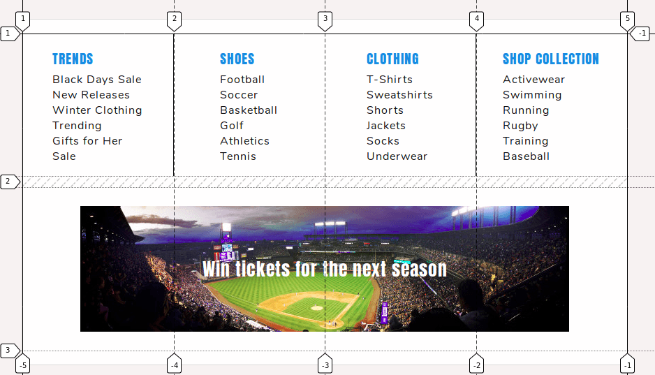
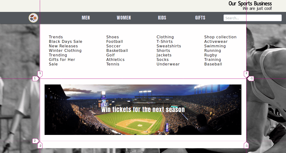
This item contains five elements, four text columns with links, and an image at the bottom with a call to action (win tickets).
The grid will have four columns, the fifth item will be placed automatically at the beginning of the second row. It has a fixed width of 868px and a fixed height (the total height of the viewport minus 120px). There is a gap between rows of 1rem (approx. 16px on a desktop computer).
- Edit the CSS code:
/* MAIN MENU MEN */

.main-menu-men {
   display: grid;
   grid-template-columns: repeat(4, 1fr);
   grid-row-gap: 1rem;
   width: 868px;
   margin: auto;
   padding: 20px 0;
   background-color: #fffefe;
   min-height: calc(100vh - 120px);
   border: 1px solid #dbd9d9;
}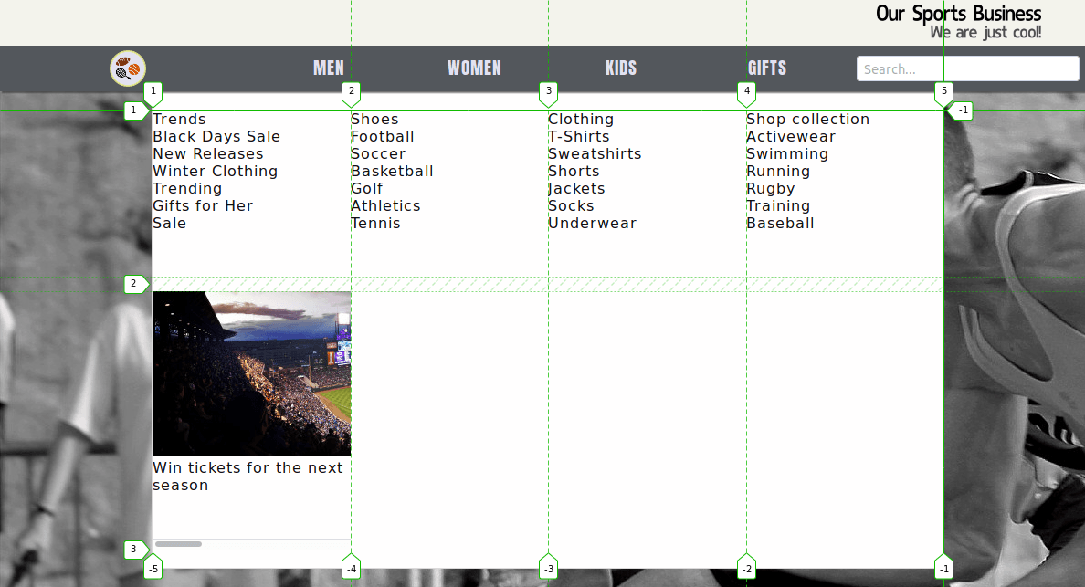
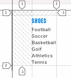
The lists of links inside each menu container have to be centered on both axes, these containers will be grids inside another grid.
- Edit the CSS code:
.menu-container {
display: grid;
justify-items: center;
align-items: center;
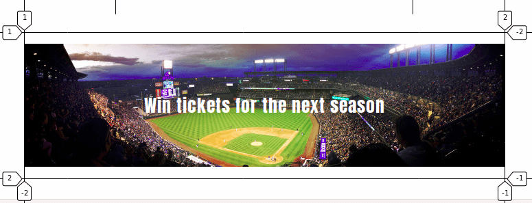
}Now take a look at the fifth container. It has two items in it. You have to span the item horizontally across its whole parent grid.
- Edit the CSS code:
/* FIFTH CONTAINER */

.fifth {
   grid-column: 1 / -1; /* ACTS AS A GRID ITEM */

   grid-template-columns: 1fr; /* ACTS AS A GRID CONTAINER */
   padding: 10px 0;
   align-items: center;
   justify-items: center;
}
Furthermore, the items in it, i.e. the image and call-to-action text require to be placed on the same grid area.
- Edit the CSS code:
.fifth img {
   grid-row: 1 / -1;
   grid-column: 1 / -1;
   width: 100%;
   display: block;
   padding: 0 20px;
   margin: auto;
}

.fifth a {
   grid-row: 1 / -1;
   grid-column: 1 / -1;
   color: #fffefe;
   font-family: 'Anton', sans-serif;
   font-size: 1.6em;
}
You have to add some styling to the links inside the main menu:
- Edit the CSS code:
/* STYLING LINKS MAIN MENU */

.menu-container ul li,
input {
   font-family: 'Nunito', sans-serif;
}

/* STYLING TITLE LINKS */

.menu-container ul li:first-child {
   line-height: 2em;
   font-size: 1.2em;
   font-family: 'Anton', sans-serif;
   text-transform: uppercase;
}

.menu-container ul li:first-child a {
   color: #178ce3;
}
This finishes the CSS Grid part of the tutorial. For showing / hiding the menu when hovering over a link on the menu-bar, it is necessary to create one more CSS class, which will be added dynamically through jQuery.
Step #5. - The JavaScript
- Create a file called script.js
- Copy and paste the following code:
$('li.men').hover(
   function(){ $('.main-menu-men').addClass('show-menu-men') },
   function(){ $('.main-menu-men').removeClass('show-menu-men') }
)

$('.main-menu-men').hover(
   function(){ $('.main-menu-men').addClass('show-menu-men') },
   function(){ $('.main-menu-men').removeClass('show-menu-men') }
)
The first part of this code adds/removes a class when hovering over/leaving the ‘Men’ link, whereas the second part of the code adds/removes the same class when hovering over /leaving the main-menu-men container.
There are two more things you have to do in your CSS file:
- Hide the
main-menu-mencontainer - Create a
show-menu-menclass.
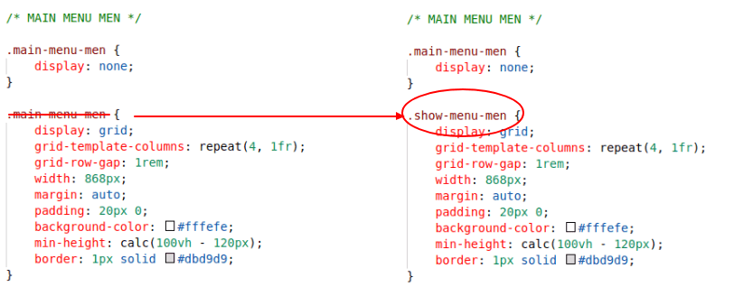
Locate the /* MAIN MENU MEN */ code section within your CSS file and add a selector to hide the main-menu-men container.
- Edit the CSS code:
/* MAIN MENU MEN */

.main-menu-men {
   display: none;
}
Change the name of the “second” class selector .main-menu-men for .show-menu-men.
.show-menu-men {
   display: grid;
   grid-template-columns: repeat(4, 1fr);
   grid-row-gap: 1rem;
   width: 868px;
   margin: auto;
   padding: 20px 0;
   background-color: #fffefe;
   min-height: calc(100vh - 120px);
   border: 1px solid #dbd9d9;
}
- Save all files and refresh the browser.
Congratulations! You just coded a dropdown menu using CSS Grid. I hope it was fun doing this tutorial. Please, leave us your comments below.
The previous 17 posts in this series:
- CSS Grid #1: Everything Joomla users need to get started with CSS Grid
- CSS Grid #2: How to Use the Firefox Grid Inspector with CSS Grid
- CSS Grid #3: Understanding Explicit and Implicit Grids in CSS Grid
- CSS Grid #4: How to Use the Autoflow Property in CSS Grid
- CSS Grid #5: Determining the Size of the Tracks in CSS Grid
- CSS Grid #6: The Auto Keyword and Repeat Notation in CSS Grid
- CSS Grid #7: How to Size Grid Items with the Span Keyword in CSS Grid
- CSS Grid #8: How to Use Line Placing in CSS Grid
- CSS Grid #9: How to Layer Items Inside a CSS Grid
- CSS Grid #10: How to Name Grid Lines
- CSS Grid #11: How to Place Items with Grid Template Areas
- CSS Grid #12: The minmax() Function
- CSS Grid #13: The auto-fill and auto-fit Keywords in CSS Grid
- CSS Grid #14: Centering and Aligning Items in CSS Grid
- CSS Grid #15. The justify-content and align-content Properties
- CSS Grid #16. The grid-auto-flow: dense Property
- CSS Grid #17. Nesting Grids
Get our CSS Grid Explained Book
All Joomlashack Pro members get access to our "CSS Grid Explained" book. All you need to do is sign up for a Joomlashack extension, template or training membership.
In this short book, you are going to master the key ideas behind CSS Grid. This book is in the best traditions of OSTraining. There are no long-dense paragraphs of theory. You pick up the book and you start writing code immediately.
In the first chapter, we start with the basic terminology. You'll learn the difference between Grid Areas and Grid Cells, between Grid Tracks and Grid Gaps.
Then, using a hands-on approach, you'll start building CSS Grids. There are 9 different exercises in this book. You'll build everything from the most basic CSS Grid to a full site layout.
About the author