
As you already have learned in the previous tutorials of this series, CSS Grid (the Grid specification in your browser) positions grid items into grid cells or areas, based on an auto-placement algorithm, unless you position the items by yourself.
The browser will automatically create new rows and place items according to their source order. But what if you want to have an empty row without content?
In this tutorial, you will learn how to generate an empty row in a grid and then use this row to overlap two grid items.
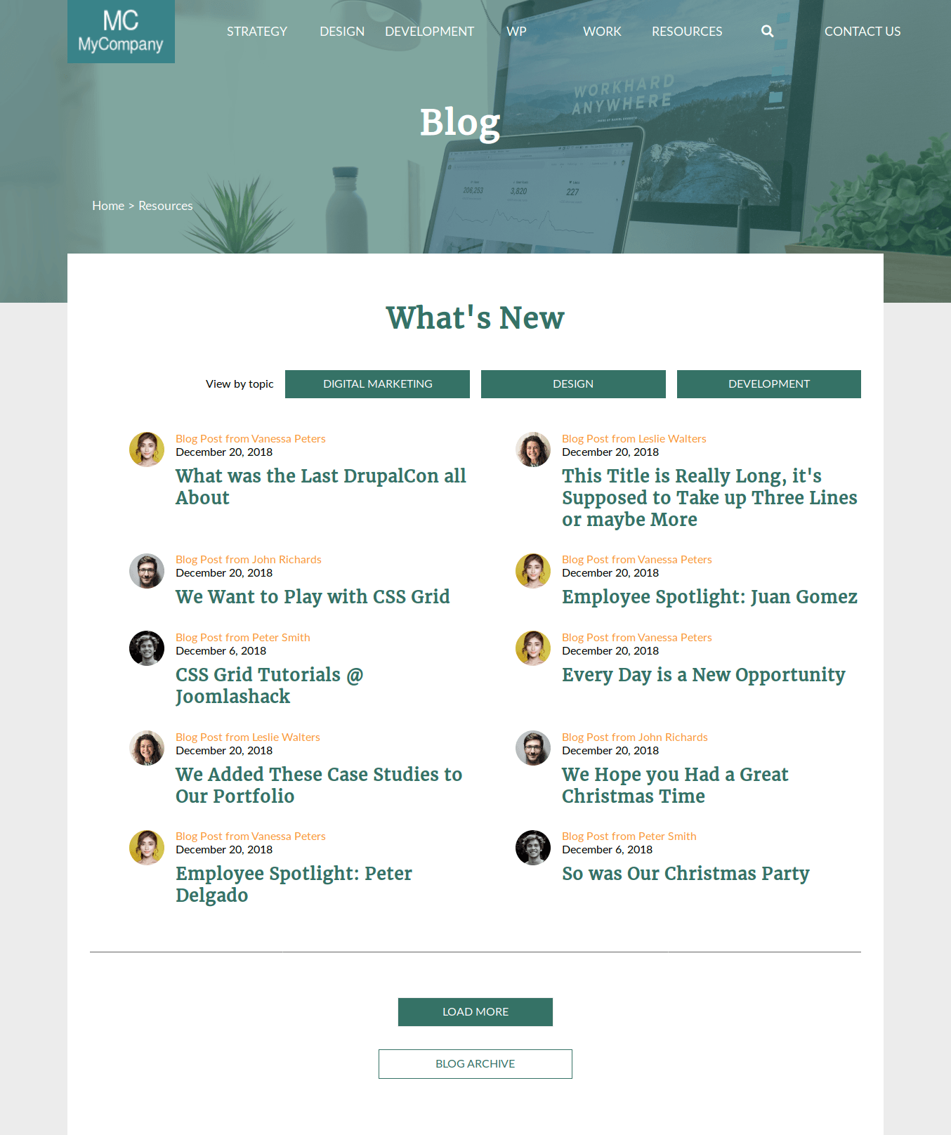
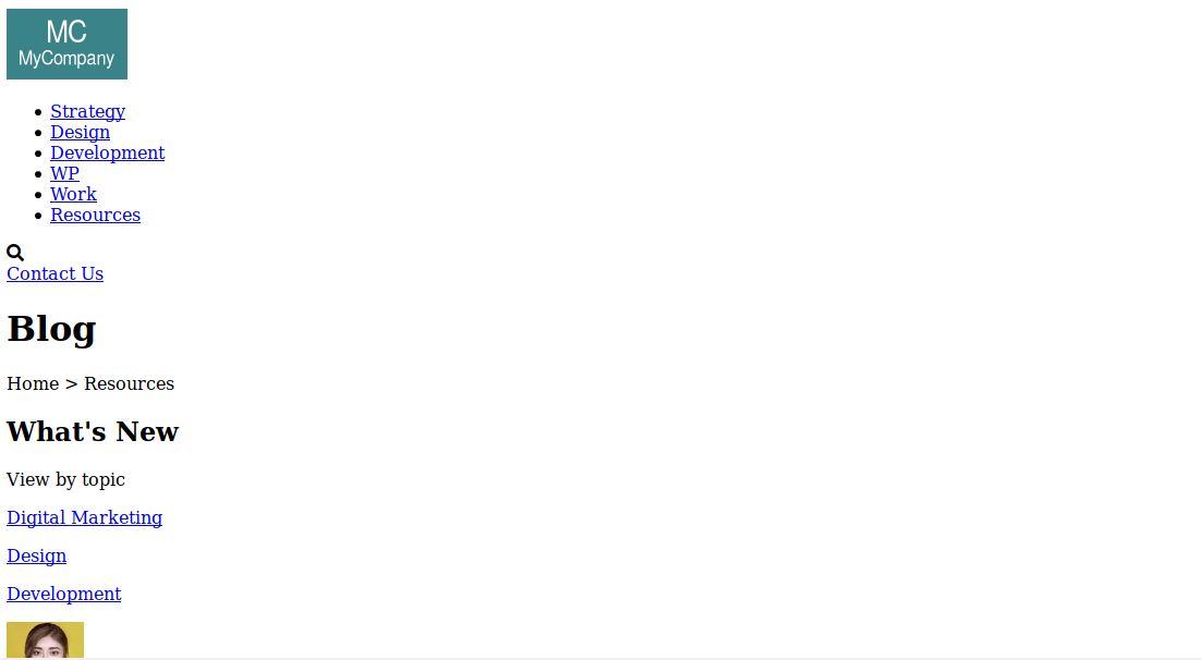
The final result will look like the layout of a “Blog listing” page of a fictional company. The content area overlaps with the main banner, providing a pleasant visual effect.
Let’s start!
Step #1. - The Layout
In order to understand how the layout “works”, it is necessary to break it up in parts.
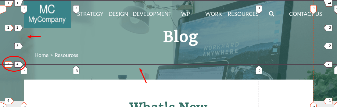
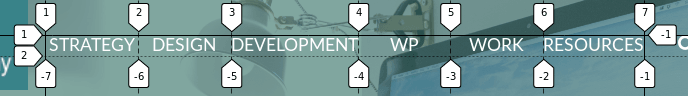
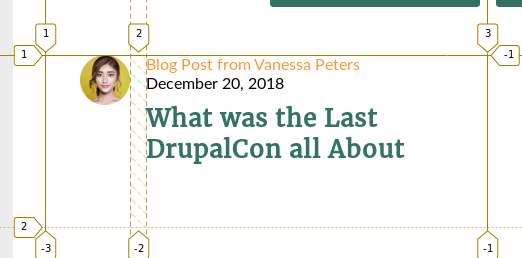
- The main container is a 3-column grid, it has 3 rows. The first and second rows contain the hero section of the site (hero), the content section (content-container) also overlaps the “empty” second row and spans over the third row.
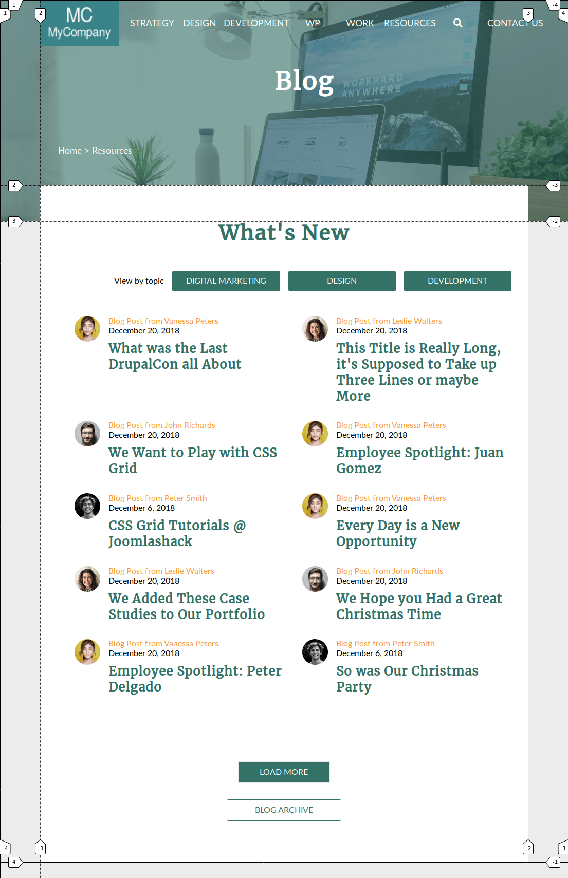
- The
herosection (hero) is a 3x3 nested grid. The size of the columns on both sides is equal to the size of the column on both sides of its parent container, in order to line up thelogoelement with thecontent-container. The background image will be applied to this grid container.
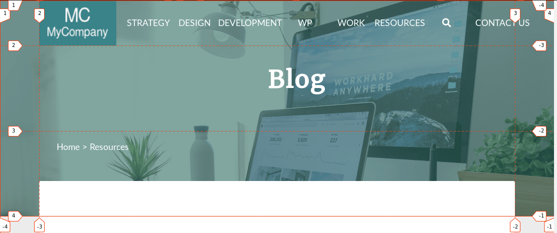
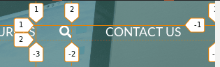
- The
headersection is a grid containing the logo, menu, search area, title, and breadcrumbs. This grid starts on the inline axis at column line #2 from its parent container. It spans on the block axis from row line 1 to row line 3. This grid has 3 columns and 3 rows.
- There are other elements that have to be displayed as grid containers as well, such as the navigation menu, the search area or the teaser container.
Step #2. - The HTML
- Download this file.
- Open up this file in a code editor and copy the HTML code.
- Create an empty HTML file and paste in there the HTML code you just copied.
Notice that inside the head tag of the file, there are already links to Font Awesome, Google fonts, and to the stylesheet (style.css).
Step # 3. - The Basic CSS Styles
- Create a file called style.css.
- Paste this code, in order to add some basic styling:
/* BASIC STYLES */ * { padding: 0; margin: 0; } li { list-style-type: none; } a { text-decoration: none; } body { font-family: 'Lato', sans-serif; background-color: #ececec; } h1, h2, h3, h4, h5, h6 { font-family: 'Merriweather', serif; }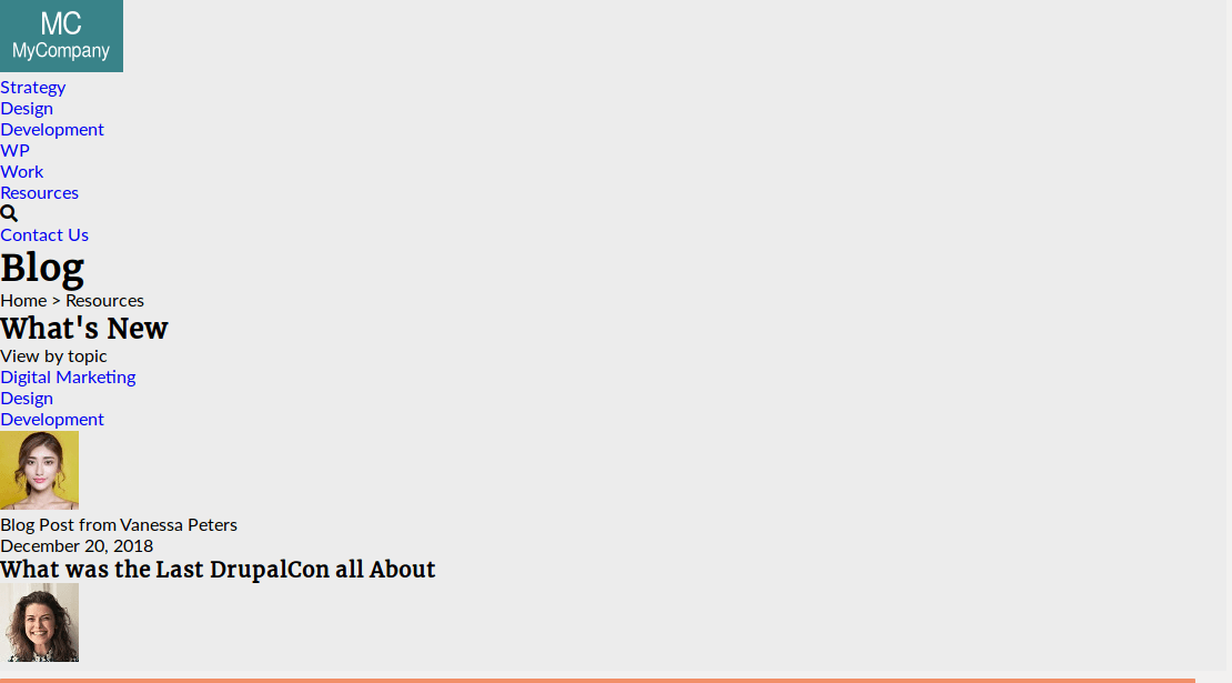
Step # 4. - The CSS Grid Styles
The first element you need to target is the main-container.
- Edit the CSS code:
/* GRID STYLES */ .main-container { display: grid; grid-template-columns: 7vw 1fr 7vw; grid-template-rows: auto 70px auto; }This creates 3 columns. The columns on the left and on the right have been set with the relative unit vw (i.e. 7% of the total vertical width of the viewport). That is about 95px in a 1360px wide screen.
The second row (where the overlapping is going to take place) will be 70px high.
In order to create an empty row, you have to generate content through CSS with the pseudo-classes ::before or ::after in combination with the content property.
- Edit the CSS code:
.main-container::before { content: ""; grid-column: 2 / -2; grid-row: 2 / 3; background-color: #fff; }Your layout still looks broken. That is because you have placed the empty element on the grid, but you still have to place the other two elements (hero and content-container) on their parent grid.
- Edit the CSS code:
.hero { grid-column: 1 / -1; grid-row: 1 / 3; } .content-container { grid-column: 2 / -2; grid-row: 2 / 4; }Notice, that both elements overlap the generated content. The reason is that the content was generated using the ::before pseudo-class, i.e. it appears in the source order before other elements within its container.
If you want a refresher on this subject, take a look at this Joomlashack tutorial.
The hero element has a background image and by default, its height will be 70% of the total viewport height.
- Edit the CSS code:
.hero { grid-column: 1 / -1; grid-row: 1 / 3; background: url(img/banner.png) no-repeat fixed center; background-size: cover; height: 70vh; }The header item is the only child of hero. It starts at column line 2 on the inline axis and at row line 1 to 3 on the block axis. In order to position this item, you have to declare the hero item as a grid container.
- Edit the CSS code:
.hero { grid-column: 1 / -1; grid-row: 1 / 3; background: url(img/banner.png) no-repeat fixed center; background-size: cover; height: 70vh; display: grid; /* ACTING AS A GRID CONTAINER */ grid-template-columns: 7vw 1fr 7vw; grid-template-rows: 90px repeat(2, 1fr); }
The header element is the parent of 5 items. This grid has 3 columns and 3 rows. The height of the grid will be the total height of the hero section minus 70px (the height of the empty row).
- Edit the CSS code:
.header { grid-column: 2 / -1; grid-row: 1 / 3; display: grid; /* ACTING AS A GRID CONTAINER */ grid-template-columns: 2fr 7fr 3fr; grid-template-rows: 90px repeat(2, 1fr); height: calc(70vh - 70px); align-items: center; }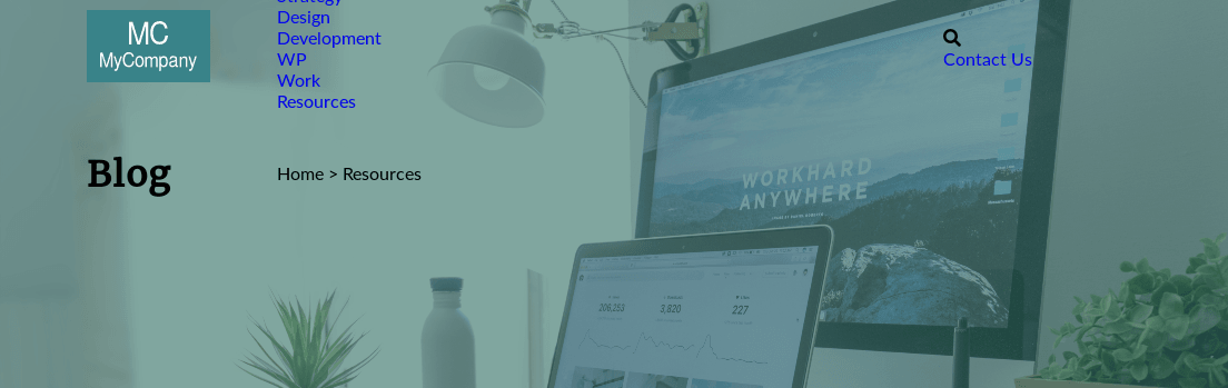
Relocate the title and breadcrumbs items.
- Edit the CSS code:
.title { grid-column: 1 / -1; grid-row: 2; justify-self: center; } .breadcrumbs { grid-column: 1 / 3; grid-row: 3; }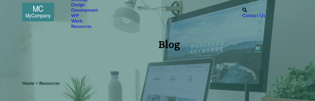
The main navigation menu and the search area are grid containers.
- Edit the CSS code:
.main-menu ul { display: grid; grid-template-columns: repeat(6, 1fr); align-items: center; justify-items: center; } .search-area { display: grid; grid-template-columns: 1fr 4fr; justify-items: center; }
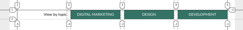
The layout for the upper part (hero) is done. Let’s focus on the content section now. There is a topic-choice section with a title and 3 options. This is a 4-column grid.
- Edit the CSS code:
.topic-choice { display: grid; grid-template-columns: repeat(4, 1fr); grid-column-gap: 1em; align-items: center; }The first paragraph (“View by topic”) is aligned to the right, i.e. at the end of the inline axis.
- Edit the CSS code:
.topic-choice > p { justify-self: end; }Each one of the topic “buttons” (p elements) will be a grid container. Its content will be vertically centered. This will be useful at the moment of declaring a specific height for these containers.
- Edit the CSS code:
.topic { display: grid; align-items: center; }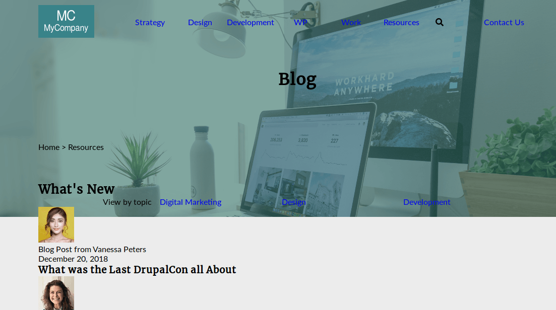
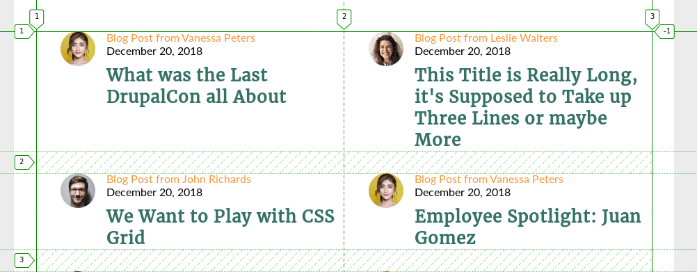
Now you can proceed with the teaser-container and teaser elements. The teaser-container will be a grid with as many 380px columns as they fit on the screen, that is, it is by default responsive. If you want to refresh this concept, take a look at this Joomlashack tutorial.
Each teaser is a 2-column grid. The image is aligned horizontally to the end of its cell. The gap between columns is 1em (approx. 16px).
- Edit the CSS code:
.teaser { display: grid; grid-template-columns: 1fr 4fr; grid-column-gap: 1em; } .teaser-image { justify-self: end; }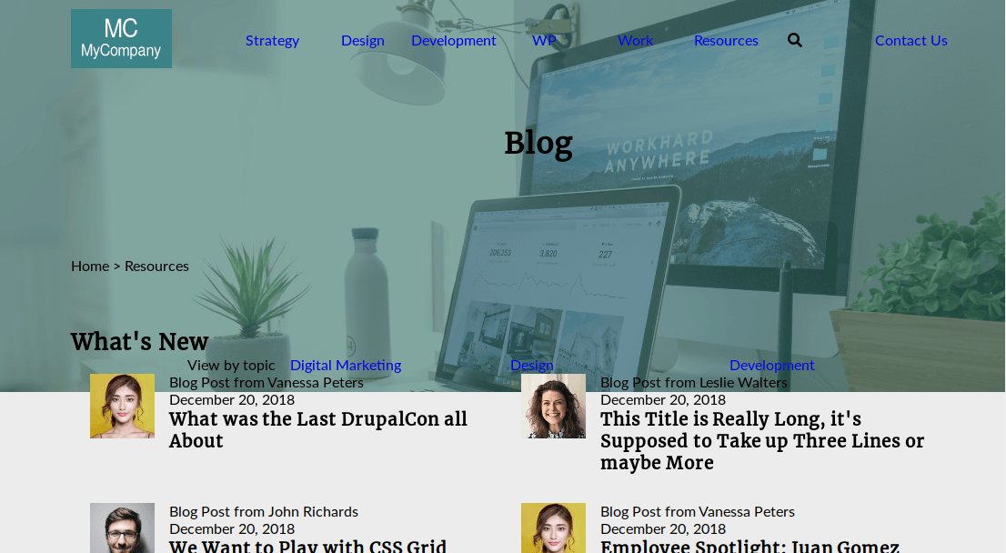
Those are all the CSS Grid styles needed for the layout. Now you have to add some cosmetic styling to match the initial design.
Step # 5. - Other Styles
Apply styles to the logo image and the main navigation links.
- Edit the CSS code:
/* OTHER STYLES */ .logo img { display: block; height: 90px; } .main-menu a, .contact-link a { color: #fff; text-transform: uppercase; font-size: 1.1em; display: block; } .search-icon { color: #fff; font-size: 1.1em; justify-self: end; }The logo image is now as high as its containing row. All menu links have a white color now.
Change the color and font size of the page title. You have to adjust the margin on the right of the title, since its parent container starts 7vw from the left (this is the advantage of relative units - it will always adjust relative to the width of the viewport).
- Edit the CSS code:
h1 { font-size: 3em; color: #ffffff; margin-right: 7vw; }Displace the breadcrumbs item to the left by applying padding to it.
- Edit the CSS code:
.breadcrumbs { font-size: 1.1em; color: #fff; padding-left: 2em; }The content-container has a white background. Its borders are slightly rounded. The main title of this section is centered and each one of the titles has a nice green color.
- Edit the CSS code:
.content-container { background-color: #fff; border-radius: 3px; padding: 3rem 2rem; } .content-container h2 { font-size: 2.5em; color: #357266; text-align: center; margin: 0.5em 0 1em; } .content-container h3 { font-size: 1.5em; color: #357266; }Target the topic-choice section and apply the following styles.
- Edit the CSS code:
.topic-choice { margin: 3em 0; } .topic { background-color: #357266; text-align: center; color: #fff; height: 2.5em; text-transform: uppercase; border-radius: 3px; } .topic a { color: #fff; }Add spacing and styling to the teaser-container and teaser elements.
- Edit the CSS code:
.teaser-container { padding-bottom: 4em; margin-bottom: 4em; border-bottom: 1px solid #f99639; } .teaser-image img {
border-radius: 50%; height: 50px; } .teaser-text p:first-child { color: #f99639; } .teaser-text h3 { margin: 0.4em 0 0; }
Finally, you have to style the last 2 buttons within the call-to-action section. These are regular block elements (divs) with different width sizes and background colors. Both are centered horizontally by declaring the margin: auto property on the left and right sides of the div.
- Edit the CSS code:
.call-to-action p { margin: 2em auto; text-align: center; text-transform: uppercase; line-height: 2.5em; border-radius: 3px; } .call-to-action p:first-child { width: 20%; background-color: #357266; border: 1px solid #ececec; } .call-to-action p:last-child { width: 25%; border: 1px solid #357266; } .call-to-action p:first-child a { display: block; color: #fff; } .call-to-action p:last-child a { display: block; color: #357266; }That’s it! Congratulations! I hope this tutorial helped you practice a little bit more the concepts you’ve learned along this series. Thanks for reading!
The previous 20 posts in this series:
- CSS Grid #1: Everything Joomla users need to get started with CSS Grid
- CSS Grid #2: How to Use the Firefox Grid Inspector with CSS Grid
- CSS Grid #3: Understanding Explicit and Implicit Grids in CSS Grid
- CSS Grid #4: How to Use the Autoflow Property in CSS Grid
- CSS Grid #5: Determining the Size of the Tracks in CSS Grid
- CSS Grid #6: The Auto Keyword and Repeat Notation in CSS Grid
- CSS Grid #7: How to Size Grid Items with the Span Keyword in CSS Grid
- CSS Grid #8: How to Use Line Placing in CSS Grid
- CSS Grid #9: How to Layer Items Inside a CSS Grid
- CSS Grid #10: How to Name Grid Lines
- CSS Grid #11: How to Place Items with Grid Template Areas
- CSS Grid #12: The minmax() Function
- CSS Grid #13: The auto-fill and auto-fit Keywords in CSS Grid
- CSS Grid #14: Centering and Aligning Items in CSS Grid
- CSS Grid #15. The justify-content and align-content Properties
- CSS Grid #16. The grid-auto-flow: dense Property
- CSS Grid #17. Nesting Grids
- CSS Grid #18: How to Build a Dropdown Menu
- CSS Grid #19: Difference Between Grid Containers and Block Containers
- CSS Grid #20: Build a Teaser Gallery with Cards
About the author