Welcome to the 14th tutorial in our series on the CSS Grid.
We are presenting this series to help Joomla developers learn about CSS Grid. The introduction of CSS Grid will be one of the major changes in Joomla 4.
Vertically centering elements on a web page has been an issue for web designers and developers when working with CSS.
Each developer tried their own solution so you can imagine how many possibilities and workarounds refer to this issue. CSS Grid Layout is a bidimensional layout model.
That means it operates with two axes: the block axis, also known as the y-axis and the inline axis, also known as the x-axis.
When dealing with the block axis (vertical), you’ll be using the align property, whereas if you want to align or center on the horizontal axis, you should use the justify property.
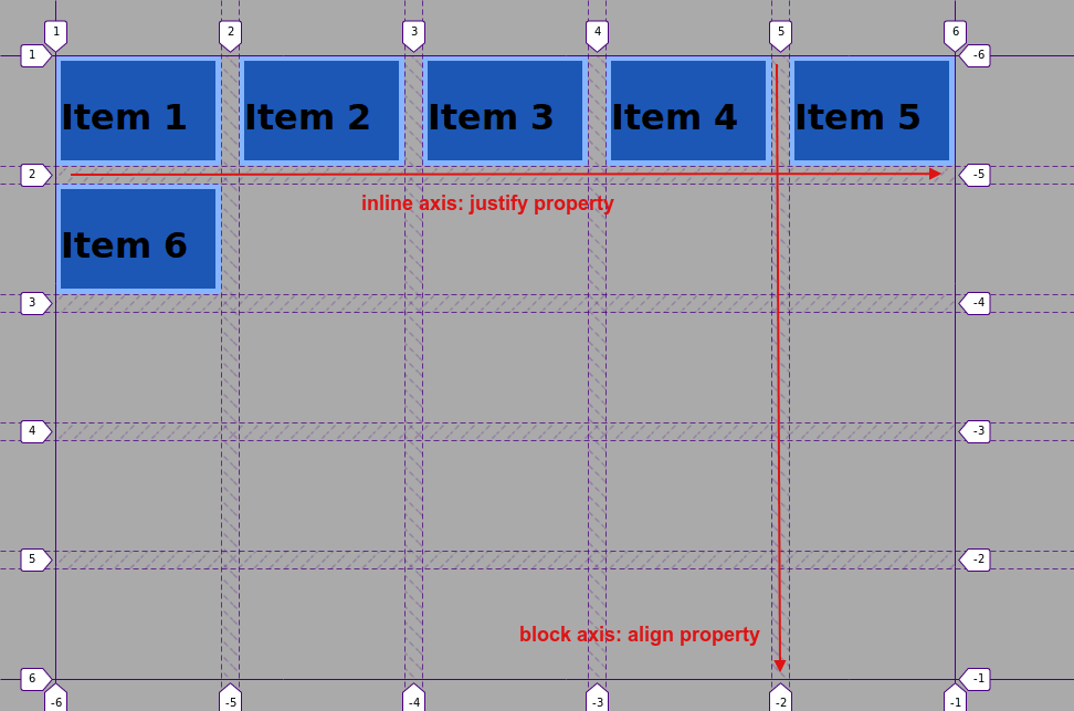
Let’s demonstrate this with an example!
Step #1. Create the HTML
- Open your preferred code editor.
- Create an HTML file and paste the following code:
<div class="container">
       <div class="item item1">Item 1</div>
       <div class="item item2">Item 2</div>
       <div class="item item3">Item 3</div>
       <div class="item item4">Item 4</div>
       <div class="item item5">Item 5</div>
       <div class="item item6">Item 6</div>
   </div>
Step #2. Create the CSS
- Create a CSS file and link it to your HTML file.
- Add the following global styles:
/* GLOBAL STYLES */

   * {
       box-sizing: border-box;
       }

   body {
   background-color: #AAA;
   margin: 50px;
   }

   .item {
   border: 5px solid #87b5ff;
   border-radius: 3px;
   font-size: 2em;
   font-family: sans-serif;
   font-weight: bold;
   background-color: #1c57b5
   }
Step #3. Create the CSS Grid
Create a grid with 5 columns and 5 rows. Each column will have a width of 150px and each row will have a height of 100px. The gap between columns and rows will be 1rem (that is about 16px in a desktop screen).
.container {
   display: grid;
   grid-gap: 1rem;
   grid-template-columns:  repeat(5, 150px);
   grid-template-rows: repeat(5, 100px);
   }
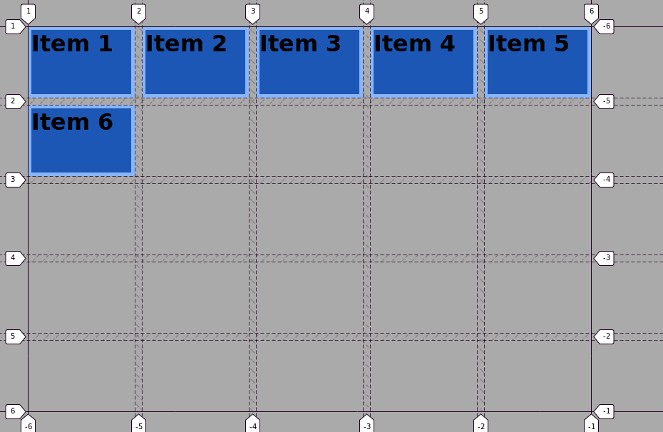
Now, place the items on different areas of the grid with help of the grid-column and grid-row properties and the numbered lines in the grid.
- Edit the CSS code:
   .item1 {
       grid-row: 1 / 3;
   }

   .item2 {
       grid-column: 2 / 4;
   }

   .item3 {
       grid-row: 1 / 4;
       grid-column: 4 / 5;
   }

   .item4 {
       grid-row: 2 / -2;
       grid-column: 5 / -1;
   }

   .item5 {
       grid-row: 4 / -1;
       grid-column: 2 / 4;
   }

   .item6 {
       grid-row: 3 / -1;
   }

Step #4. The align-items property
This property is used at the grid container level. As already stated, the align deals with the vertical (block) axis.
- Edit the CSS code:
.container {
   display: grid;
   grid-gap: 1rem;
   grid-template-columns:  repeat(5, 150px);
   grid-template-rows: repeat(5, 100px);
   align-items: center;
   }
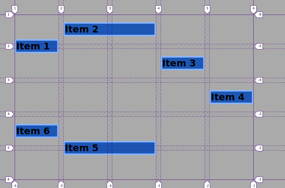
As you can see, now all items have a height value of auto. This means they are as tall as the content inside them.
All items are vertically centered within their respective grid area (the ones you defined by placing grid items with line numbers).
These are some of the values you can pass to the align-items property:
startendstretch
Edit the CSS code, in order to test these values:
.container {
   display: grid;
   grid-gap: 1rem;
   grid-template-columns:  repeat(5, 150px);
   grid-template-rows: repeat(5, 100px);
   align-items: start;
   }
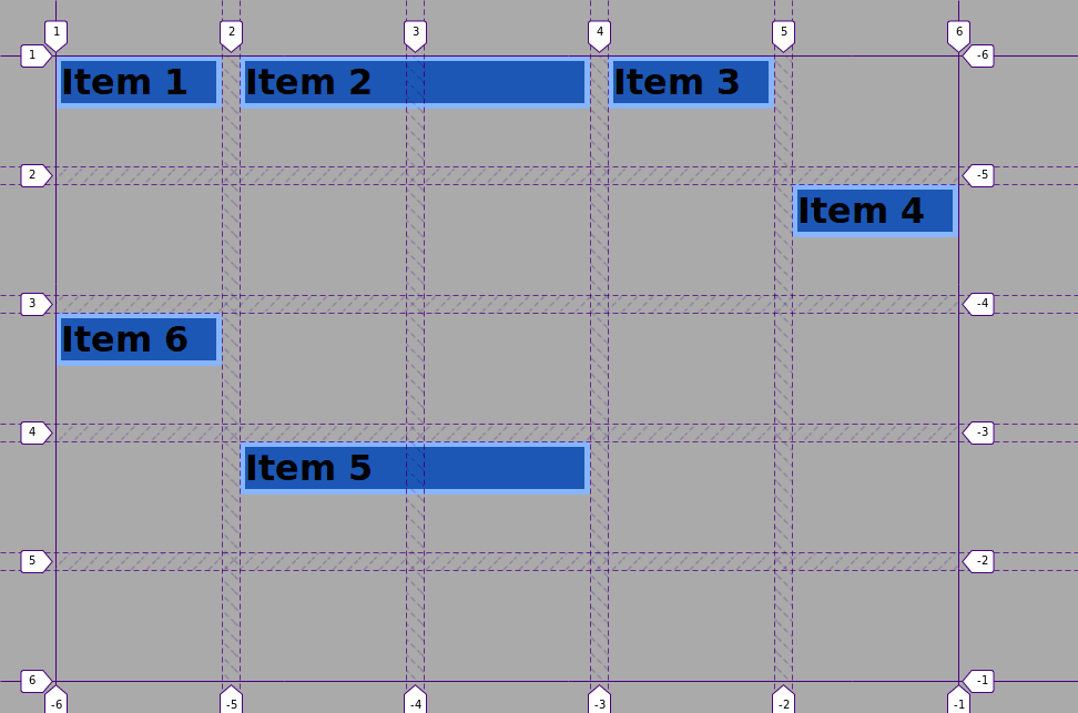
Each item is now placed at the start of its corresponding grid area.
Setting the value of the align-items property to end will place the items (vertically) to the end of their corresponding grid areas.
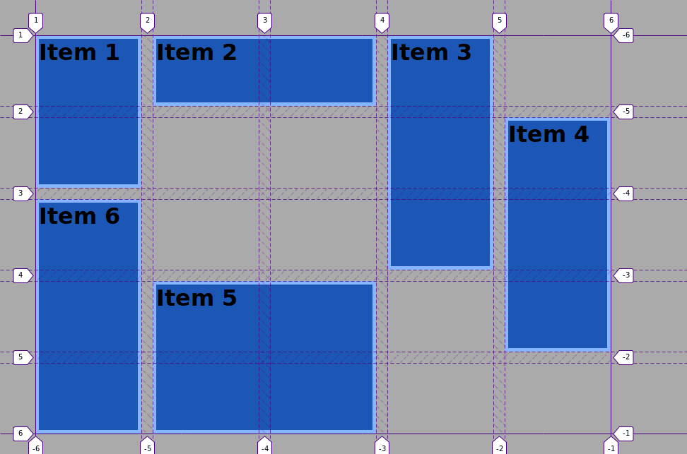
The value assigned to the stretch will stretch the items across the whole area.
Edit the CSS code once again:
 .container {
   display: grid;
   grid-gap: 1rem;
   grid-template-columns:  repeat(5, 150px);
   grid-template-rows: repeat(5, 100px);
   align-items: stretch;
   }
Step #5. The justify-items property
The justify-items property accepts the same values and works pretty much the same as the align-items property but on the inline (horizontal) axis.
- Edit the CSS code:
   .container {
   display: grid;
   grid-gap: 1rem;
   grid-template-columns:  repeat(5, 150px);
   grid-template-rows: repeat(5, 100px);
   align-items: center;
   justify-items: center;
   }
As you can notice, the items are now as high and as wide as the content inside of them. Moreover, they are perfectly placed in the center of their respective grid areas.
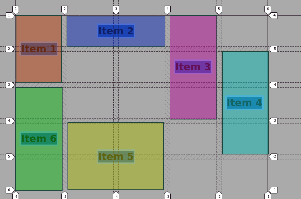
This is the basic usage of the justify-items and align-items properties.
But what if you want to target just one item, in order to align and/or center it? For those cases, you should use the align-self and justify-self properties at the item level.
Step # 6. The align-self and justify-self properties
These properties are used at the item level.
- Edit the CSS code:
   .item2 {
       grid-column: 2 / 4;
       justify-self: stretch;
   }

   .item3 {
       grid-row: 1 / 4;
       grid-column: 4 / 5;
       align-self: stretch;
   }

   .item4 {
       grid-row: 2 / -2;
       grid-column: 5 / -1;
       align-self: end;
   }
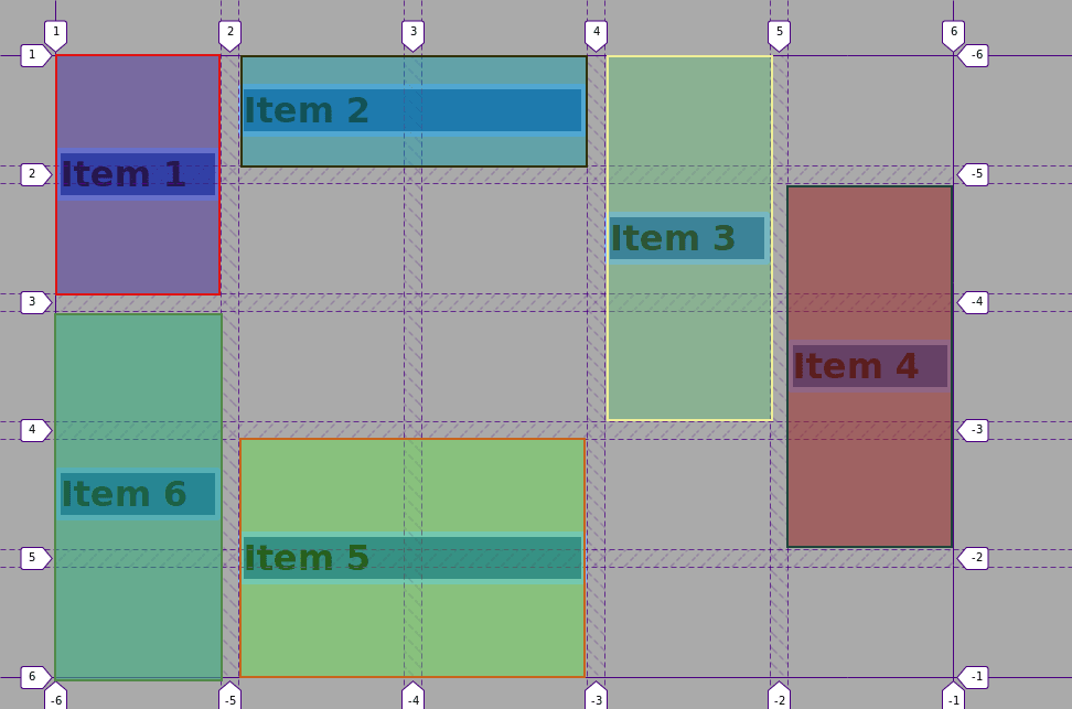
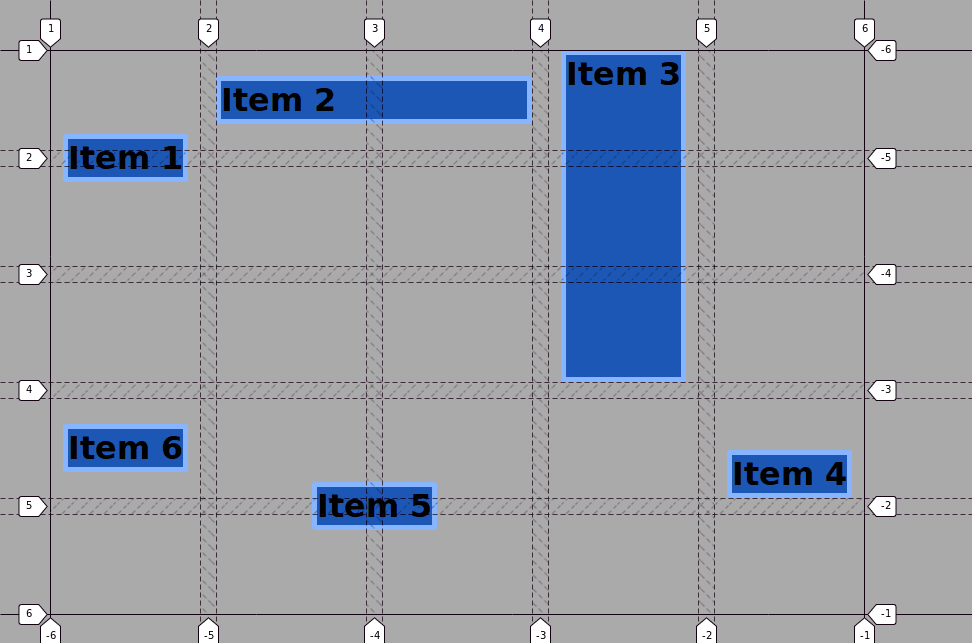
Item 2 stretches across the whole grid area along its horizontal axis (justify).
Item 3, on the other hand, stretches vertically along the block axis and item 4 has been placed vertically to the end of its grid area.
The other items (1, 5 and 6) are placed according to the properties declared at the grid container level.
The align and justify properties in CSS will allow you to center and align items relative to their containing grid area in a comprehensive way with less code than trying to align the items with other layout methods.
Thanks for reading!
The previous 13 posts in this series:
- CSS Grid #1: Everything Joomla users need to get started with CSS Grid
- CSS Grid #2: How to Use the Firefox Grid Inspector with CSS Grid
- CSS Grid #3: Understanding Explicit and Implicit Grids in CSS Grid
- CSS Grid #4: How to Use the Autoflow Property in CSS Grid
- CSS Grid #5: Determining the Size of the Tracks in CSS Grid
- CSS Grid #6: The Auto Keyword and Repeat Notation in CSS Grid
- CSS Grid #7: How to Size Grid Items with the Span Keyword in CSS Grid
- CSS Grid #8: How to Use Line Placing in CSS Grid
- CSS Grid #9: How to Layer Items Inside a CSS Grid
- CSS Grid #10: How to Name Grid Lines
- CSS Grid #11: How to Place Items with Grid Template Areas
- CSS Grid #12: The minmax() Function
- CSS Grid #13: The auto-fill and auto-fit Keywords in CSS Grid
Get our CSS Grid Explained Book
All Joomlashack Pro members get access to our "CSS Grid Explained" book. All you need to do is sign up for a Joomlashack extension, template or training membership.
In this short book, you are going to master the key ideas behind CSS Grid. This book is in the best traditions of OSTraining. There are no long-dense paragraphs of theory. You pick up the book and you start writing code immediately.
In the first chapter, we start with the basic terminology. You'll learn the difference between Grid Areas and Grid Cells, between Grid Tracks and Grid Gaps.
Then, using a hands-on approach, you'll start building CSS Grids. There are 9 different exercises in this book. You'll build everything from the most basic CSS Grid to a full site layout.


