The "Navigation" tab in Shack Slides helps you customize your slideshow's navigational tools.
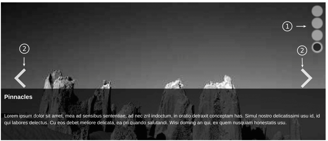
Shack Slides navigation has two key options and you can see both in the image below
- The slideshow navigation bar.
- The slideshow previous/next buttons.
This video and text guide will show you how to customize your slide navigation.
Video guide to Shack Slides navigation
#1. The slideshow navigation bar
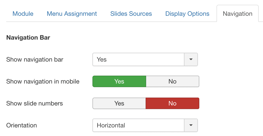
- Show navigation bar: Select whether you want to use the navigation bar or not.
- Show navigation in mobile: The navigation will be small on mobile devices. Should it still be shown?
- Show slide numbers: Select whether you want to display slide numbers along each navigation dot.
- Orientation: Select between the horizontal and vertical orientation of your the navigation bar.
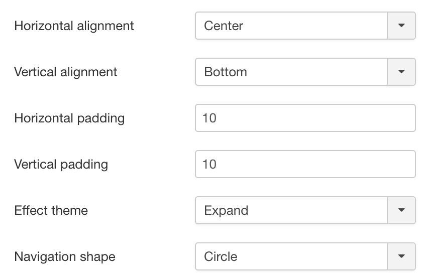
- Horizontal alignment: Select the horizontal alignment within the slider for the navigation bar:
- Left
- Right
- Center
- Vertical alignment: Select the vertical alignment within the slider for the navigation bar:
- Top
- Bottom
- Center
- Horizontal padding: Add some horizontal padding within the slider to position the navigation bar.
- Vertical padding: Add some vertical padding within the slider to position the navigation bar.
- Effect theme: Select between one of the pre-defined effect themes for the navigation bar:
- None
- Static
- Expand
- Blur
- Pulse
- Hover Inside
- Show up
- Hover delay
- Navigation shape: Select between one of the predefined shapes for the navigation bar:
- None
- Square
- Circle
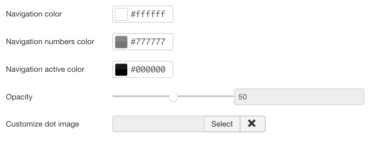
- Navigation Color: Select the color you want to use for the navigation bar.
- Navigation numbers color: Select the color you want to use for the navigation bar numbers.
- Opacity: Select an opacity for the navigation bar.
- Customize dot image: Customize the dots by uploading an image file.
- Customize hover dot image: Customize the hover of dots by uploading an image file.
- Customize active dot image: Customize the active dot by uploading an image file.
#2. The slideshow previous/next buttons
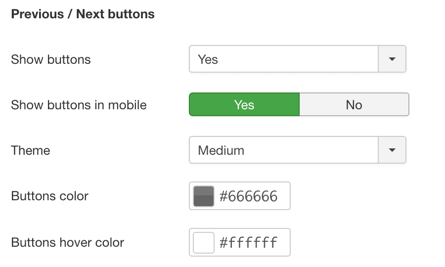
- Show Buttons: Select whether you want to use the next/prev buttons or not?
- Theme: Select between one of the predefined themes for the buttons:
- None
- Thin
- Medium
- Fat
- Buttons Color: Select the color you want to use for the buttons.
- Buttons Hover Color: Select the hover color you want to use for the buttons.
- Opacity: Would you like to use opacity on the previous/next buttons?
- Customize previous button image: Customize the previous button by uploading your own image file.
- Customize hover previous button image: Customize the hover of the previous button by uploading your own image file.
- Customize next button image: Customize the next button by uploading an image file.
- Customize hover next button image: Customize the hover of the next button by uploading an image file.
