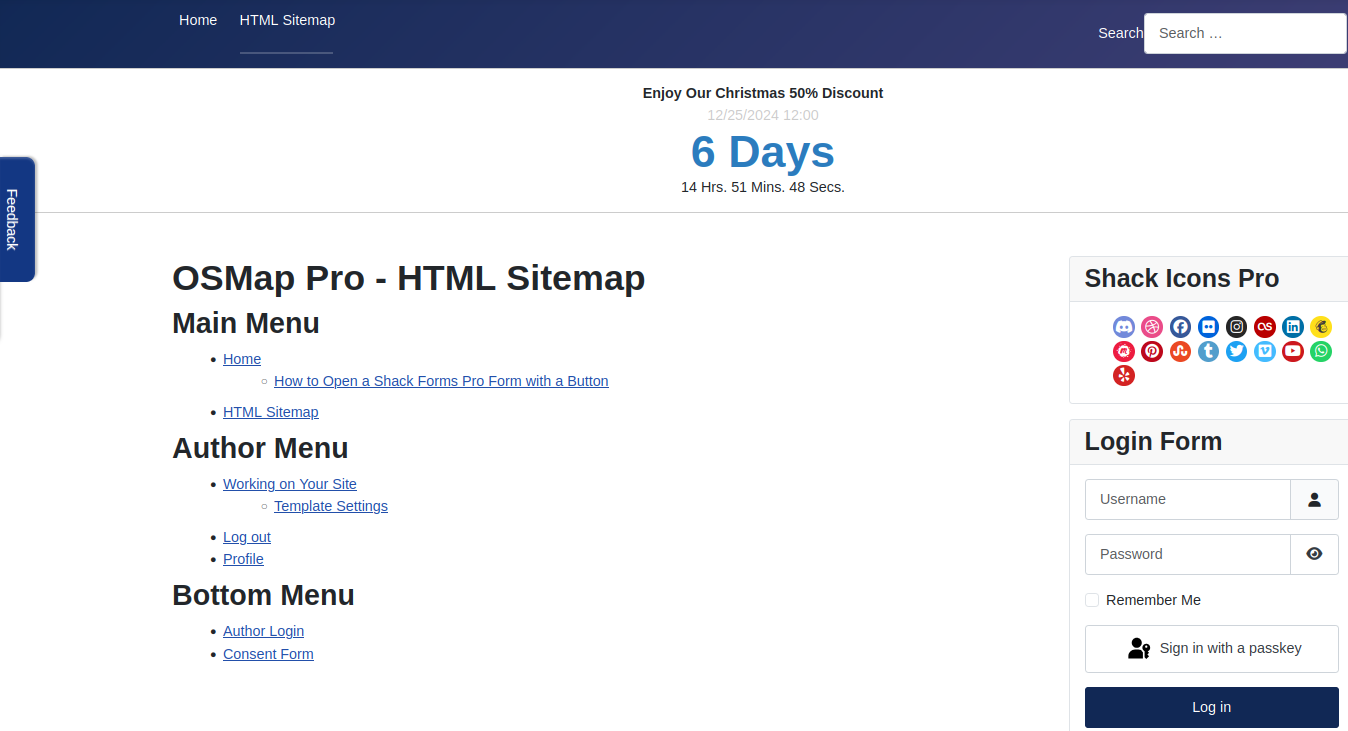
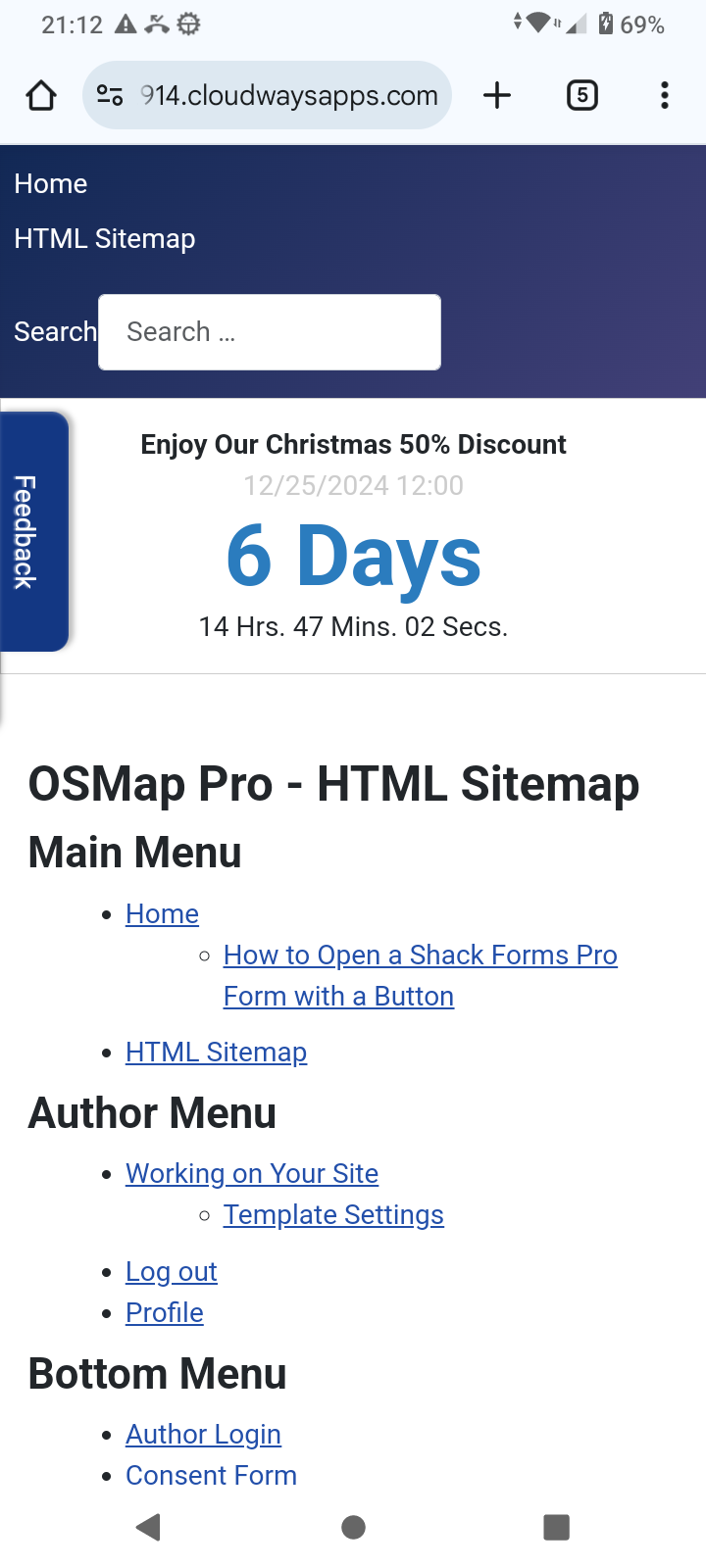
Yes, the HTML sitemap generated by OSMap is responsive. It automatically adapts to your website's layout, ensuring it looks good on devices of all sizes, including desktops, tablets, and mobile phones.
Here is a demo of an OSMap HTML sitemap viewed with a desktop screen:

Here is the same HTML sitemap viewed with an Android device:

This responsiveness is largely achieved because the OSMap component uses Joomla's native framework and adheres to its template styling rules.
However, there are a few points to consider:
- The appearance of your OSMap HTML sitemap relies on your Joomla site's template.
- The OSMap HTML sitemap will inherit those responsive styles if your template is responsive (most modern Joomla templates are).
- If the default styling doesn't suit your needs, you can easily tweak it by adding custom CSS to your template.
- Testing the sitemap on different devices and screen sizes is a good idea. Tools like Google Chrome's Developer Tools (Responsive Design Mode) or online services like BrowserStack can help verify how the sitemap renders.
- If you notice any issues or need assistance tweaking the sitemap for responsiveness, please get in touch with your template provider.
