Joomlashack's Wright framework now has an improved mobile menu system. If your site navigation includes submenus, they will be hidden until you click on the new toggle button. This feature was requested by a good number of users.
This feature works for menus in the following template positions:
- The toolbar
- The menu
- The bottom menu.
These are the module positions that you will find in all Joomlashack templates.
In this post, I'll give you an overview of how this mobile feature works.
- Visit our Wright template demo site using your smartphone, or resize your desktop browser window to a maximum of 979 pixels width.
- Open one of your navigation menus.
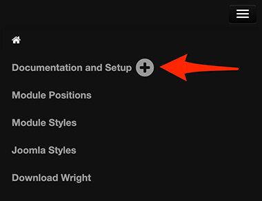
- Click on the plus icon next to a menu item title:

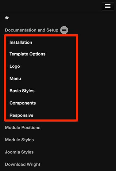
- You will see the submenu of this menu item opened:

- Close the submenu by clicking on the minus icon once again.

