Back in August, we took a first look at Joomla 4.
This was part of a series of posts on Joomla that have also covered the new Media Manager and the new installer.
Overall, I was really impressed with Joomla 4 ... except for the administrator template. The admin screens were not well-designed.
Well, I now have much better news! The first alpha version of Joomla 4 has just arrived, and the Joomla team are making great progress on the admin area.
Elisa Foltyn has a post in the Joomla Magazine with screenshots from the new admin.
You can try the new admin area by clicking this link. Give it a go!
The admin area is based on a new Joomla pattern created by Chiara Aliotta. Click here to see the pattern. You'll be impressed!
By the way, did you know that Chiara designed the OSTraining logo and book series?
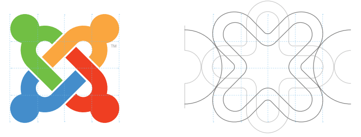
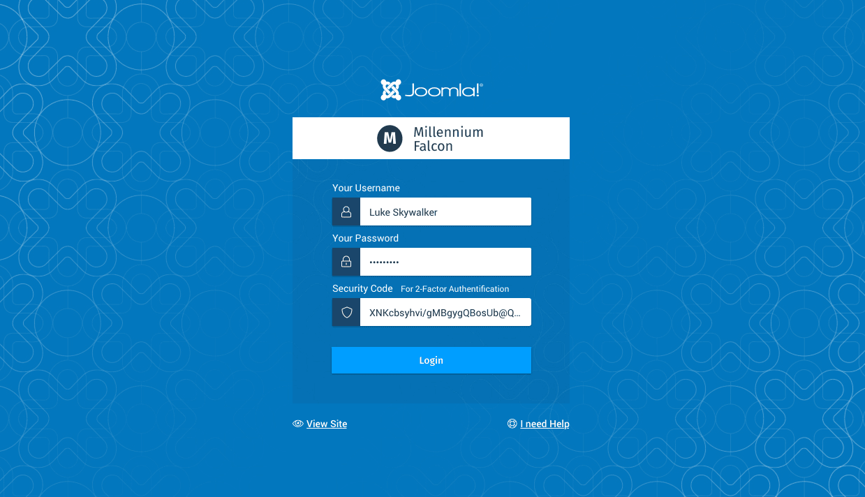
This pattern is shown on the Joomla 4 admin login screen:
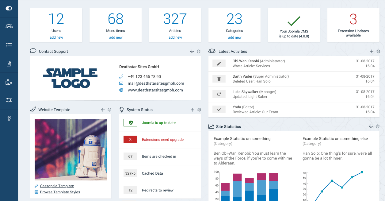
Inside the admin area, you'll see screens that are much cleaner than Joomla 3. Notice that the Joomla pattern is also showing in the background of these screens. Here's the dashboard:
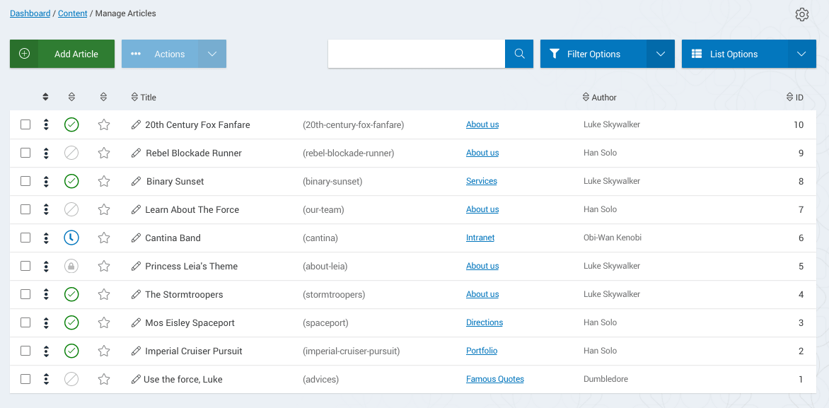
Here's the main article screen:
All-in-all, this is a very encourgaging design direction. The template isn't live yet, but you can see it's under active development. Check the feedback under Elisa's post ... I haven't seen such positive feedback for a new Joomla feature in years.

