
We recently wrote that Joomla 4 will adopt CSS Grid. This generated a really positive response from Joomlashack readers, many of whom are excited to use CSS Grid in Joomla.
So we decided to write some tutorials about the CSS Grid, helping everyone get up to speed.
If you haven't done so yet, please read our first two tutorials before reading this one:
In this third article, we'll explain the difference between implicit and explicit grids. Understanding the difference is the key to successfully placing rows and columns with CSS Grid.
What Are Explicit and Implicit Grids?
To understand explicit and implicit grids, it's useful to quickly recap the code we've written so far. The HTML code we've been using for these tutorials is shown below. This code places 9 items inside a container:
<div class="container">
       <div class="item">1</div>
       <div class="item">2</div>
       <div class="item">3</div>
       <div class="item">4</div>
       <div class="item">5</div>
       <div class="item">6</div>
       <div class="item">7</div>
       <div class="item">8</div>
       <div class="item">9</div>
   </div>
The CSS code creates a grid container and 3 columns inside that container. The distance between rows and columns (gap) is 20 px.
.container {
       display: grid;
       grid-template-columns: 100px 100px 100px;
       grid-gap: 20px;
   }
The browser places the fourth item on the second row. The second and third rows are implicit tracks. You can tell by the dotted style of the horizontal grid lines.
- Let’s define explicitly the rows in the grid with the grid-template-rows property:
.container {
       display: grid;
       grid-template-columns: 100px 100px 100px;
       grid-template-rows: 60px 60px 60px;
       grid-gap: 20px;
   }
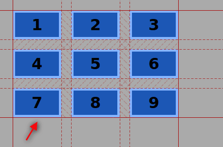
The explicit grid has now three columns and three rows. You can tell this by using the Firefox Grid Inspector to check the continuous line “closing” the grid at the bottom, after the third row:
- Add two more items inside the grid container in the HTML code.
<div class="container ">
       <div class="item ">1</div>
       <div class="item ">2</div>
       <div class="item ">3</div>
       <div class="item ">4</div>
       <div class="item ">5</div>
       <div class="item ">6</div>
       <div class="item ">7</div>
       <div class="item ">8</div>
       <div class="item ">9</div>
       <div class="item ">10</div>
       <div class="item ">11</div>
</div>- Save, refresh and check the Grid Inspector again.
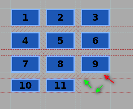
There is still a line marking the end of the explicit grid after the third row (red arrow). The new elements were positioned by the browser in an implicit track (green arrows), because there are more items than grid cells.
In other words, you don’t have to declare each track and place each item manually on the grid. Web browsers are capable of placing these extra items in a logical and ordered way, according to the CSS Grid Specification.
The height of the row is determined by the content inside the item. To let the browser generate rows with a particular height, use the grid-auto-rows property.
.container {
       display: grid;
       grid-template-columns: 100px 100px 100px;
       grid-template-rows: 60px 60px 60px;
       grid-auto-rows: 60px;
       grid-gap: 20px;
   }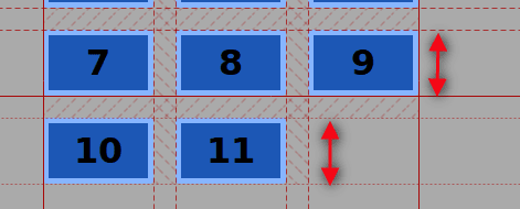
Because we've taken this approach, every new generated row will have a default (minimum height) of 60px.
Please note that the following CSS code won’t work on Firefox, but it will do on Webkit browsers such as Chrome:
.container {
 display: grid;
 grid-template-columns: 100px 100px 100px;
 grid-template-rows: 60px 60px 60px;
 grid-auto-rows: 60px 90px;
 grid-gap: 20px;
 }
This tutorial showed the difference between the concept of explicit grid and implicit grid. It is important to understand the way web browsers position elements in the explicit grid through a placement algorithm.
Get our CSS Grid Explained Book
All Joomlashack Pro members get access to our "CSS Grid Explained" book. All you need to do is sign up for a Joomlashack extension, template or training membership.
In this short book, you are going to master the key ideas behind CSS Grid. This book is in the best traditions of OSTraining. There are no long-dense paragraphs of theory. You pick up the book and you start writing code immediately.
In the first chapter, we start with the basic terminology. You'll learn the difference between Grid Areas and Grid Cells, between Grid Tracks and Grid Gaps.
Then, using a hands-on approach, you'll start building CSS Grids. There are 9 different exercises in this book. You'll build everything from the most basic CSS Grid to a full site layout.

