
Welcome to the third post in our series about Widgetkit, the Joomla toolkit from YOOtheme.
In the previous post, we created some widgets to show photo galleries and maps. In this post, I'm going to show you how to create more widgets, including X / Twitter integration, a Grid Stack display of articles and a slideshow.
Overview of Widgetkit integrations
By default Widgetkit allow you to pull from all core Joomla data sources. If you use a CCK like K2 or Zoo (YOOtheme’s own CCK), Widgetkit will discover these automatically and allow them to be used as a source.
Some extension developers also provide Widgetkit integrations: Zoolander is one example.
You can even build your own integrations if you’re skilled enough: the Yootheme documentation provides some examples.
Example 1: X / Twitter integration
X / Twitter is Widgetkit data source, which means that you can display your Tweets in any format you would like, simply by selecting a presentation type. Let’s keep things simple for this example and use a Grid, which is probably the most appropriate use for X / Twitter.
- Go to your Widgetkit component, click New.
- Select X / Twitter as the source and Grid as the presentation type.
- Source: Either a X / Twitter user or a search term, such as a hashtag. In this case I simply chose the @ostraining X / Twitter account. Also I only chose tweets with media attached.
- X / Twitter API: In order to make the Widget work with X / Twitter, it needs access to the X / Twitter API. For this, you have to request a Pincode, which is basically just clicking on the button in the Widget.
- Settings: This allows you to style your X / Twitter widget and create a nice grid. If you use the Widget in a sidebar, 1 column is probably fine, but I used the Widget in a separate page, so I made a 4-column widget. Also you can specify whether you want all details from the Tweets or just a few.
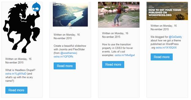
In my case this resulted in a nice grid of 4 columns, nicely displaying the latest Tweets with images attached. Even in my Protostar template this gives me a really nice view:
Example 2: Joomla article integration with a Grid Stack
Now we are actually going to use Widgetkit to display some articles in an elegant way.
First, you need some existing articles on your site. I just created 4 articles with some dummy text and an intro image from the demo images supplied with every Joomla install.
- Go to your Widgetkit component, click New.
- Select Joomla as the source and Grid Stack as the presentation type.
This will give us a display where the articles are shown in rows, with the image either aligned left and right.
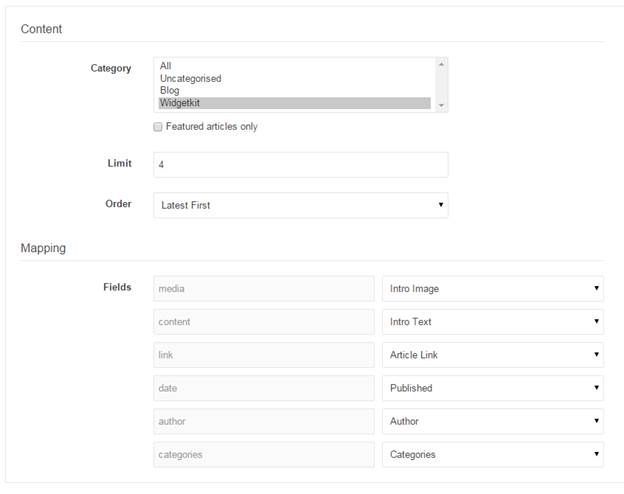
The Content settings are really easy now, as I already have my content in Joomla. I just have to specify the category from which I want to pull the articles. I can also specify how many articles I want to show, how they are ordered and what the mappings are:
Again we use the Settings tab to tell Widgetkit how are widget needs to be formatted. Most of the defaults are often fine, or enough to use as a start. In this case, I did some minor tweaks by setting a fixed size for the images to obtain a standard look (which nicely crops a portion of the images, with aspect ratio intact).
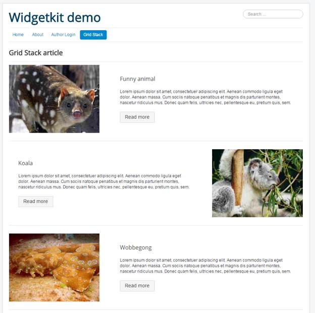
The only thing I would like to be added to Widgetkit is the ability to set the Read More setting from the widget. Currently it simple respects the Read More that you choose in the Joomla article.
Example 3: Joomla integration with a Slideshow
In the third example, I'm going to use the same set of articles that I used to create the Grid Stack, but now I am going to build a Slideshow:
Create a new widget, select your Joomla Category again and build the layout from the Settings tab again. I mainly left the defaults as they were, except for a Thumbnail navigation. In this case this resulted in a very nice display of my articles in a slideshow with the image as a background and the text in an overlay. The images of the other articles are used as the navigation between the articles in the slideshow:
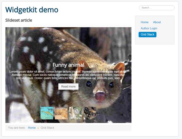
You see, 2 completely different layouts from the same source. Just as easily, you can build Tabbed navigations or a Parallax module. Also, these layouts were created extremely easily and quickly, in just a few minutes.
Good luck with building your own Widgetkit widgets!
