Part 1: The making of the design.
It was in the air that something new at Joomlashack was about to happen and finally here we are: a brand new website and identity were unveiled last week. For all the Shack aficionados (or users); this new look is a big move, but for us at Joomlashack it was about time to refresh our identity.
Joomlashack is one of the oldest clubs in the Joomla! community. Since 2005, the team has been working hard to bring high class templates and extensions to our industry and raise the quality of Joomla! websites. I joined the team last year and Eddie, CEO at Joomlashack, shared with me his wish to finally go for a major change of the Joomlashack identity.
This is how the story started and I am thrilled to share with you the details in this post.
Like Antoine de Saint-Exupéry, a French aviator and writer of the famous book, “The Little Prince”, we will fly over the new website to discover its most secret and hidden corners. Let’s start!
Let’s pack our bags
1) The brief
Usually, when a designer starts a new project, the first question is, “Do you have a brief? Do you have something specific in mind?”
A brief is not a Santa Clause wish-list; it is an important tool for us designers to understand business objectives and limits. The more accurate it is, the easier it is for a designer to come up with a great, effective solution.
We had different meetings and exchanged emails with the team to better define the goals and objectives we wanted to accomplish.
After so many years of Joomlashack having the same look, there was a strong and extremely obvious desire to go for something completely different, highly competitive and relevant; something that could place a milestone in Joomlashack history.
Based on these chats, wishes and initial information, I moved on to create a map of priorities and goals, collect some values, define a specific user group, and start designing.
I came up with three different proposals, but just one hit the target.
2) Inspiration and idea
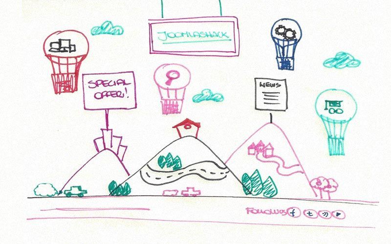
The design you now see online came from a sentence that you could spot here and there on the old Joomlashack website, and most of you probably remember it. It said: “The best templates and extensions in the Joomlasphere”.
I did love the originality of this expression, and I really fell in love with the word “Joomlasphere”. I said: “You could create a world out of this word!”. And so I did!
It was extremely fun imagining how the world around the “Shack” could be. So I started designing a marvelous place, beautiful and happy, surrounded by green mountains and rivers, and at the top of it, there was a small, cute shack, the Joomlashack’s shack, in fact. Around this imaginary world, there are some flying objects, the Joomlashack products, floating in the air with their colorful balloons.
3) Color Scheme
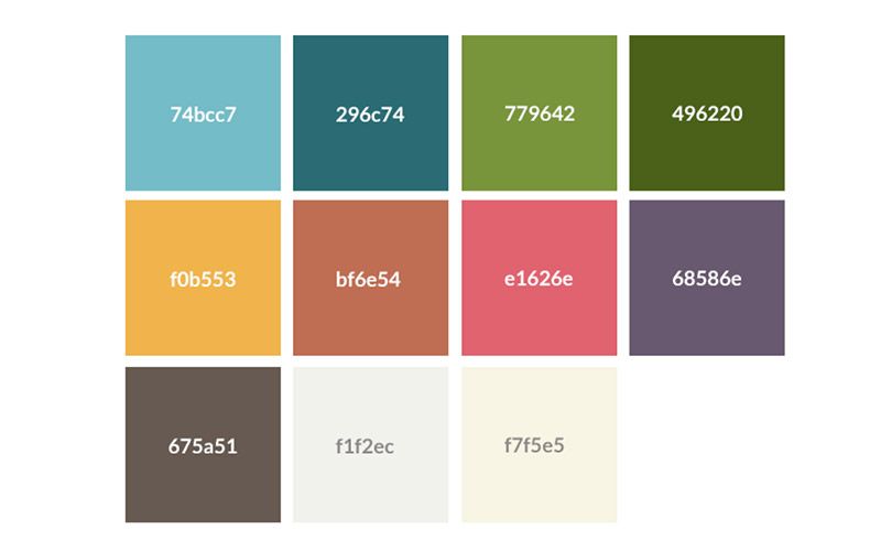
We decided to completely get rid of the black in the old website and keep green as the unique and official corporate color. Today, Joomlashack’s color palette is extremely wide. However, a color scheme has been defined in order to have some general guidelines.
Generally, the colors are bright, vivid and they confer a joyful look to the entire website.
4) Typography
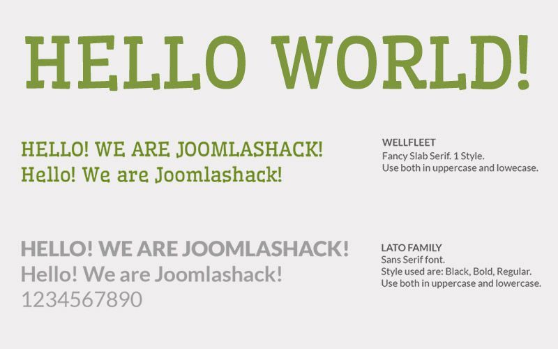
In order to keep the spirit of our website high, I decided to try a fancy combination of fonts: Wellfleet, by Riccardo De Franceschi, a pretty irregular Slab Serif font, used mostly for headings and banners, and Lato, a clean, conventional Sans Serif font designed by Łukasz Dziedzic, used mostly for all the text on the site that requires high legibility and clarity.
Oh! All the places you’ll go!
Home Sweet Home
When you browse our website, you are welcomed to a beautiful, colorful and radiant page: the Jooomlashack world.
The design is extremely lively and it is normal that, at the beginning, you feel a bit lost, especially if you were visiting our old site frequently.
However, as a user and our guest, you can try two paths. The simpler one is to click on the top menu and easily have access to all our pages, but if you feel more like Indiana Jones, you will love discovering all the clickable links embedded in the design and seeing where they bring you. It’s all up to you and how you want to experience the site!
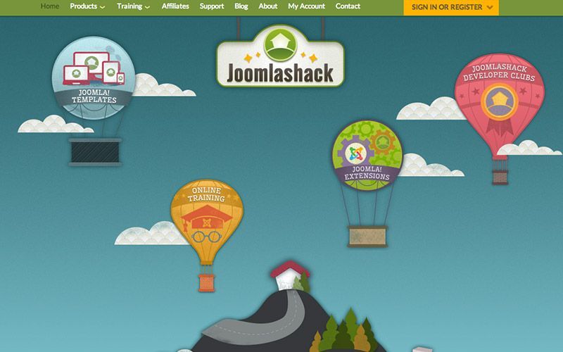
At the top part of the homepage, over the mountains, you will bump into some floating elements: those are our products. Templates, Extensions, Joomlashack University (now powered by OSTraining) and Developer Clubs have now turned into colorful hot-air balloons.
If you are wondering why balloons and not something else, well, I have an answer for this, in the words of Wikipedia, “hot-air balloons are the most ancient, successful human carrying technology”. I really like this analogy to represent our cool products! And since they are floating in the air and travelling from place to place, I think they represent Joomlashack’s mission, which is about releasing great and reliable everyday products to the entire Joomla! community.
If you scroll down a bit, you will jump into a completely different section.
While the top part of the website shows how a “typical morning” at the Shack looks, in the second section the landscape has radically changed.
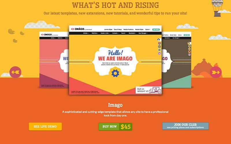
It is afternoon in the Joomlashack world, and it is time for a nice walk around the latest released products. Scrolling our slider, you will discover what’s hot and sunny right now at the Shack.
Then, the night-time can surprise you if you scroll down. Underneath the starry vault of heaven you can read some nice, inspiring blog posts that the Joomlashack team has written for you.
But your adventure has just started.
More details to discover
The site has been designed thinking of you, dear user. Small details and objects will guide you through a pleasant journey.
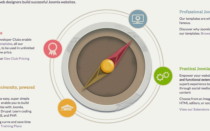
The products page introduces our wide range of product categories. Don’t know what to choose? Don’t worry; a big compass will show you the best-sellers: our Great Value Developer Club, our Joomla! Professional Templates, our Practical Joomla! Extensions and finally the famous Joomlashack University, where even grandma can learn Joomla!
Clicking on one of them you will take you to the product’s landing page, and a small compass on the top left will guide you to check out other products. Don’t feel like using our compass? Our menu is there, just a click away.

And if you get lost, don’t worry, you can use the breadcrumbs to retrace your steps, unless Antonio, the aviator, finds you first. He will bring you to a safe place where you can start a new search!
Joomlashack at a glance
A page that I really loved designing and enhancing is our “about” page. If you haven’t visited it yet, do it now! You are about to see one of the gems of our website.
On this page we give you 9 reasons (we have many more, but we didn’t want to sound too pretentious!) to start with Joomlashack today. You will also meet the Shackerini (as I usually call them), or the Shackers, in person and read their biographies.
It is the most intricately designed page, after the home page, and you will find lots of information.
Hola! Is anybody there?
In all nice stories and travels you always come across some nice person or some curious character. It is natural to wonder if the Joomlashack world is inhabited...
The big population at Joomlashack is made up of our users, friendly people that come and visit our site every day, buying our products and cheering us up with some nice comments on our Facebook page. We have redesigned our resourceful forum and our contact form for them so that they can communicate with us easier and faster.

We also have some bizarre people living at the Shack and you can find them at the Joomlashack University where they have found their home.
Design challenges: the things that no designer will tell you
I followed the building of this site step-by-step, and designed and personally took care of any small detail of the new website. Together with the capable and skilled team at Joomlashack, we have created a highly interactive and visually stimulating experience.
However, many pages were re-designed, reviewed on-the-go and many others were adapted just while we were coding. It was a time-consuming project, but it is worth every single pixel.
Bring it with you wherever you go
From today, you can travel on the Joomlashack website from your tablet, your mobile and any other kind of device. The Joomlashack website’s major change is not only the design, but also the innovative Wright Framework and the way it has been coded. So keep an eye on our blog if you want to discover more about how we developed and coded our new website.
Here are some fun facts and trivia about the new site to whet your appetite for exploration.
FACTS
• 500+ images were cut and used to build the site
• 365+ days (and some nights) of work
• 400+ Basecamp Project Management discussions completed before the launch
• 12,000+ lines on Skype chats
• 10+ people involved
TRIVIA
• The first proposal of the Joomlashack index was set in outer space. But we decided to move it to Earth.
• The small aviator, Antonio, is inspired by the French writer and aviator Antoine de Saint-Exupéry.
• Since its launch, the Facebook Fan page has registered 56,000+ fans.

