We recently wrote that Joomla 4 will adopt CSS Grid. This generated a really positive response from Joomlashack readers, many of whom are excited to use CSS Grid in Joomla.
So we decided to write some tutorials about the CSS Grid, helping everyone get up to speed. If you haven't read our first tutorial yet, head over tolearn the basic of CSS Grid.
This second tutorial expands on that first article. Now that you know the basics, let's show you how to use the Grid Inspector tool in Firefox. We'll also explain the difference between implicit and explicit grid.
The Grid Inspector
- Open the HTML file you created in the last tutorial in Firefox. We use Firebox because it has the best tools for workign with CSS Grid.
- Open Firefox Dev Tools with Ctrl + Shift + I in Windows/Linux or Cmd + Opt + I in Mac.
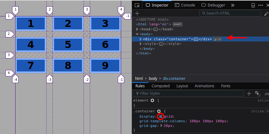
- Click the Grid container element in order to see which styles have been applied to it, you can identify this element in the HTML pane with the word grid.
- Click on the small grid symbol besides the css property in order to display the grid on your screen.

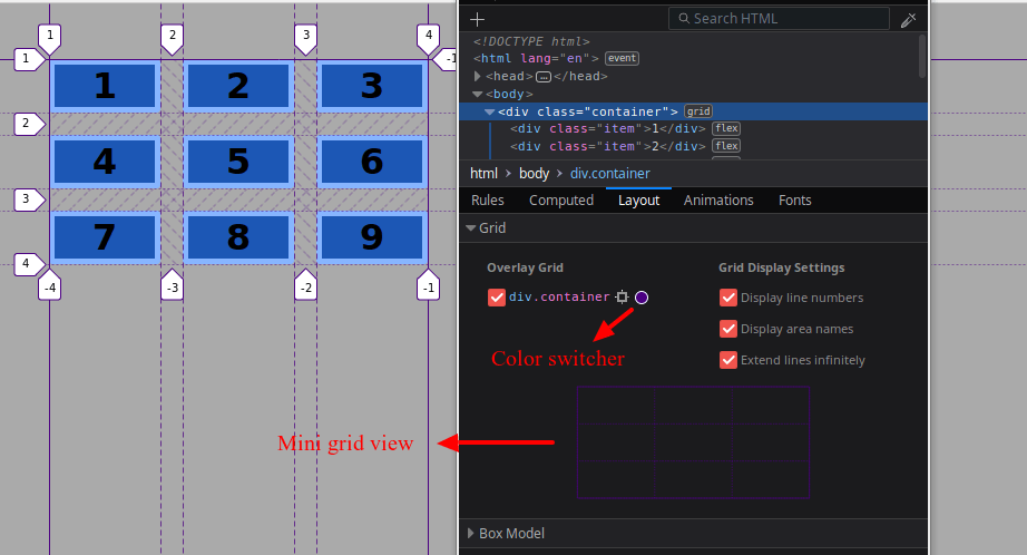
- Click the Layout tab.
There are two sections:
- The Grid.
- The Box model.
The Grid section shows on the left all elements within the HTML document that have been declared as a grid container with the display:grid property (in this case only one). You can check/uncheck this checkbox, in order to show or hide the grid container.
It has a color switcher, which lets you define the color of the grid, this is useful when having multiple grids in one page or if the background color of your site is similar to the color of the grid.
The options on the right side that let you configure the line numbers and their appearance. There is also an option to display the names of the declared areas inside the grid (we haven’t declared any area, so this option won’t do much at this moment).

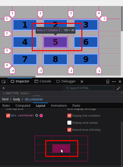
The Mini grid view lets you easily locate the position of a grid area. It provides information about the dimensions of the selected area and its position.

These features might seem superficial with a fixed width 3x3 grid, but are very useful with bigger and more complicated grid designs.
The Line Conventions
If you take a closer look at the lines crossing and surrounding the grid, you’ll notice that they have different styles. The convention used with these lines will help you to understand how elements are placed inside the grid.
- The continuous line marks where the grid starts and ends. Notice that there is a continuous line at both sides and on top of the grid, but there’s no continuous line closing the grid container at the bottom.
- The diagonal lines to left and right correspond to the horizontal and vertical gap between grid items (grid areas).
- The long-dashed line limits the tracks that have been explicitly defined through the (in this case the columns).
- The dotted line corresponds to the tracks that are being defined in an implicit way by the browser (in this case the rows)

Leave us your comments below. Thanks for reading!
If you're ready, move onto the third tutorial, understanding the difference between implicit and explict grids in CSS Grid.
Get our CSS Grid Explained Book

All Joomlashack Pro members get access to our "CSS Grid Explained" book. All you need to do is sign up for a Joomlashack extension, template or training membership.
In this short book, you are going to master the key ideas behind CSS Grid. This book is in the best traditions of OSTraining. There are no long-dense paragraphs of theory. You pick up the book and you start writing code immediately.
In the first chapter, we start with the basic terminology. You'll learn the difference between Grid Areas and Grid Cells, between Grid Tracks and Grid Gaps.
Then, using a hands-on approach, you'll start building CSS Grids. There are 9 different exercises in this book. You'll build everything from the most basic CSS Grid to a full site layout.

